
The complete set of title cards introducing the different chapters of the film

One of the characters was a pulp movie producer, these were some of the posters for films we imagined he might be most proud of to decorate his office. There was no budget for stock images on this film, so I had to get creative for my special effects, photographing dust on a mirror, down the barrel of a wall plug and a torch reflected in a window. Luckily cheap and crap was the look we were going for!
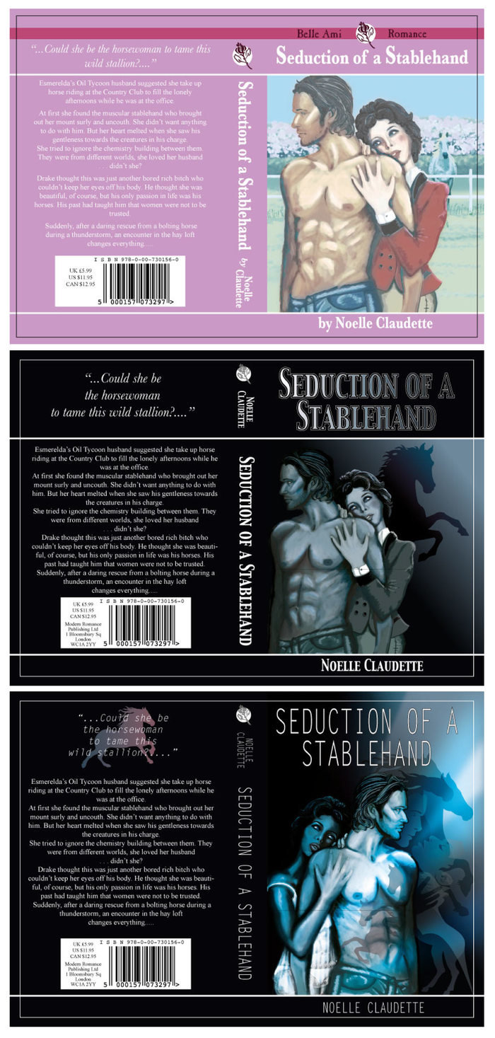
Another character is reading a romance novel throughout the film. I originally imagined it as a kitsch Mills & Boon style romance, but Amanda wanted something darker, more '50 Shades' but still quite tacky.
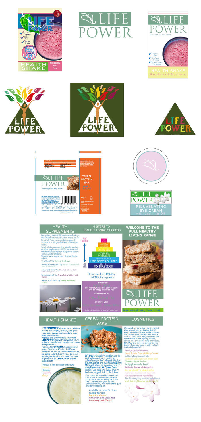
Another character is selling a brand of health foods and cosmetics called 'Life Power' which I was developing some ideas for.

I remember being particularly pleased with this cleaning product logo!
gLike
Party Pieces (Feature Film, 2014)
Unfortunately, this film was halted mid-way through filming and never completed, so the world will never see my first ever attempt at Lead Graphics on a feature film!
The project involved designing six different art nouveux style title cards to seperate the film's different "chapters" as well as more mundane food and drinks labels, a romance novel and some film posters. I was still learning how to use Photoshop and Illustrator at the time, so these look very clunky to me now!
Available
Freelance, Full-time
Lucy Bullen
Prop Maker, Illustrator and Graphic Designer
Sheffield, United Kingdom