
Part of the performance's backstory was to be told via newspaper clippings for the audience to read. I produced a range of styles, suggesting different mid-century newspapers, documenting the company's rise and fall over a number of years.
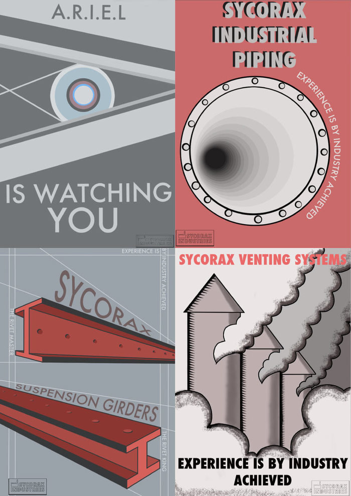
Another piece of the backstory was delivered by these large promotional posters. Director, Simon Ryninks was keen for them to be in a mid-century/Russian constructivist style with a strong red and grey-blue colour scheme.I was just beginning to teach myself how to use Photoshop properly, so this was quite a challenge for me. They're not perfect, but I was very proud of them at the time!
gLike
O Brave New World! (Theatre, 2011)
I produced some posters and newspaper clippings for an immersive reimagining of 'The Tempest' by my good friends at Retz theatre company.
Available
Freelance, Full-time
Lucy Bullen
Prop Maker, Illustrator and Graphic Designer
Sheffield, United Kingdom