UC BERKELEY TDPS: Self-mailing brochure for 2017-18 performance season.
Photo 1/2 — cover + gate fold.
HONORS: 2018 GD USA American Graphic Design Award
Bronze, Branding (awarded to entire refresh project) — Indigo Design Awards 2019
Bronze, Integrated Design (awarded to entire refresh project) — Indigo Design Awards 2019

UC BERKELEY TDPS: Self-mailing brochure for 2017-18 performance season.
Photo 2/2 — inside panels.
HONORS: 2018 GD USA American Graphic Design Award
Bronze, Branding (awarded to entire refresh project) — Indigo Design Awards 2019
Bronze, Integrated Design (awarded to entire refresh project) — Indigo Design Awards 2019

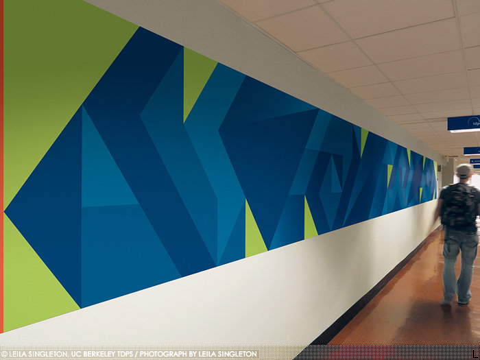
UC BERKELEY TDPS: "Hidden Initials" wall decal.
Photo 1/3 — post-installation.
HONORS: Silver, Graphis Design Annual 2019
Silver, Typography, Indigo Design Awards 2019
Bronze, Hiiibrand Hiii Typography 2018
GD USA American Graphic Design Award
Award of Distinction, American Graphic Design & Advertising 32
Bronze, Branding (awarded to entire refresh project) — Indigo Design Awards 2019
Bronze, Integrated Design (awarded to entire refresh project) — Indigo Design Awards 2019

UC BERKELEY TDPS: "Hidden Initials" wall decal.
Photo 2/3: To-scale sketch.
HONORS: Silver, Graphis Design Annual 2019
Silver, Typography, Indigo Design Awards 2019
Bronze, Hiiibrand Hiii Typography 2018
GD USA American Graphic Design Award
Award of Distinction, American Graphic Design & Advertising 32
Bronze, Branding (awarded to entire refresh project) — Indigo Design Awards 2019
Bronze, Integrated Design (awarded to entire refresh project) — Indigo Design Awards 2019

UC BERKELEY TDPS: "Hidden Initials" wall decal.
Photo 3/3 — hidden letters (T, d, p, s) isolated.
HONORS: Silver, Graphis Design Annual 2019
Silver, Typography, Indigo Design Awards 2019
Bronze, Hiiibrand Hiii Typography 2018
GD USA American Graphic Design Award
Award of Distinction, American Graphic Design & Advertising 32
Bronze, Branding (awarded to entire refresh project) — Indigo Design Awards 2019
Bronze, Integrated Design (awarded to entire refresh project) — Indigo Design Awards 2019

UC BERKELEY TDPS: Sell sheet with die cut.
HONORS: 2017 GD USA American Graphic Design Award
Bronze, Branding (awarded to entire refresh project) — Indigo Design Awards 2019
Bronze, Integrated Design (awarded to entire refresh project) — Indigo Design Awards 2019

UC BERKELEY TDPS: Outdoor banner, 120" w x 45" h
HONORS: Bronze, Branding (awarded to entire refresh project) — Indigo Design Awards 2019
Bronze, Integrated Design (awarded to entire refresh project) — Indigo Design Awards 2019

UC BERKELEY TDPS: Sell sheet with spot UV gloss.
Photo 1/2 — front + back.
HONORS: Bronze, Branding (awarded to entire refresh project) — Indigo Design Awards 2019
Bronze, Integrated Design (awarded to entire refresh project) — Indigo Design Awards 2019

UC BERKELEY TDPS: Sell sheet with spot UV gloss.
Photo 2/2 — gloss detail.
HONORS: Bronze, Branding (awarded to entire refresh project) — Indigo Design Awards 2019
Bronze, Integrated Design (awarded to entire refresh project) — Indigo Design Awards 2019

UC BERKELEY TDPS: Newsletter cover. Special design to celebrate department's 75th anniversary.
HONORS: Bronze, Branding (awarded to entire refresh project) — Indigo Design Awards 2019
Bronze, Integrated Design (awarded to entire refresh project) — Indigo Design Awards 2019

UC BERKELEY TDPS: Round stickers, 2" diameter.
HONORS: Bronze, Branding (awarded to entire refresh project) — Indigo Design Awards 2019
Bronze, Integrated Design (awarded to entire refresh project) — Indigo Design Awards 2019

UC BERKELEY TDPS: Self-mailing brochure for 2015-16 performance season.
Photo 1/3 — cover + gate fold.
HONORS: 2016 GD USA American Graphic Design Award
Academy of Interactive and Visual Arts (AIVA): Davey Awards Silver
AIVA: Communicator Award of Distinction

UC BERKELEY TDPS: Self-mailing brochure for 2015-16 performance season.
Photo 2/3 — inside panels.
HONORS: 2016 GD USA American Graphic Design Award
Academy of Interactive and Visual Arts (AIVA): Davey Awards Silver
AIVA: Communicator Award of Distinction

UC BERKELEY TDPS: Self-mailing brochure for 2015-16 performance season.
Photo 3/3 — mailing panel.
HONORS: 2016 GD USA American Graphic Design Award
Academy of Interactive and Visual Arts (AIVA): Davey Awards Silver
AIVA: Communicator Award of Distinction
gLike