
Responsive UI design for PDMOST, a site for professional development teacher assessments. The collection of data from these assessments feeds into the continuing development and improvement of tools for K-12 instruction.
One of six sections of the Overview, each having a unique accent color and defining icon. PDMOST was developed by the Harvard Smithsonian Center for Astrophysics through a grant from the National Science Foundation.
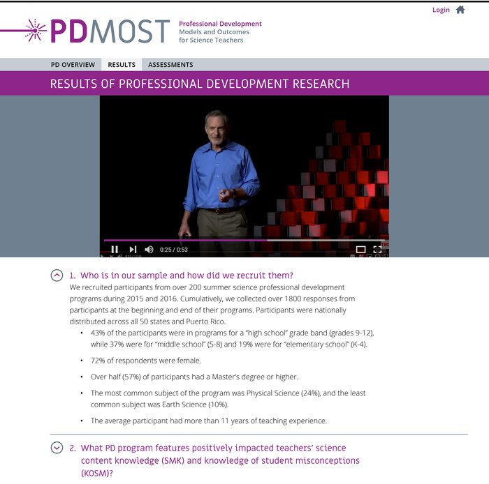
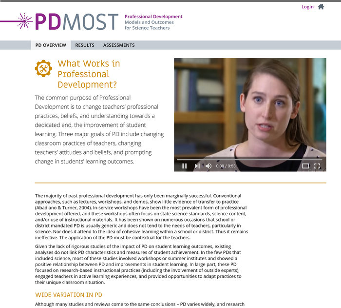
Curated videos are utilized on several pages throughout the site to engage teachers in the research. Likewise, accordions are utilized for accessibility and to allow their audience to delve deep.

Under Assessments, teachers learn about common misconceptions, sorted by science field and grade level, then directly access the assessments to share their outcomes. The UI design allows multiple ways for reaching the assessments – the core of the site.
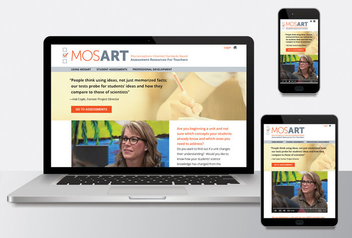
MOSART is the parent site for PDMOST. Similarly, I fully storyboarded desktop, tablet, and mobile versions. I also designed both its and PDMOST's logotypes to have similar yet different feels.
Like PDMOST, MOSART was developed by the Harvard Smithsonian Center for Astrophysics with NSF funding. Its UI design intentionally complements PDMOST while creating some fresh distinctions.
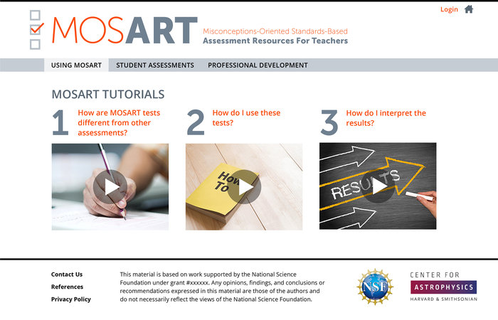
The UI design of MOSART is friendly and clean. It translates very effectively to tablet and mobile devices.
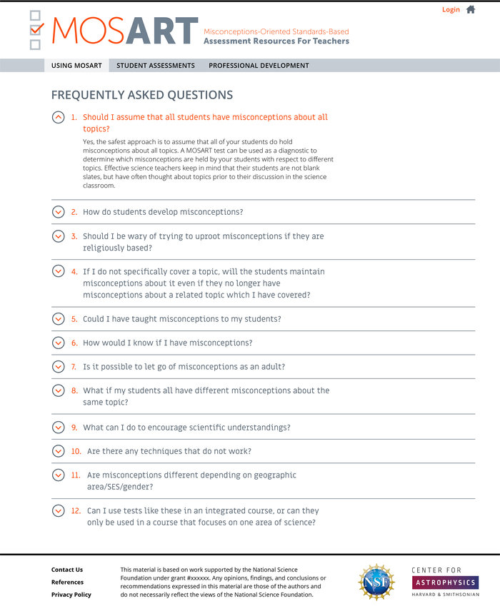
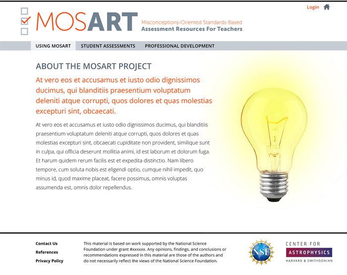
Like PDMOST, accordions are utilized to capture in-depth content is an accessible, user-friendly manner.
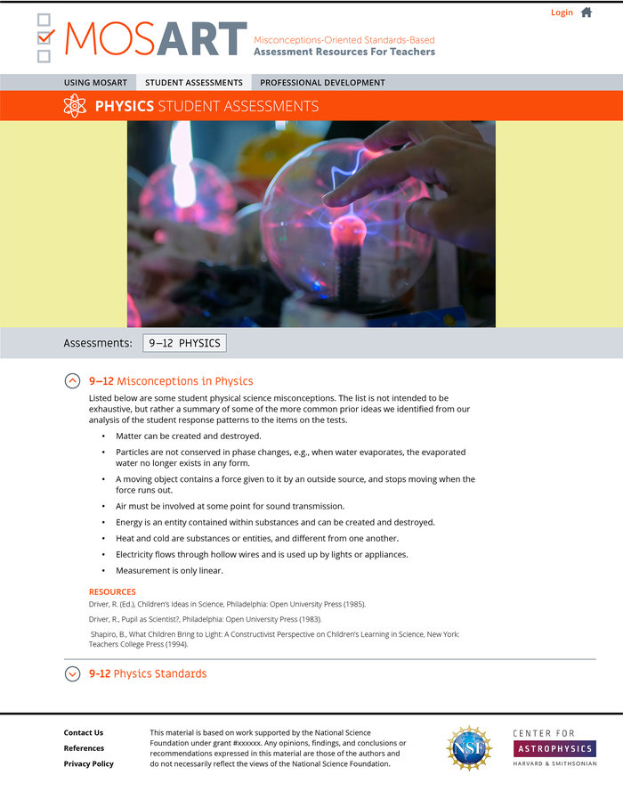
MOSART, unlike PDMOST, is a site for student assessments, not teacher assessments. Assessments are categorized by science field and grade level.
The responsive site is found here: waps.cfa.harvard.edu/mosart.
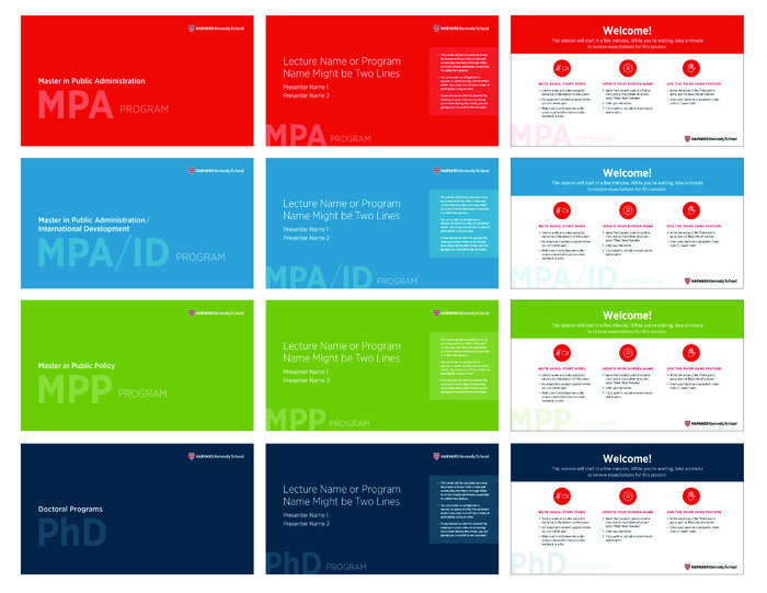
Digital screens for Harvard Kennedy School's remote events, by degree program. These examples illustrate the color identification system I designed to differentiate the degree programs while maintaining HKS's brand integrity.

Working with Harvard Kennedy School's Degree Programs and Student Affairs, I create assets for the HKS's webpages. The Office of Career Advancement publishes annual data, via this microsite, on students' employment post-graduation.

Data visualization assets for the HKS Employment Snapshot demonstrate post-graduation outcomes for students by degree program and employment sector. It's used as a tool for admissions recruitment.

Harvard Kennedy School's 2021 Employment Snapshot microsite is available here: www.hks.harvard.edu/more/employers/about-our-graduates/employment-snapshot/class-2021-employment-snapshot.
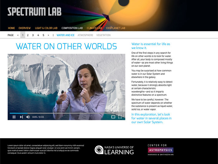
The "Spectrum Lab" is a relatively recent collaboration with the Harvard Smithsonian Center for Astrophysics. Introductory videos from scientists explain how we're able to look for water and ice, atmosphere, and vegetation on planets outside our solar system.
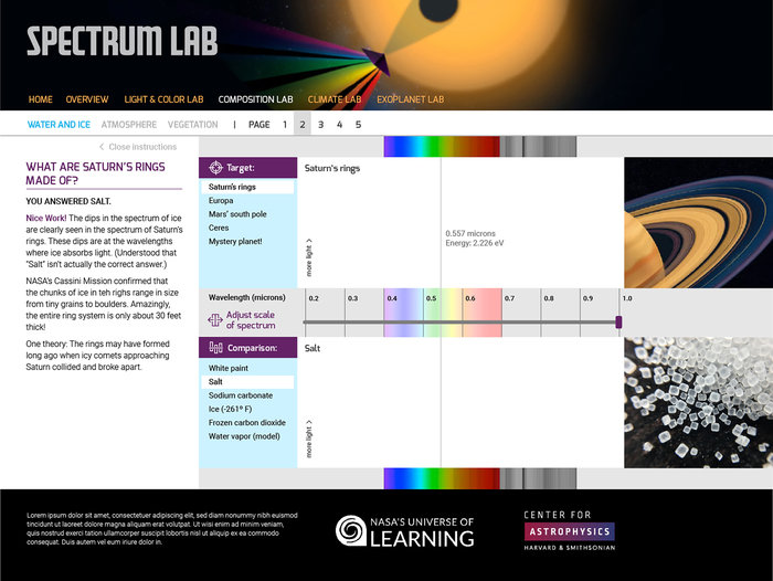
I developed the UI for the "Spectrum Lab" in collaboration with the Harvard Smithsonian Center for Astrophysics. Designing tools to explain complex concepts, making them accessible and understandable to a wide audience, is one of my passions.
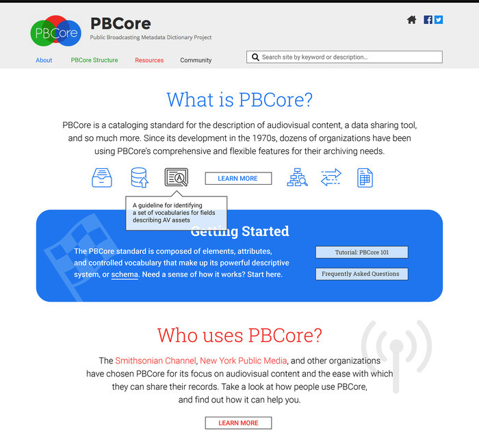
PBCore is is a cataloging standard for the description of audiovisual content and a data sharing tool. I designed its clean, simple UI design to attract and engage users..
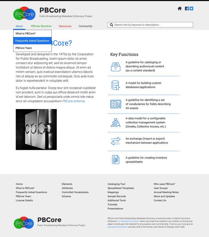
In collaboration with PCCore's development team, I designed a set of simple icons to explain the multi-functionality of PBCore — a powerful tool.
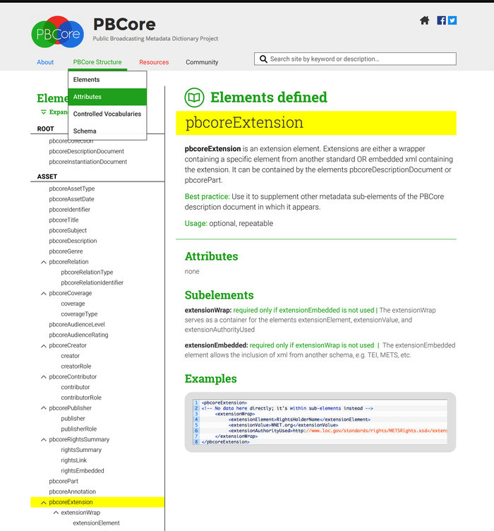
Like all my UI projects, I storyboarded the complete PBCore site. I designed and supplied the assets, working closely with the development team.
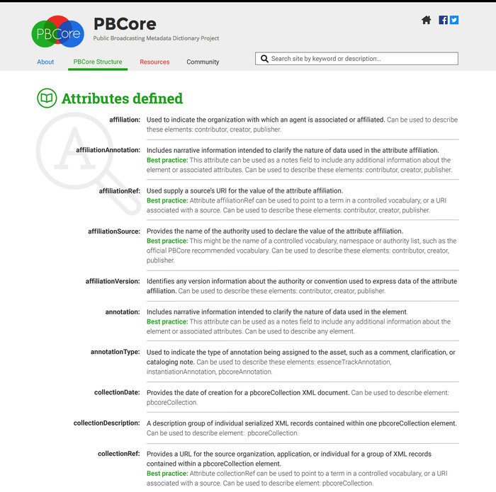
The "Attributes Defined" page from PBCore's site includes all necessary definitions to understand this tool.
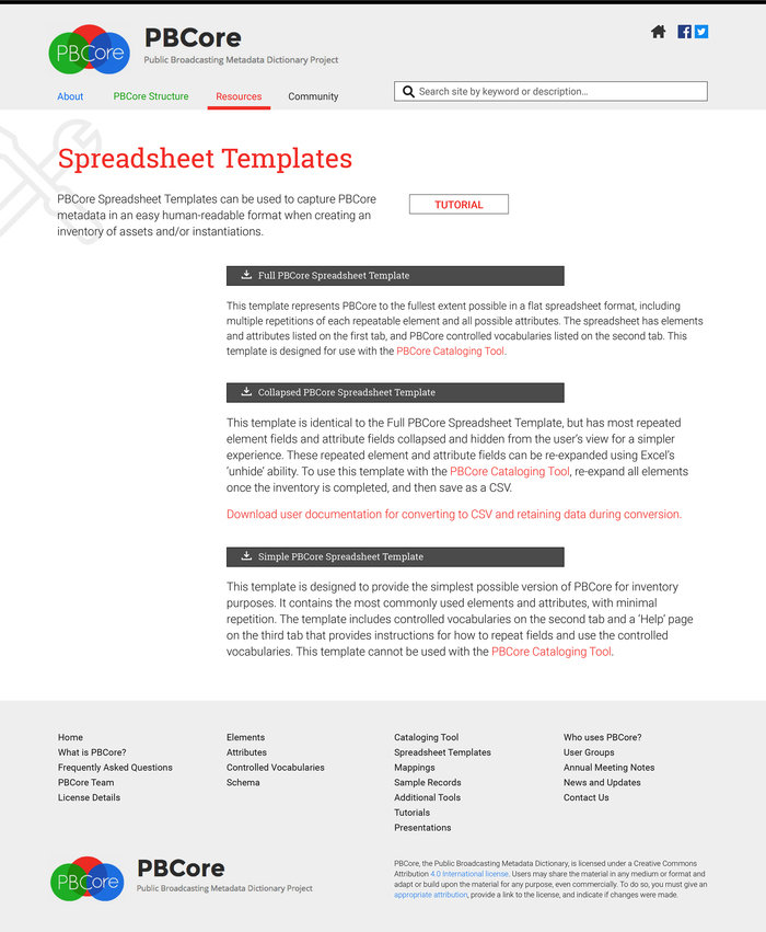
View the full responsive site at pbcore.org.
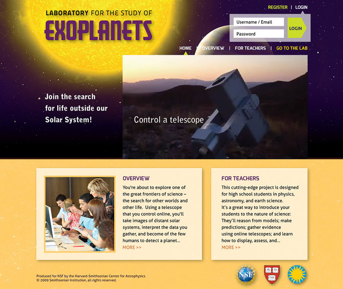
Homepage for the "Laboratory for the Study of Exoplanets" — an ambitious science-education outreach program for high school students. I developed the program's UI design in collaboration with the Smithsonian Astrophysical Observatory at Harvard.
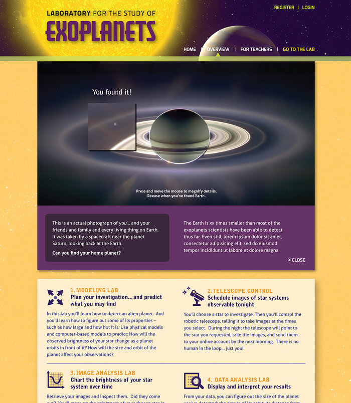
Overview page of the "Laboratory for the Study of Exoplanets". It explains this National Science Foundation (NSF) outreach project to teachers interested in using the program in their classrooms.
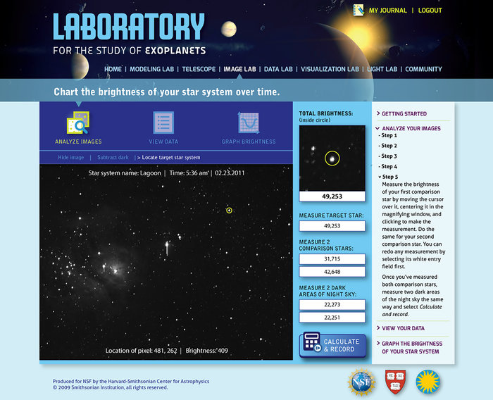
The "Image Lab" is one of several labs developed the for "Laboratory for the Study of Exoplanets". The lab portion of the site has a complementary yet differentiated feel from the overview section. Even its logotype is different.
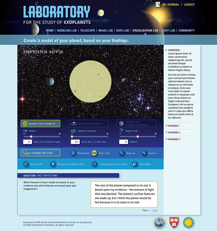
Each lab of this science education program guides students through the identification and study of planets outside our Solar System — exoplanets. They're highly specializes tools for teaching the scientific method.
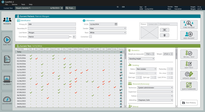
Morgan Scientific is an industry leader in the field of pulmonary function testing software. Working closely with Morgan Scientific's development team, I revisioned both light and dark themes for their functionally complex ComPAS2 software. It's friendly, clean appearance is intended to break down user barriers. My work represented a complete overhaul of their color palette, system of icons, and information design.

UI redesign for a highly complex search engine of assets developed for the American Archive of Public Broadcasting. My work was coordinated through their partnership with GBH's Creative team.
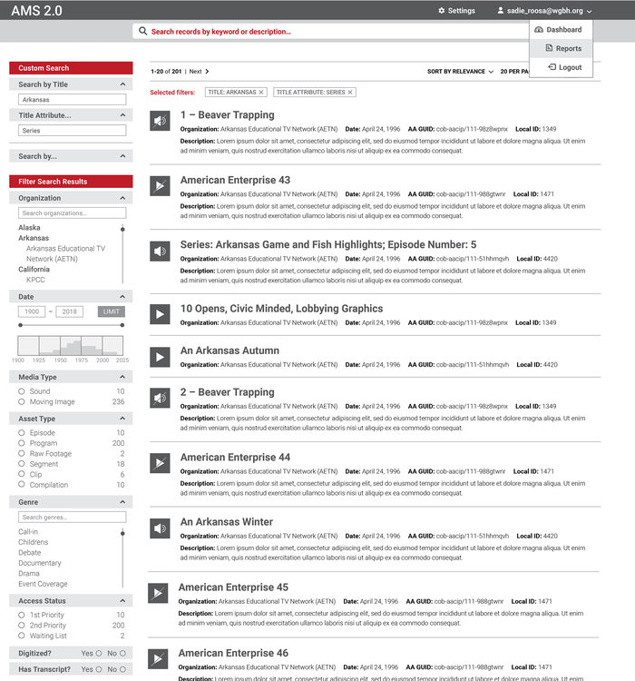
In collaboration with AAPB's development team, I created extensive storyboards for the visualization of AMS 2.0's search and filtering capabilities.

My work for American Archive of Public Broadcasting's AMS 2.0 engine included UI storyboarding and design for asset and instantiation information.

A simple color change from red to blue allows users to quickly track and differentiate their work in the asset vs. instantiation fields.

As part of GBH's Creative team, I collaborated with the American Archive of Public Broadcasting on a simplified online asset search engine. Search by asset creator location was reinforced visually by utilizing a map interface.

Likewise, AAPB's searches by time period utilize a timeline to enhance user accessibility and comprehension.
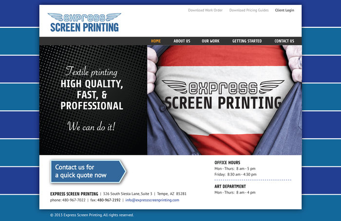
My redesign of Express Screenprinting's website has expanded the reach of their business — see expressscreenprinting.com.
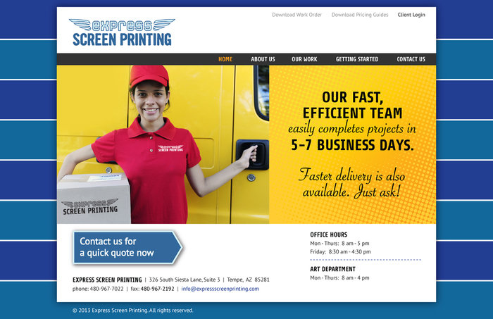
The homepage of Express Screenprinting's website utilizes a slider and its CMS, powered by Word Press, is easily updatable. Unlike their previous site, ESP's site is now responsive.
gLike
UI design | digital
View Website