
Trend reference used to inspire the style and direction of the theme

Initial sketches for the 3 new arts to be completed by the artists

Instruction sheet showing final layouts with sketches, individual color palettes, lettering reference for the hand lettering artists to follow, as well as finishing information and cost of goods.
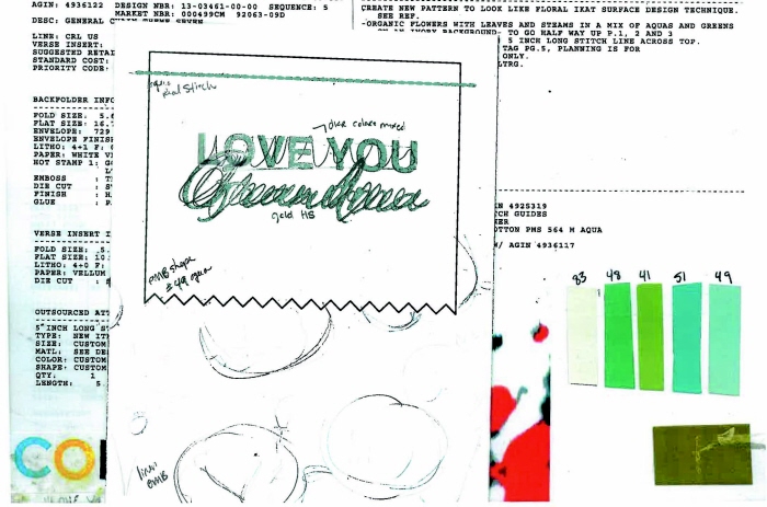
Instruction sheet showing final layouts with sketches, individual color palettes, lettering reference for the hand lettering artists to follow, as well as finishing information and cost of goods.
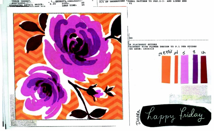
Instruction sheet showing final layouts, individual color palettes, lettering reference for the hand lettering artists to follow, as well as finishing information and cost of goods. This job reworked existing art and did not need to go to the artists.
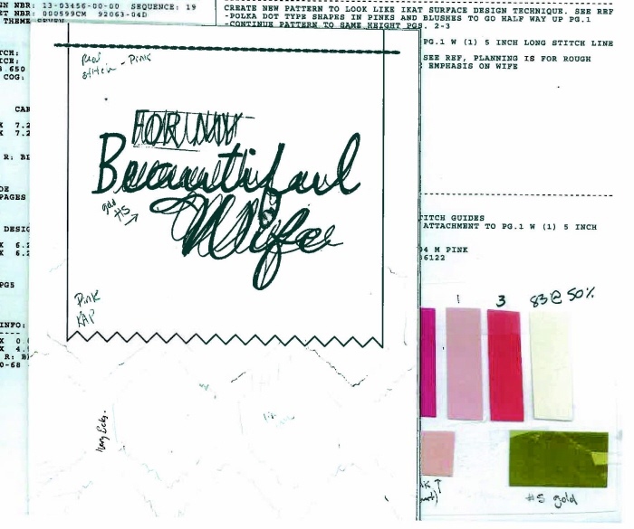
Instruction sheet showing final layouts with sketches, individual color palettes, lettering reference for the hand lettering artists to follow, as well as finishing information and cost of goods.

Finished art

Finished art

Finished art

Finished art
gLike
Target Mother's Day Theme
Art directed this 4 card theme within a larger run of the 2013 Target Mother's day Vantage Row. This theme was challenged with being trend forward, but still conventional and attractive. Each card was offered at a different price point and had varying finishings to achieve it's overall price value. Finishings included pearlized attachments, sequins, stitching, and printed ribbon tags. The four cards coordinated in both color palette and new card code sizes within a larger Vantage Row offering of approximately 20 cards.