
A stylized Mount Mansfield is featured in a stamp-like logo, evoking travel stickers and ski resort signage.
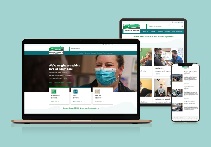
The new website features photography from local Burlington photographer David Seaver, who really captured the warmth of the employees despite still being under mask order.
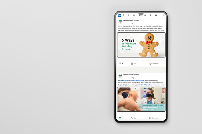
Revamped social presence included consolidating accounts and creating a look and voice for posts.
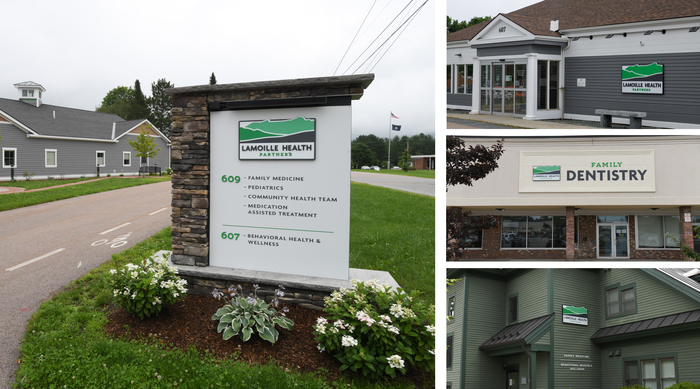
New signage at all locations. Family Dentistry must be seen from the road, so a variation on the theme was necessary.
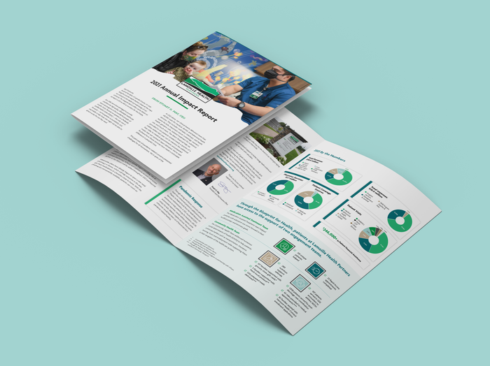
Annual Impact Report, sent as a self-mailing newsletter to area residents
gLike
Lamoille Health Partners
New name and visual identity for a Federally Qualified Health Center (FQHC) in rural Vermont. Goal was to connect six disparate practices under one brand to create unity internally and simplicity externally. Involving employees in decision making was key to success and led to a more accurate depiction of Mount Mansfield, an important local landmark, from their side of the mountain.