
The original logo and the Canton red were non-negotiable, so the challenge was to brighten and expand the palette without clashing with the red.
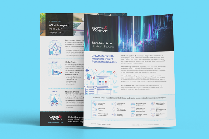
Sales flyers combine abstract imagery, typical business stock, and semi-custom illustrations to liven up healthcare strategy and growth services.
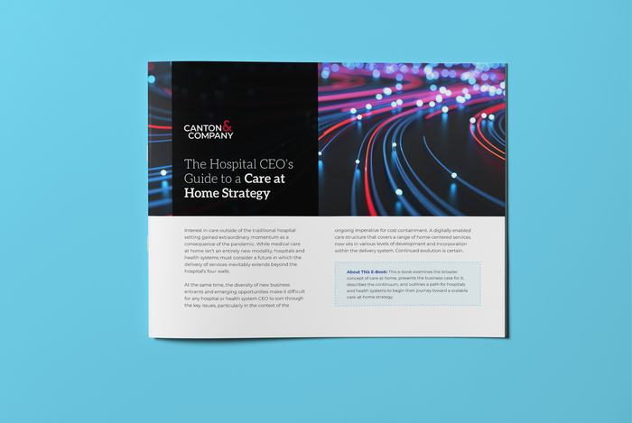
Longer form content, an eBook
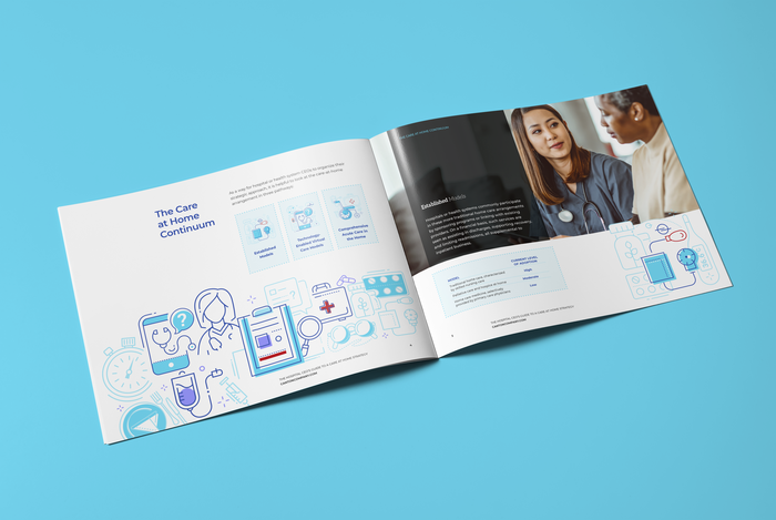
Care at Home Strategy eBook interior

Slides are clean and favor illustrations over text
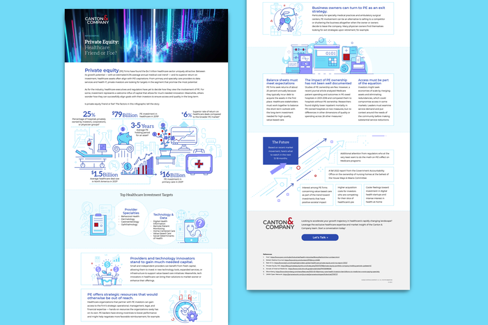
Infographics are not only fun, but a great showcase for the illustrations
gLike
Canton & Company
The Canton & Company brand was too conservative for the bold, contrarian voice they espoused. It was time for a refresh to differentiate from other healthcare consulting firms.