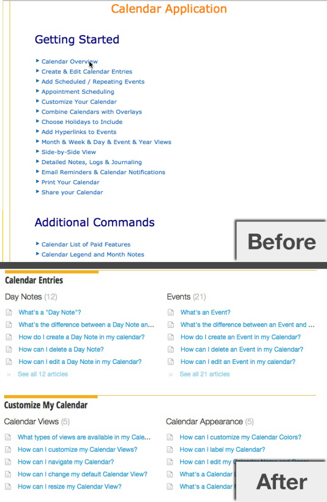
Before and After samples of the directory for the help system I rebuilt for KeepandShare.com. Long hand articles were broken down into short, tagged solutions and organized by relevant content.

An example of efficient search for "What's an overlay?" in the tagged and organized help system I built for KeepandShare.com.

Before and After samples of the Calendar Overlays article for the help system I rebuilt for KeepandShare.com. Long hand articles were broken down into short, tagged solutions, and organized by relevant content (as noted by the changes in the breadcrumbs and side bar).
I also created a graphic diagram for this "definition" article to clearly explain the concept of Calendar Overlays before delving into how one can use Calendar Overlays.

An example of efficient search for "color calendar" in the tagged and organized help system I built for KeepandShare.com.

Before and After samples of the Calendar Colors article for the help system I rebuilt for KeepandShare.com. Long hand articles were broken down into short, tagged solutions, and organized by relevant content (as noted by the changes in the breadcrumbs and side bar).
gLike