

View PDF
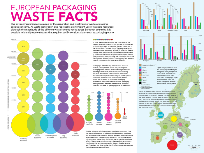
This project visualizes packaging waste statistics and illustrates the materials’ recycle rate during recent six years. Despite the fact that the number of recycling programs and initiatives is constantly rising, the current recycling rate is still about 25%. The major graph represents the cumulative packaging waste against the population of the country.
This type of visualization also allows to compare across different details. The visualization on the map allows to illustrate the waste against the country's acreage. Colors that represent countries in the major graph are similar to representation of this piece. Pink tag lines point reader's attention to an interesting facts, while the type below them explains the issue a bit deeper.
The bottom graph breaks down the cumulative waste to a categories, explaining the most common group to be a paper and cardboard.
Earlier versions allow you to see the development process and the little details which show the excellence of this project.