
gLike
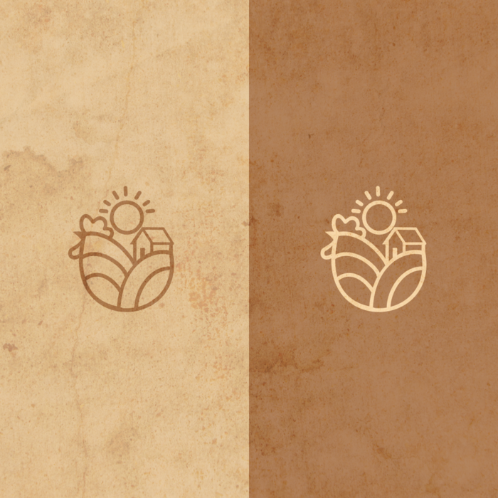
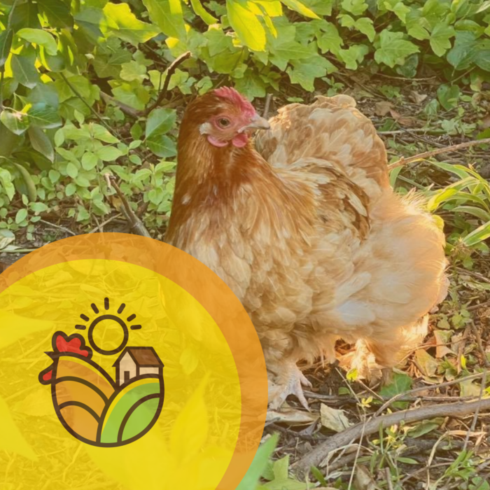
Logo Design for Lovestead Farm
The client is a married couple that runs a small backyard homestead/farm that has grown quite a bit in the last year. They needed a logo design as they look to expand their online presence as well as make some craft goods.
They were interested in incorporating the sun, as well as something signifying both livestock (primarily chickens for now) and vegetable production.
We were through a few concepts and decided on this one, which cleverly uses the farm fields to form the shape of a chicken.