
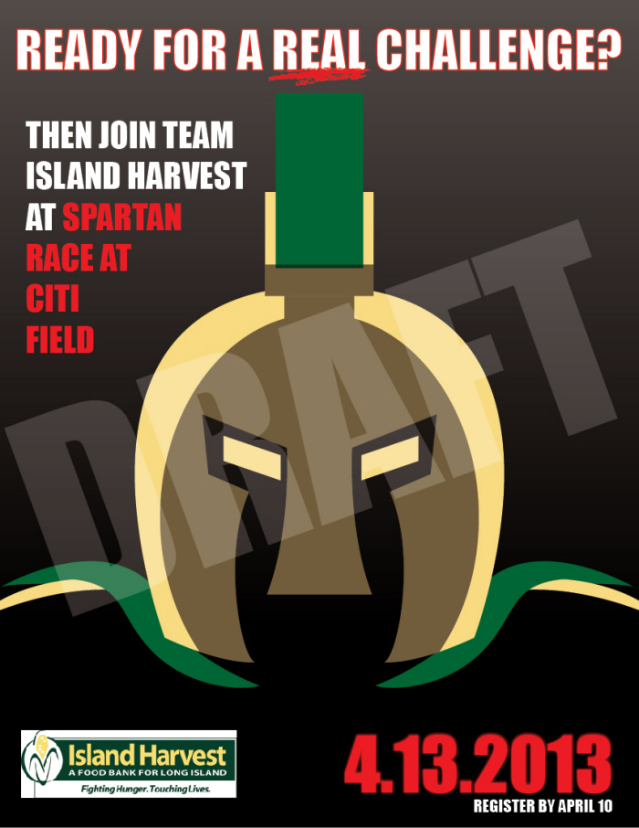
The first of three design drafts. The client requested a "cool" design because of the target demographic, so my first idea was to go with a head shot of a Spartan warrior, with his armor in the organization's color scheme of green and yellow.

The second design draft was to show a person triumphantly standing on top of a cliff, having overcome the race's rugged conditions. I decided to make the poster primarily red and black to mimic the color scheme used by the Spartan Race website (http://www.spartanrace.com), with the corn symbol from Island Harvest's logo in the background.

Finally, I decided to used a brushed metal "shield" with the Island Harvest logo, initially against a solid background, but later with the incorporation of images from the Spartan Race website. This is the design that Island Harvest ultimately chose, as they wanted the poster to be more about their organization than the Spartan Race event. They also requested that I change the color scheme from red used in this draft to their colors of green and yellow.
gLike
Island Harvest - Spartan Race at Citi Field Poster
This is a poster I designed for Island Harvest as part of Briarcliffe's "Service Learning" program. With this program, students are required to contact a local charity and do some design work relevant to the course they're taking. In my case, the Service Learning project needed to be created in Illustrator because that was the software I was studying.
Another requirement for the project was that I needed to create rough drafts for three different designs from which the client would choose for the finished design. The design with the logo "shield" surrounded by different photos was the one they eventually chose.