
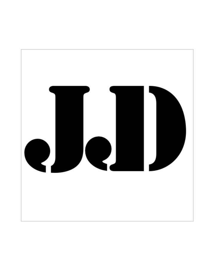
JJD #1 - Our assignment with this project was to create a composition using only our initials. We could change the type face between letters but it was encouraged that we stick to either a Sans Serif or Serif style and not jump between the two. This was the version I ended up choosing as my final to pass in. I like it because I tryed to make the D appear as the shadow to the J. I also like fact that the J seems to sit in the curve at the top of the D. Created the first semester of my sophomore year.
View PDF
View PDF
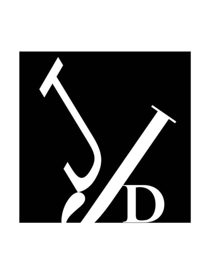
JJD #2 - One of my versions along the way. I wanted it to seem as if everything was balanced perfectly but if the wind blew everything would tumble over. This was created the first semester of my sophomore year.
View PDF
View PDF
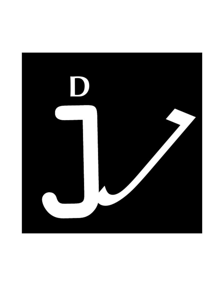
JJD #3 - This was my runner up design. It took my classmates a few minutes to see the D on top of the lower case J but once they did they really enjoyed the cleverness of this one. This was created the first semester of my sophomore year.
View PDF
View PDF
JJD Logo 1 - The first half of the project was to create a composition using our initials, this meant the letters could break the spacial plane of the composition. The second half of the project was to design a Logo of our initials. This meant it had to stand alone in the middle of the page. This was the version I passed in. Created first semester of my sophomore year.
View PDF
View PDF

JJD Logo 2 - This was my alternate version of a logo using my initials. I almost like this one better but the one I actually used was more well received.
View PDF
View PDF
gLike
Initials Project
This project I had to use my initials in black and white in a creative way. I couldn't replicate them or add anything other than the letters themselves. The ones with black background white letters are supposed to be more like a composition or piece of art that can break the plane of the canvas, where as the white background black letters are supposed to look more like a logo and float in the middle.