
RECKSTAR Magazine Logo - Client: RECKSTAR Magazine
Logo for a SoCal magazine.
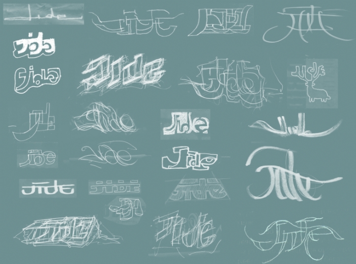
Logo development
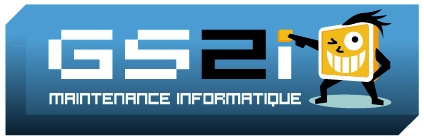
GS2i Logo - Client: GS2i Maintenance Informatique
This combination mark was commisioned by one of the largest computer maintenance company in Paris, France. The client was looking for a friendly visual solution.The main requirement was to convey a sense of reliability and fast service (as easy as a click of a button), GS2i's competitive advantage over its competitors.
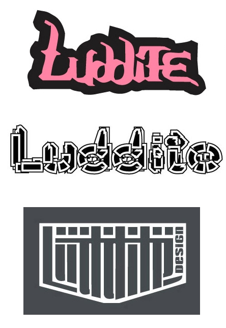
LUDDITE Logo - Luddite offers amazing jewelry made with recycled airplane components.
The first logo was a typographic collage, built by transforming different characters of the same font, using lower, upper case, and numbers.
The fascinating typographic experiment used for the second option, efficiently captures the viewer's attention and was picked by the client as best final solution.
The vertical rythm used for the third solution, reflects the visual rythm found consistently in the jewlery collection.
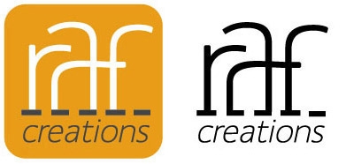
Raf Creations Logo - Client: RAF Creations
French fashion designer Raphael Lobello was looking for a visual solution reflecting the nature of his business.
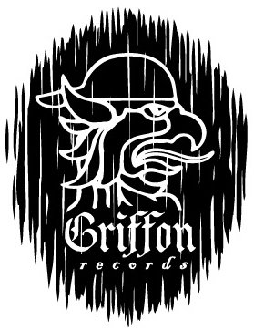
Griffon Records Logo - Client: GRIFFON RECORDS
This record label caters to the new-punk audience, white suburban youth. The effective visual catch was achieved by merely adding a baseball cap to an old european icon, and apply a wood textured background to the final result.
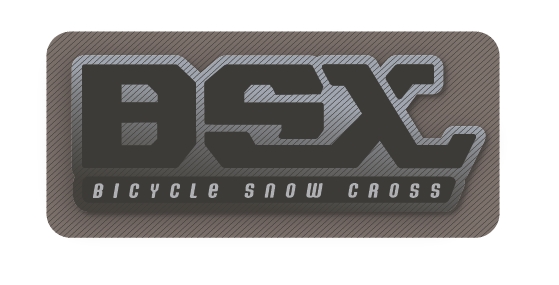
BSX Logo - This new sport on snow is the perfect mix between snowboarding and BMX. The typography reveals the general shape and concept of the product while clearly spelling the name.
TILT MAGAZINE Logo - Client: TILT Magazine
TILT Magazine was looking for a visual pun version of their logo, for the cover of the fifth year celebration issue.
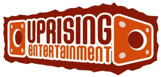
Uprising Entertainment Logo - Client: UPRISING ENTERTAINMENT
I developped this logo for a production co. specialized in Hip-Hop shows and other music events.
Logo design for an action-sport consulting and marketing agency - Overcoming these 2 challenges:
1- Taking a symbol from the client's recognized past established brand(Good Times skateboards) and integrate it to the mar: Choosing and modifying a font that would echo the form and weight of the symbol, in order to achieve visual unity.
2- Reflecting the company's qualities:
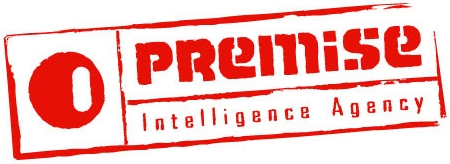
The lines around all elements of this logo, suggest the frames used on government forms or classifieds documents, reflecting the secretive and investigative side of this agency.
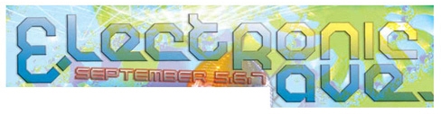
Logo developed for San Diego Street Scene flyer - In 2003, the San Diego Street Scene festival introduced a new electronic music stage and was looking for a nightclub look and feel for the promotional flyers. I modified a geometric and innovative font to create this attractive solution.
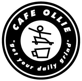
CAFE OLLIE Logo - Client: CAFE OLLIE
This combination mark created for a coffee shop built in a skateboard shop. The pun resides in the word "ollie", the fundamental skateboarding trick, similar sounding to "au lait", which, in french means "with cream". The overall shape suggest a skateboard wheel.
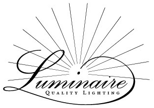
Luminaire - Client: Luminaire
The elegant use of contrasting script and small caps letter forms, reveals the classic touch and quality of Luminaire's lighting accessories.


Stationery design
gLike
Branding