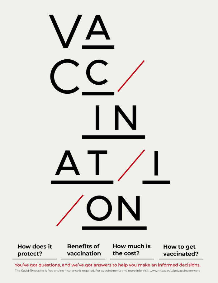
PSA Covid Vaccine Poster
The goal was to design typographic poster related to Covid-19, utilizing the Swiss style aesthetics. I chose to approach creating a clever way to dissect the word vaccination to achieve an interesting composition and used the red slashes to visually communicate the tips of the syringe needles.
I used the Metropolis typeface in 2 font sizes for the main headline Vaccination, and added lines under many of the letters to create emphasis , and grid system to keep everything balanced. The use of red sparingly to enhance how the information is read and built clear hierarchy.


