Organic Department - The flower display units were designed to elevate the product to a higher quality level (flowers were originally placed in buckets). The graphics are updated to look more contemporary. It not only incorporates but celebrates the new logo design. Endcaps were also updated with new designs & graphics, giving the aesthetic a fresher feel.

Cashwrap - This is a photo-morphed image incorporating the new logo and new graphics along with cashier header numbers.

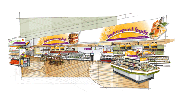
Power Aisle - The Prepared Foods fixture is designed to offer pre-made or partially-made items, helping the consumer save valuable quality time that could be spent with their family. Flexibility was key in designing fixtures for this client. New graphics were also applied to each department.

Deli Department - The Solution Display units were designed for the purpose of combining products that could be paired together to make a meal. (Making Mom the hero) These units are very flexible and can be placed in any department. Tasting display units can also be placed near Solution Display units to further emphasize the product. New graphics were also added for a fresher feel.
gLike