
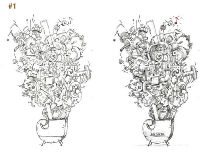
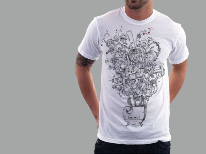
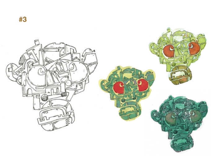
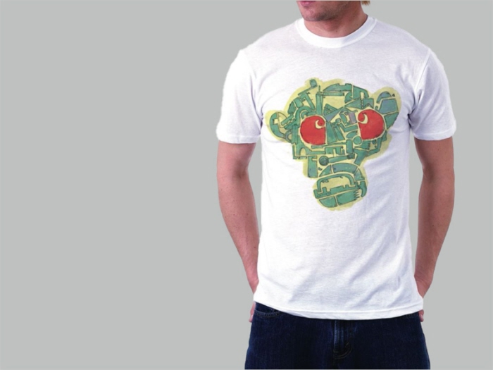
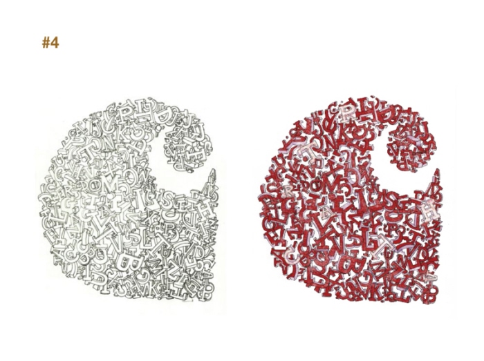
C collection - This academic project is a set of illustrations created for a collection of t-shirts. The selection of Carhartt is justified by the personal identification with the brand and some similarities in terms of language.
After characterizing the brand identity with the adjectives strong, original, innovative, young, creative, cool, urban, vital ... The logo is always present in the illustrations. The C letter gains weight, volume and life. It becomes a heart, a bird or a mystical object.


gLike