
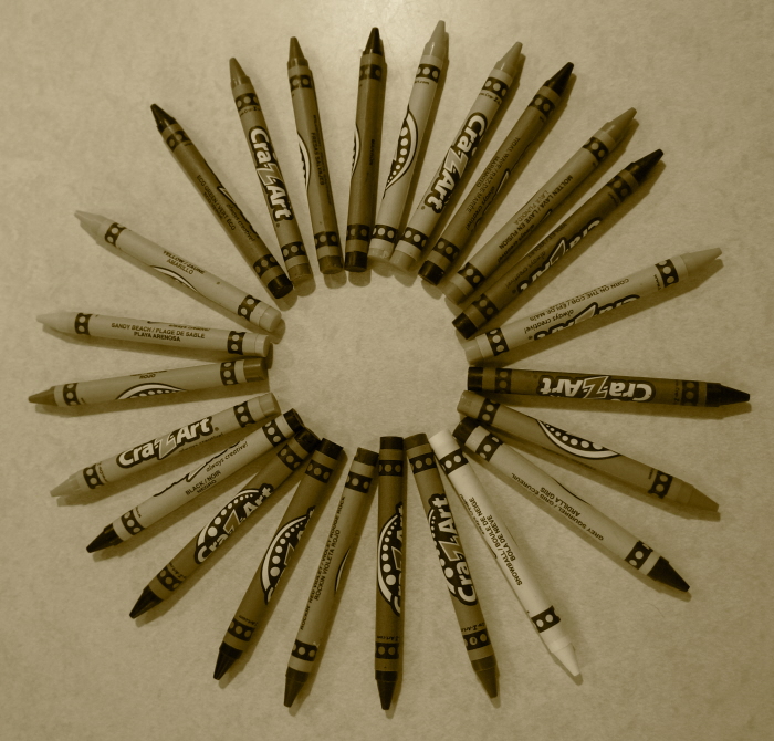
Pattern, 2014. Pattern is an element that occurs over and over again in a composition. In photo-shop, I turned this black and white and adjusted the red to 104 and yellow to 15.
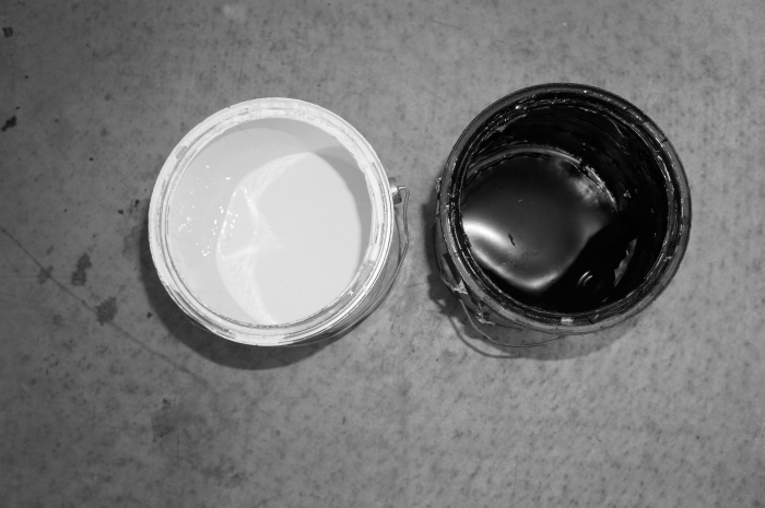
Contrast, 2014. Contrast refers to the opposite and difference in the work. You can achieve verity by using different shapes, textures, colors, and values in your work. In photo-shop, i just turned this black and white, and turned the red down to 27 from 40.
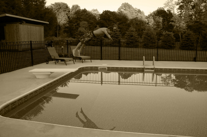
Movement, 2014. Movement adds excitement to your work by showing action and directing the viewer's eye throughout the picture plane. I changed this picture to black and white, then added a tint which turned it into Sepia. I changed the red to 59, yellow to 100, green to 163, cyan to 95, blue to 53, and magenta to 78.
Unity, 2014. Unity is seen in a painting or drawing when all the parts equal a whole. The whole thing needs to be in focus. In photo-shop, i turned this to black and white, then tinted it so it turned into Sepia. i adjusted the color green to 104, yellow to 138, red to 66, cyan to 60, blue to 83, and magenta to 142.
Balance, 2014. Balance is a sense of stability in the body of work. Balance can be created by repeating the same shapes and by creating a feeling of equal weight. In photo-shop, I turned the brightness to 43, and contrast to 24.

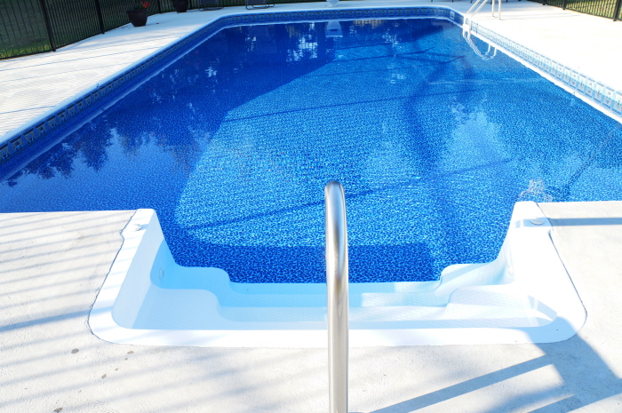
Size/Scale, 2014. Size/Scale uses human form to show proportion in reference to its surrounding objects. In photo-shop, I adjusted the vibrance to 8 and the saturation to 9.

Emphasis, Contrast, Unity, 2014. Emphasis in a composition, refers to developed points of interest to pull the viewer's eyes to important parts of the work. Contrast refers to the opposite and difference in the work. You can achieve verity by using different shapes, textures, colors, and values in your work. Unity is seen in a painting or drawing when all the parts equal a whole. The whole thing needs to be in focus. I chose this picture to represent three elements of design. It represents Emphasis, because the bright red stop sign is what pops out, and its what you see first. It represents contrast, because of the vibrant red compared to the dark green and faded blue sky. It shows Unity because if you take out the red stop sign, there is just space behind it which equals a whole.
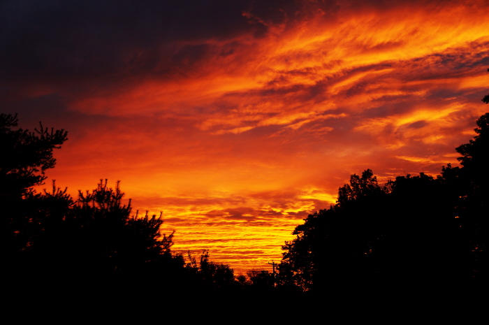
Emphasis, 2014. Emphasis in a composition, refers to developed points of interest to pull the viewer's eyes to important parts of the work. In photo-shop, I adjusted the brightness to 62, and the contrast to 74. I also adjusted it a small amount in curves.
gLike
Elements of Design
Emphasis
Balance
Unity
Contrast
Movement/Rhythm
Pattern/Repetition
Size/Scale