Current version of the NGO's CMS system which was a CMS from 2007. It was copy-heavy and the functionality was out-dated.

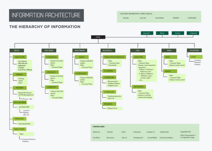
My solution was to ask the NGO + their host/developer to run a traffic analysis to inspect which content to edit out vs keep. I then drew out a streamlined structure in order for the front user to quickly get to pertinent information.

I proposed a cleaner, more modern look to clarify the functionalities for the user.

Also added new multimedia features.

I had proposed to use Google Map plug-in for their directory.

I also thought it was important to have the members to have their photographs to make the organization more personable.


In terms of aesthetics, I proposed a much cleaner and modern look. I minimized the deluge of green that was originally used and added a revolving console for their news + events.


gLike