
For my website, I wanted to do my personal potfolio, fatpandaclub, in the one-page scroller style, with dynamic visualizations. Inspiration can be found here: http://www.pinterest.com/ncecilie/website-research/
The website would be build using HTML5, CSS and jQuery.
Unfortunately, I lost my early paper sketches.
This is the first digital sketch I did. I wanted to go for a menu at the top, that sticks to the top of the screen, when the user scrolls through the site.
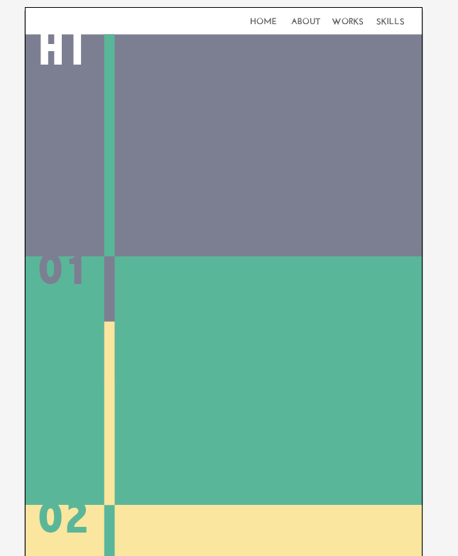
Throughout the project, I must have changed colors a hundred times. Usually when I make websites, I go for a very minimalistic look in b&w, and lots of white space. For this project, I wanted to bring color in, in order to make my site more distinguishable from other portfolios.

After sketching around a bit, I decided on having page numbers, in order to connect the different "pages" on the site.
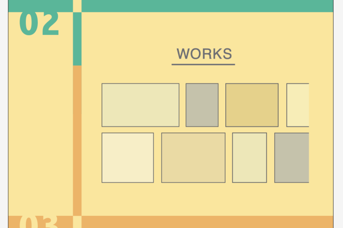
Here we see another example of experimenting with the color.
On the page containing my work, I wanted to use small thumbnails, that pops up in a larger format on the site, when triggered by a click.

In order to keep the one-page look, I decided to bring in side-scrolling to the "works" page. This enables the user to browse through my work, without distorting the layout.
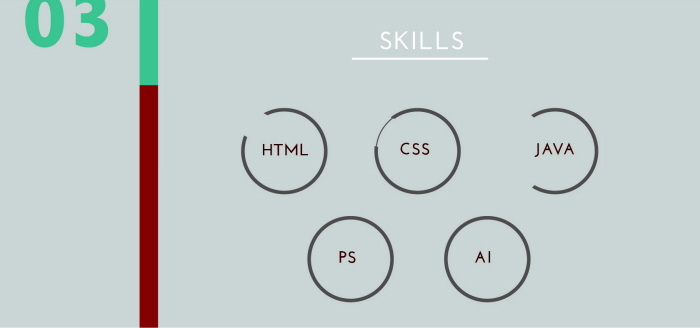
At first I wanted to use this kind of circle diagrams, in order to show my skills in various software and languages. As you can see, I experimented with different styles (HTML & CSS examples).
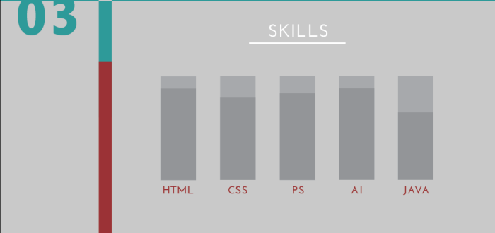
However, I found that I didn't like the look of the diagrams too much unless the skill-level was at at least 75%, so I changed it to a bar diagram.
(Btw, these aren't really my skill-levels, it's mostly just made for prototyping purposes).

For social media, I decided to add links to my LinkedIn and personal Pinterest, as I feel like these would be relevant. (The LinkedIn being a professional network and the Pinterest showing my personal aesthetics, which is relevant for design work). My Twitter, Facebook, G+, etc. profiles would be unnecessary and make my website more unprofessional.
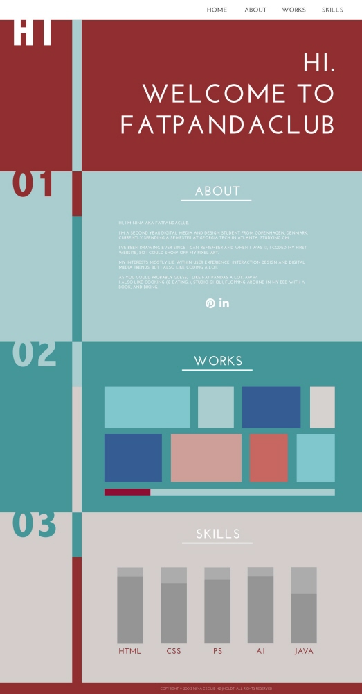
Final website. I didn't do the drilldowns, as the one-page scroller style and simplicity of the site makes it possible to see almost all the content on my site in one image.
!IMPORTANT! When viewing the website, you'll only see one "page" (Hi, 01, 02 or 03) at the time, which will fill out the entire browser window (dynamic resizing). Upon clicking on the menu links, the page will smoothly scroll down to the desired page. If you scroll manually, the site will snap to the pages. The site is dynamically loads and displays the content as you go.
Home page (hi): First "Hi." appears, then "Welcome to fatpandaclub".
About: "About" (the headline) is written out, like on a typewriter, then the body text appears, then the social media icons.
Works: "Works" (the headline) is written out, like above. Then the thumbnails appear one by one, quickly sweeping across the page.
Skills: "Skills" (the headline) is written out, like above, then the skill bars are filled up one by one.
View PDF
View PDF
gLike