
Film Magic - Post production house in Malaysia. Named FIlm Magic.

NuDerma - This is a logo design for a spa and beauty parlor in Kuala Lumpur.
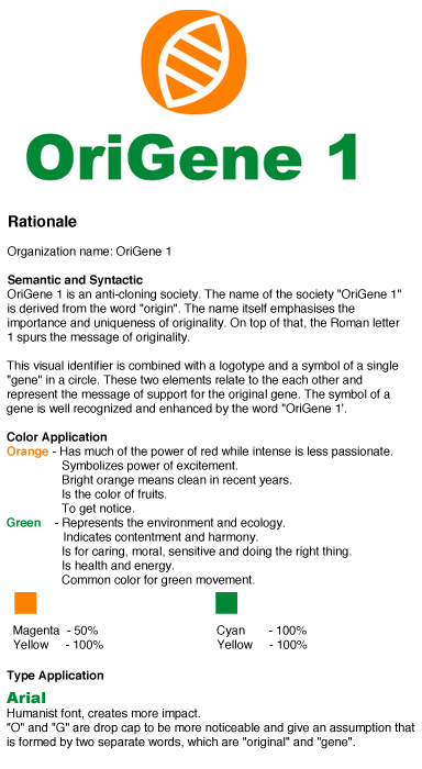
OriGene 1 - Degree project : The organization name is fiction.
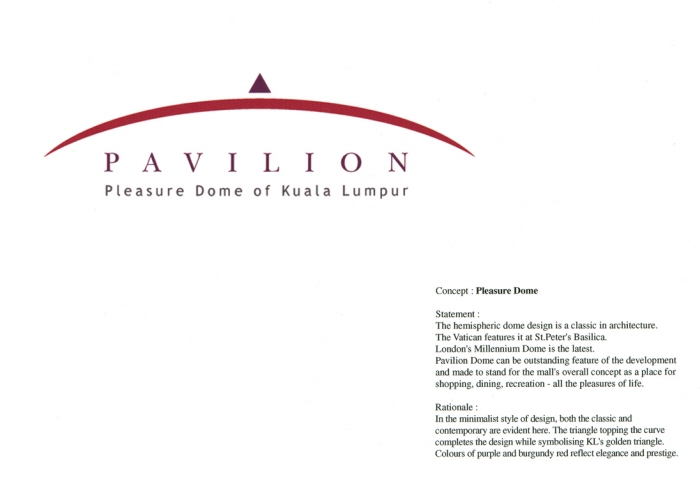
Pavilion shopping - This is a proposed design for a prestigious shopping scene in Kuala Lumpur.
The hemispheric dome design is a classic in architecture. Pavilion Dome can be outstanding feature of the development.Overall concept as a place for shopping, dining,recreation - all the pleasures of life.
Rationale:
In the minimalist style of design, both the classic and contemporary are evident here. Colours of purple and burgundy red reflect elegance and prestige.
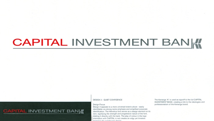
Capital Investment Bank
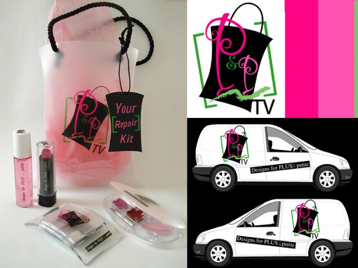
A corporate identiy system for an academic assigment. Is a Tv station targeted to woman with plus and petite figure in New Zealand.
Execution included Tv station naming, visual identifier design, corporate business system, vehicle design, website, promotional item inclusive of packaging and totebag design.
Be in the Spotlight Tupperware contest
Tupperware's go gree logo
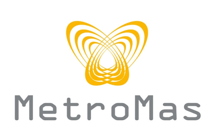
metromas - This logo brand as a more upscale metropolitan feel and masculine approach. The element connote the meaning of links, networking of commercial hub to indicate the good location of the property,. The selection of font there is very modern and edgy also give a sense of sophistication and dominance. Color tone give a sense of modern commercial ,dynamic and prosperity yellow., grey signifies the stability and growth as well as give a sense of professionalism.
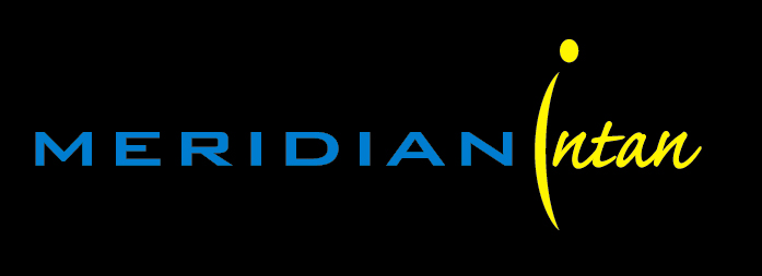
meridian intan - This is a minimalist stylized logotype design combining 2 different typeface which are one geometrical and the other is scripted. (bank Gothic and CalfishPro Script). Color usage is very much a modern feel as the color blue connote synergy and golden yellow implies wealthness. The stroke suggesting the meridian longtitute and nicely blend the alphabet I and also act as a device to break between the 2 words. Name of Meridian reflects that the property is primage and strategically located.

Pulse design
gLike
logo