Dove packaging
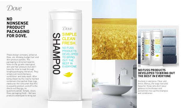
These design concepts, aimed at Dove, are showing budget hair and skin product options. The packaging is directed towards folks on the go who need good skin and hair products but don't have the time to read through lengthy packaging literature. They simply just need shampoo,
conditioner and body wash. After being
drawn by the clearly marked containers the spotted Dove logo reassures the consumer that this is a quality product, and off to the check-out they go, no questions asked.
Simple, clean, fresh - No fuss products developed to bring out the best in everyone. Clear and direct. Bonus, the large text also helps for those who don't
wear glasses in the shower and sometimes mix-up the shampoo and conditioner.


