
Trip Odometer Album Cover (outside) - This album cover was created for a continuous mix recorded by a friend of the designer. The project featured lots of angular and linear elements, consistent with the music on the album (progressive/melodic trance).
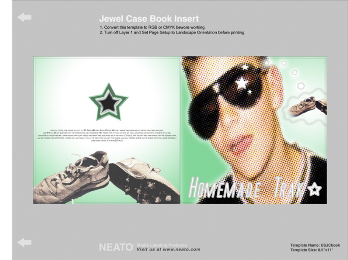
Homemade Trak Star Album Cover (outside) - This project was created for a continuous mix album recorded by a friend of the designer. This is actually the second generation of the cover, as the first was lost to antiquated technology.
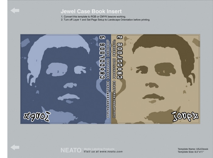
Crossfade 2 Album Cover (outside) - Created for recording artist jonpz, this cover featured the tone-on-tone look that was consistent throughout the project. Blues, browns, greens, and reds in neutral forms gave the visual effect the client desired.
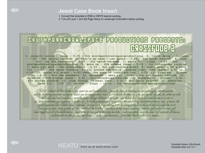
Crossfade 2 Album Cover (inside spread) - Created for recording artist jonpz, this cover spread featured the tone-on-tone look that was consistent throughout the project. Blues, browns, greens, and reds in neutral forms gave the visual effect the client desired.
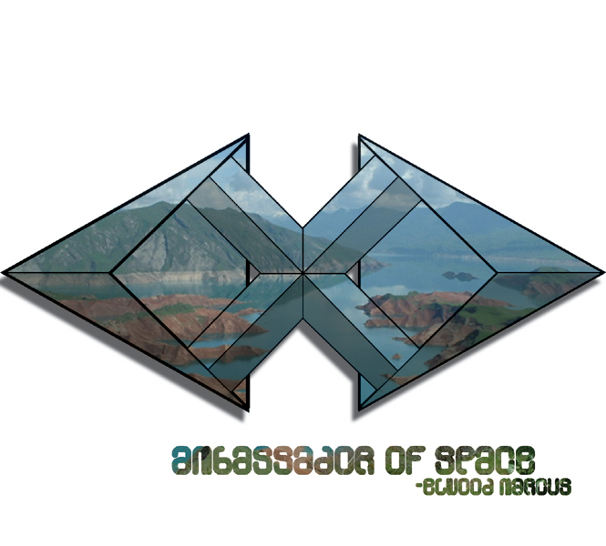
Ambassador Of Space Concept Design - Though never produced, this design was created for recording artist Elwood Marcus. The geometric shape was derived from a cleaned up doodle, and the photo was from somewhere in the former U.S.S.R.
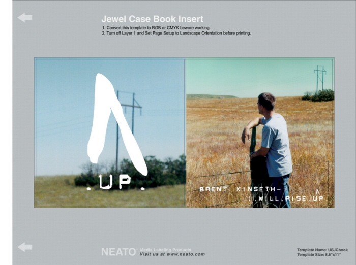
Brent Kinseth Album Cover - Created as part of recording artist Brent Kinseth's album, I Will Rise Up. The colors were shifted quite dramatically in the cover photo to give the shot a much more profound feel. The original had the hay field in bright green, which was very distracting and pulled focus away from the subject.
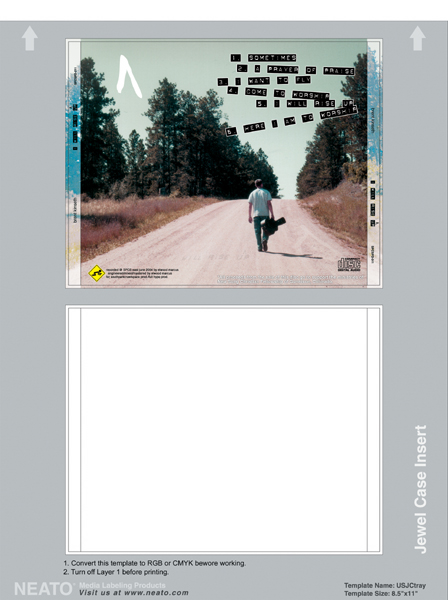
Brent Kinseth Album Traycard - Created for recording artist, Brent Kinseth, this piece was part of the album I Will Rise Up. The colors are shifted in all parts of the accompanying photography to give it a vintage, washed out 60's-70's look.
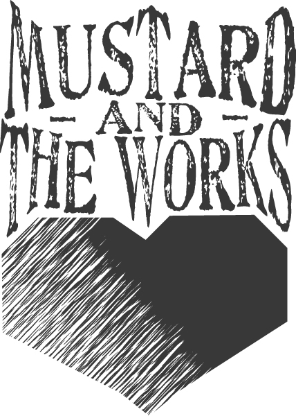
Mustard & the Works Logo (late) - This logo was created for the long-defunct band, Mustard & the Works. The logo was designed to reflect the band's musical shift toward more of an emotional bent.
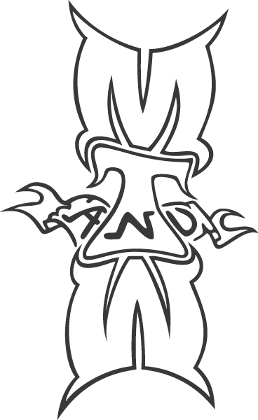
Mustard & the Works Logo (early) - This logo was created for the long-defunct band, Mustard & the Works. It was designed with two purposes in mind: 1) Unite the letters from the band's name into an iconic entity, and 2) Give the band's logo a more edgy feel. I accomplished the latter by going with a tattoo look.
gLike
Album Art