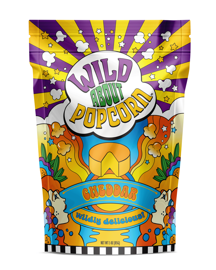
Wild About Popcorn
New packaging for an established flavored popcorn company in Florida. The client has a brick and mortar store and wanted to keep the purple - green - yellow color combination he was using currently, to keep brand recognition. To emphasize the idea of the wild flavors and variety, we used a very colorful, Peter Max-inspired look and feel for the bags. To keep order and consistency, the basic layout is the same and the top and bottom are identical. Only the colors and illustrated flavor cues vary.


