Rendering to show a potential booth set up at a franchisee / vendor trade show.
This was drawn by hand, and colored in Photoshop using a wacom tablet.
© Blair Companies

Rendering showcasing Blair Companies LED EPCUs. Rendering was done in Illustrator.
© Blair Companies

This "menu" was created for the in house engineering department during my time with Blair Companies.

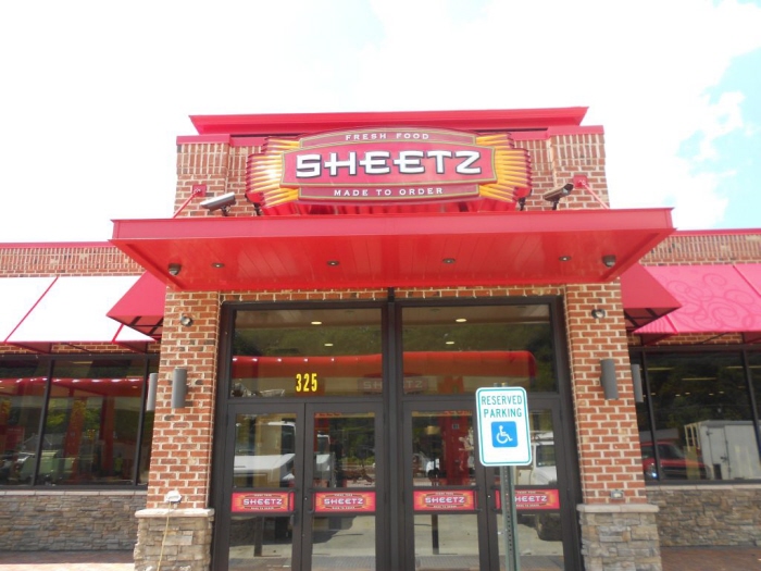
Sheetz "Finger Cabinet" signs- I was responsible for laying out artwork for approvals, vinyl production, and assisting with AutoCad shop prints for manufacturing.

Sheetz pylon pricer signs- These signs, especially when doing repair. replacement faces, were tricky. Survey info and vinyl layouts had to be perfect so that the alignment was accurate on top of the digits.

Sheetz pylon pricer with head signs and brick structure. I set artwork up for many of these signs.

Sheetz pylon pricer with head signs and brick structure. I set artwork up for many of these signs.

Sheetz pylon pricer with head signs and brick structure. I set artwork up for many of these signs. This was a custom sign with landlord tenant panel that I created production artwork for.

Sheetz Directional Signage- I set production artwork up for many of these signs. These signs are printed directly to the polycarbonate face, there is no vinyl used.

I designed this 20' Dollar Tree pylon sign from start to finish. The cornice on top was bent from aluminum, and could be easily removed for access to eye-bolts attached to the inner steel structure for placement during installation. Cladding on the frame was also easily removable for access for maintenance to the lighting components.

I designed this 20' Dollar Tree pylon sign from start to finish. The cornice on top was bent from aluminum, and could be easily removed for access to eye-bolts attached to the inner steel structure for placement during installation. Cladding on the frame was also easily removable for access for maintenance to the lighting components.

Shelby's channel letters
I worked closely with our PM team and the customer to get them something they really liked. This was a new start-up, and when they came to us, they weren't completely sure of what they wanted. In the end, everyone was very happy with the outcome of their exterior and interior signage.

Shelby's custom illuminated cabinet retrofit.

Stella's channel letters
I worked closely with our PM team and the customer to get them something they really liked. This was a new start-up, and when they came to us, they weren't completely sure of what they wanted. In the end, everyone was very happy with the outcome of their exterior and interior signage.er Your Description Here

Stella's channel letters
I worked closely with our PM team and the customer to get them something they really liked. This was a new start-up, and when they came to us, they weren't completely sure of what they wanted. In the end, everyone was very happy with the outcome of their exterior and interior signage.

Stella's Interior Window Sign.
This manufacturing of this sign was a unique endeavor I enjoyed working on from start to finish. They wanted to order a bunch of these signs and have them installed at different locations, all sites having different layouts and ceiling heights. We designed an adjustable mounting system that allows the sign to always be displayed at eye level, no matter which of their stores they installed it in.
The sign is illuminated on the front side, and non-illuminated on the back side, which can be seen from inside the store. The faces are acrylic with routed aluminum on the second layer, and the body is painted with a "poker chip" treatment.

A closer view of the Stella's Window Sign

The back side of a Stella's Window Sign

One of the accounts I worked the most on during my time at Blair Companies, was Rite Aid. This is one location that was renovated with their updated white channel letters.

A Party City location with channel letters. I worked on a lot of Party City locations nationwide, creating production artwork and manufacturing drawings.


gLike