
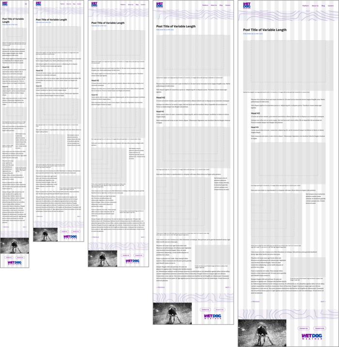
Homepage. The startup had recently finalized the main elements of its branding: logo, colors, and graphics. I developed the overall page design, styled the text, and decided how to use the colors. I employed the graphics to separate content areas and add a sense of personality and fun. Wet Dog can replace the photo at the top with an image or video that is representative of the company's work—a weather map, for example.
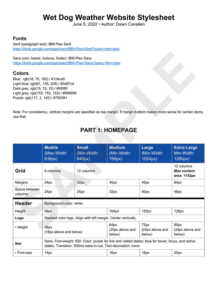
Blog post. Wet Dog asked me to wireframe a blog post as I had done for Mousebird. I provided configurations for headers, text, captions, and images. Dotted lines indicate how an image at a particular width would expand across the breakpoints. The company indicated that a main blog page, such as the one that I had wireframed for Mousebird, would not be necessary at this stage. The graphics at the top and bottom relate the blog post back to the homepage.
Style guide (page 1 of 10). The owners of Mousebird had expressed appreciation for the guide that I had written, saying that I had done “an amazing job structuring the formatting in CSS-friendly ways that made implementation much easier across a broad range of screen sizes.” I replicated that structure for Wet Dog. By providing the document in Microsoft Word, I gave the company the freedom to edit it as needed. This slideshow exhibits five of the eleven total pages.
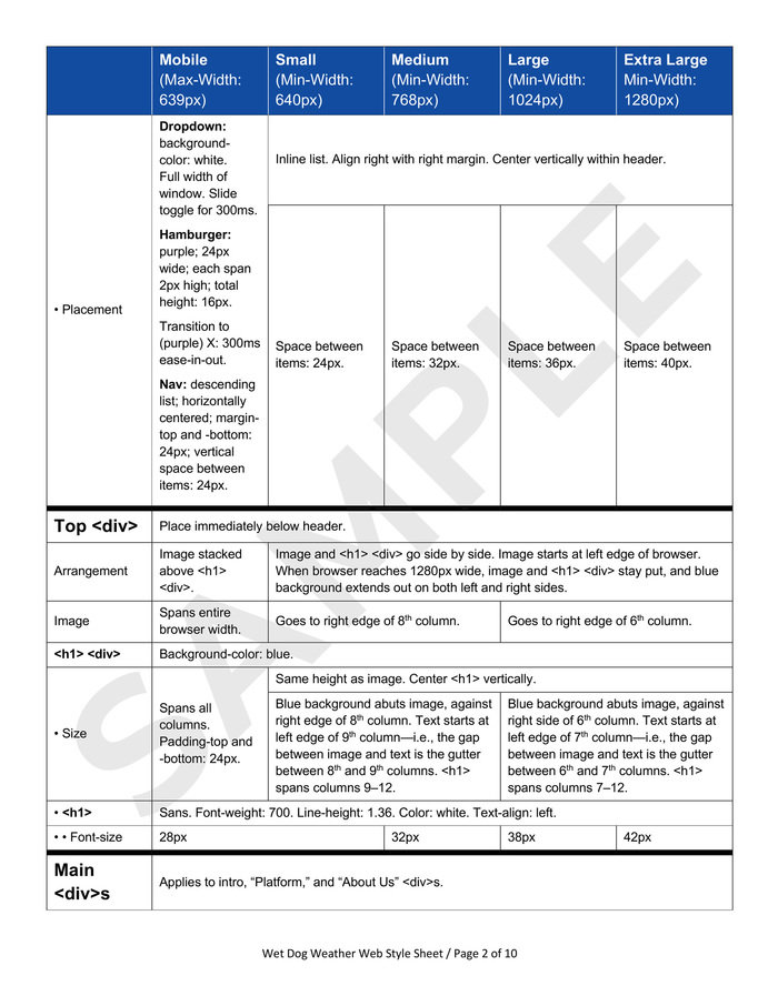
Style guide (page 2 of 10).
gLike
Website for Tech Company II
Building on the success of the website design that I had created for Mousebird Consulting (see project titled "Website for Tech Company I," in this portfolio), I designed the homepage and blog of Wet Dog Weather, a sister company that offers real-time sensor data dissemination and display. By reusing the framework that I had built for Mousebird—including breakpoints, grid, and fonts—I reduced the number of decisions that Wet Dog had to make. I also established a visual relationship between Mousebird and Wet Dog.
View WebsiteAvailable
Freelance, Full-time
Dawn Cavalieri
Designer, Artist, Photographer, Editor, and Writer
New York, NY