
Before and after: feature article. The "after" example avoids unnecessary imagery, allowing for comfortable white space and leading. The baseline grid is consistent.

Before and after: conference agenda. With the maroon background limited to the header, the redesigned page is cleaner. I used color to denote content tracks, making the agenda more comprehensible at a glance.

Before and after: conference sessions. Again the type is more elegant and approachable thanks to the baseline grid and increased leading. As in the agenda above, color coding indicates content tracks. I removed the superfluous clock graphic.

Before and after: conference sponsors. I eliminated the colored boxes that distracted from the important elements—namely, the sponsors’ logos. By moving the logos to the right edge of the columns, I better utilized the space and improved the flow of type. I made the same typographical enhancements that I discuss above.
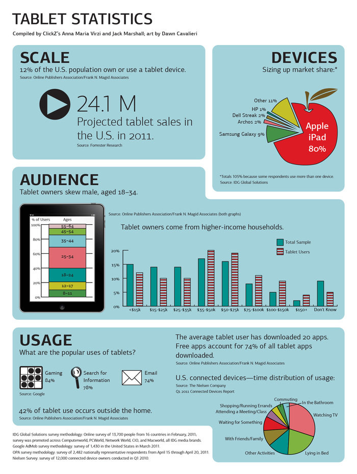
Since the release of this infographic, I have modified the pie and bar charts—adding borders, changing colors, incorporating patterns, and rearranging type—in order to comply with WCAG standards.
gLike
Magazine for Digital-Marketing Brand
SES Magazine appeared in coordination with conferences in five international markets; these events drew a total of over 5,000 digital-marketing professionals per year. (The SES, or Search Engine Strategies, conference series was later rebranded as ClickZ.) I redesigned the publication, establishing consistent typography and layout.
I produced 15 issues, executing the design as well as editing copy.
Available
Freelance, Full-time
Dawn Cavalieri
Designer, Artist, Photographer, Editor, and Writer
New York, NY


