A series of wireframes were created to explore various layouts. View the file to see the collection in it's entirety.
View PDF
I coded the front in the responsive framework of Zurb Foundation. This allow our layout to adjust to various device viewports.
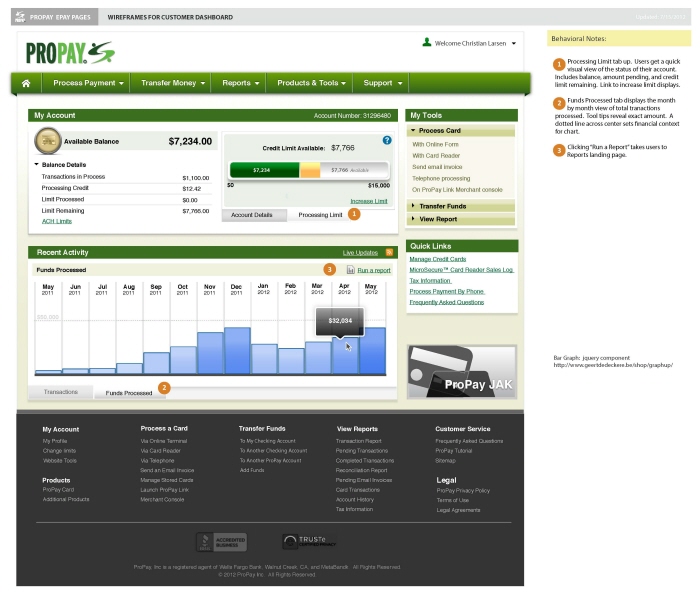
Customer could see a month over month breakdown of their account activity.
View for tablets.
An adjusted look at the layout optimized for mobile phones.
gLike
ProPay Responsive Account Dashboard

ProPay is a credit card processing company similar to PayPal. I was brought in to help examine some of the page workflows and add a dashboard for the home page. Working with the ProPay project team, I white-boarded various approaches to workflows, which I translated into sets of wireframes. Wireframes were refined through a series of reviews and tested at company conference with customers. Once approved, I then completed the visuals, and started coding the front end for the pages in the Zurb Foundation.

One challenging piece of feedback from customer testing was the need to make it responsive. This created a challenge as coding was already underway. Having to refit the HTML/CSS midway through the project to Zurb Foundation was difficult, but successful in the end. This minor pain taught me the importance of testing earlier in the design phase as this was not foreseen upfront.

View Website
Available
Freelance, Full-time
Christian Larsen
Director of UX at MRM Salt Lake City, UT