
Contrast 2013: This photo represents contrast because the contrast in opposite colors(pink and grey) and textures (soft and grainy). I did not edit this in Photo Shop because there was nothing to be edited.
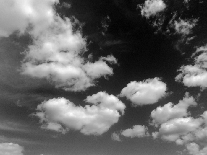
Balance 2013: This represents balance because the way the clouds float in the sky really evokes the balance and difference between the sky. I used Black and White to edit the picture in Photo Shop
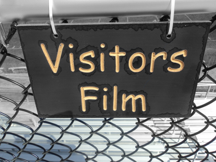
Emphasis 2013: This photograph represents emphasis because the original sign color was blue and yellow and the background was normal colors. In photo shop i just made the back round black and white and I used the paintbrush to specifically color the back except the letters to create emphasis.
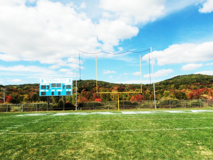
Unity 2013: This football field represents unity because there are so many things in the picture that create one thing. I brightened up the picture to show a little more emphasis on the lighting and the elements in the picture.
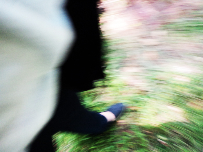
Movement 2013: Unfortunately it was very difficult to get a moving shot because my camera did not have the proper settings. I have used this picture before in my baseline. I really love this picture because it shows that I am walking with blurring out the background. I just made the picture brighter in Photo Shop
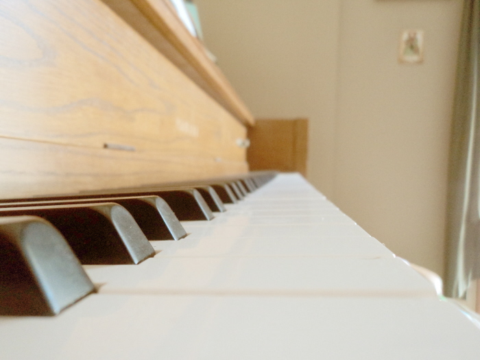
Pattern 2013: I chose to photograph the piano keys because they have a very unique structure and shape. To make the picture look more antique and different from the rest of the photos in my portfolios, I enhanced the color balance and the layers in photo shop.
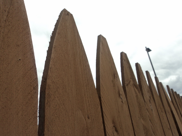
Artist Choice 2013: This is one of my favorites. The fence has pattern, shape, texture, and unity to make one picture.
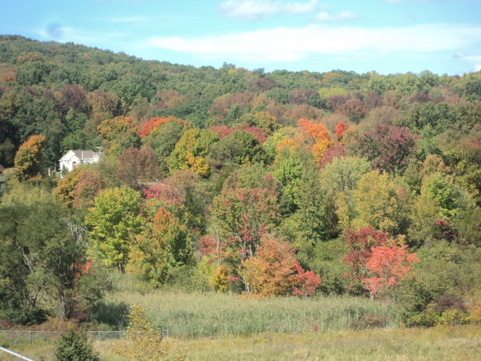
Artist Choice: This picture is one of my favorites too. I did not edit it at all because I feel like if i changed anything there would be less of an element or principle.
gLike
Principles of Art
1.) Contrast
2.) Balance
3.) Emphasis
4.) Unity
5.) Movement
6.) Pattern/Repition