
FillyDesigns.com
Currently, the website for Filly acts as a platform for past collections, direct sales, wholesale inquiries, and two types of blogs. It's difficult to navigate and needs some TLC.
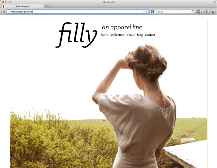
According to the website, Filly's collection suggests a well-paid female customer with a high price point and exclusivity. It’s assumed the customer of Filly would possess a high, and if not moderate, sense of technology – the website needs to match this. The website’s mood is very minimalistic with a touch of nostalgia. It’s stark white with a contrasting sepia toned typewriter typeface. This mood is a great start to what “could be” of the Filly label.
Time for some alterations!
*ALL PHOTOS DO NOT BELONG TO ME AND CREDIT IS GIVEN TO THE PHOTOGRAPHER WHEN KNOWN.