Covers of Shonen Jump volume 4, issue #7. This issue had a special "double cover" design.

Cover of Shonen Jump volume 4, issue #4.

Cover of Shonen Jump volume 1, issue #8.

Cover of Shonen Jump volume 5, issue #5.

Cover of Shonen Jump volume 6, issue #5.

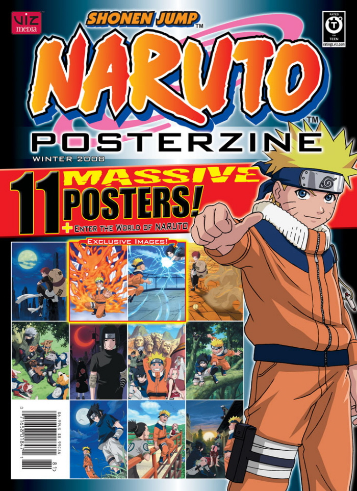
Cover of Shonen Jump's poster magazine dedicated to the extremely successful property Naruto.

"Games We Love", a regular monthly feature from Shonen Jump magazine.

Featured article: soldiers of the world's special forces units.

Featured article: interview with Japanese creator.

Featured article: comical spotlight.

Collectible card game information; a regular feature in the magazine.

Featured article: martial arts styles and famous martial artists.

Table of contents page from an issue of Shonen Jump magazine. Visual intricacy had to be balanced with ease of use.

Featured article: video game article and interview with the game's producer creator.

Featured article: video game sneak peek.

Featured article: movie spotlight and interview with the film's staff.

Introductory page for an individual chapter; several of these were included each month.

How to speak, read, and write in the Japanese language; a regular monthly feature in the magazine.

Interstitial article: cute little creatures from various stories in the magazine.

Interstitial article: information graphics excerpted from a related publication.

How to play the Japanese game of "Go"; a regular monthly feature in the magazine.
gLike