


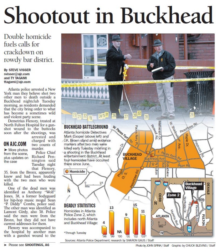
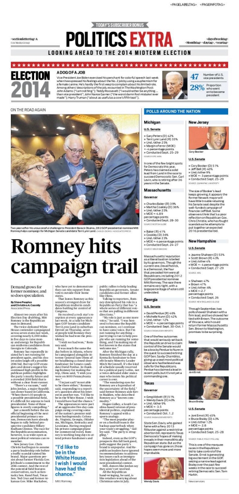
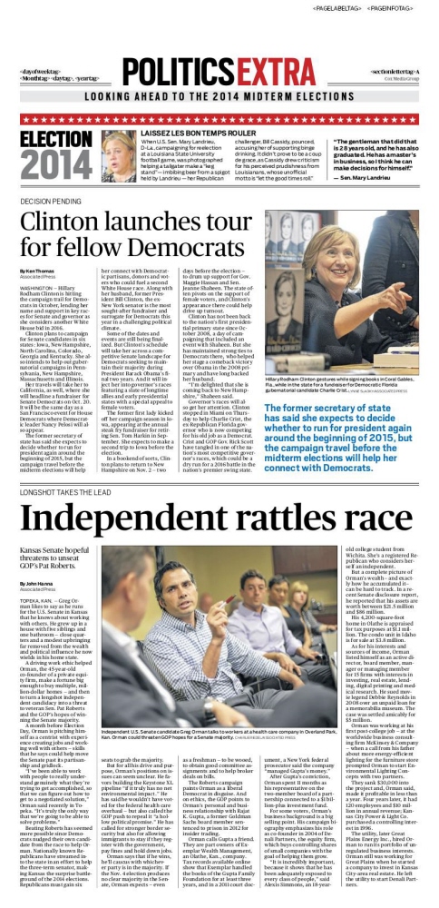
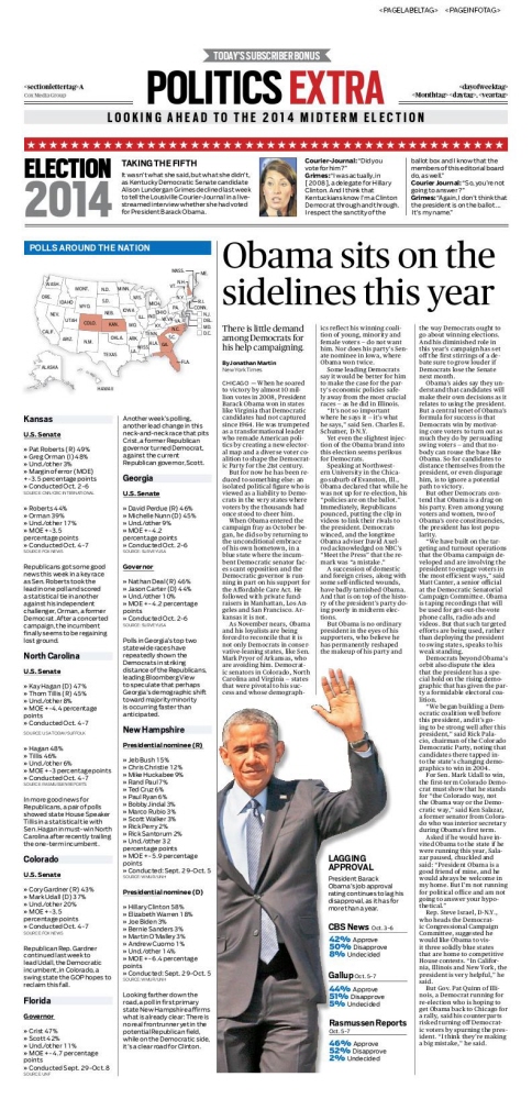


A WITNESS TO HISTORY:
20 years of designing the AJC
A retrospective.
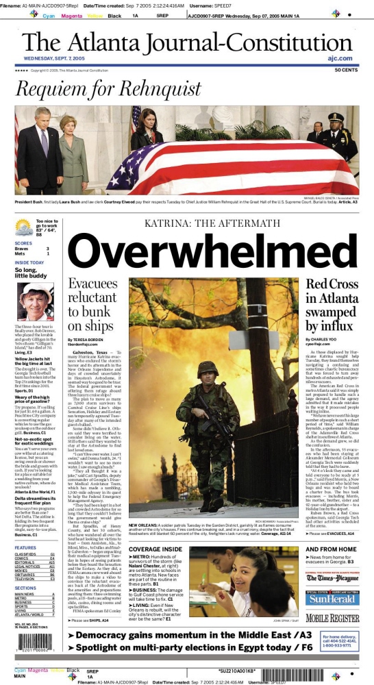
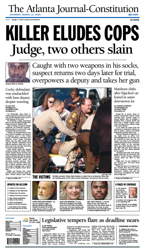
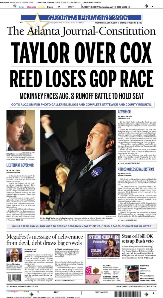
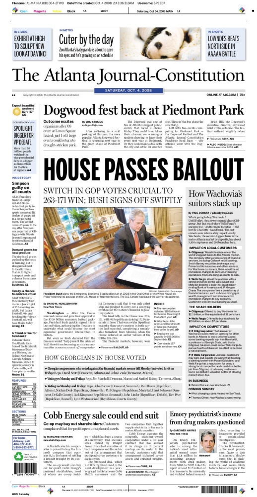
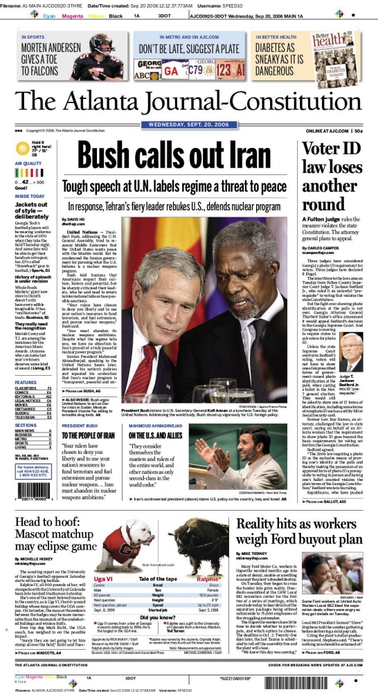
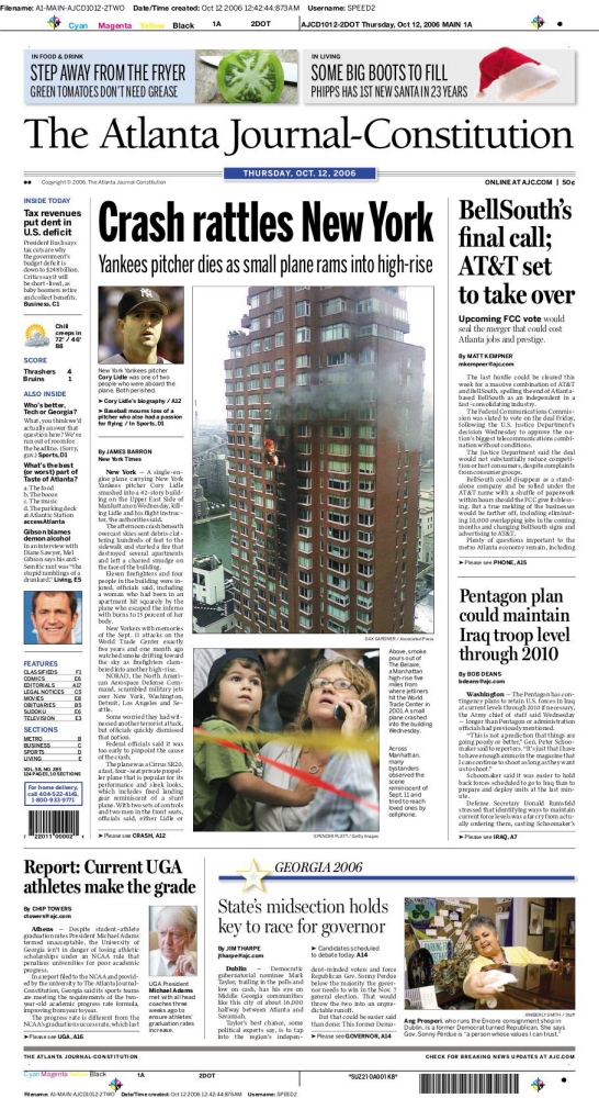
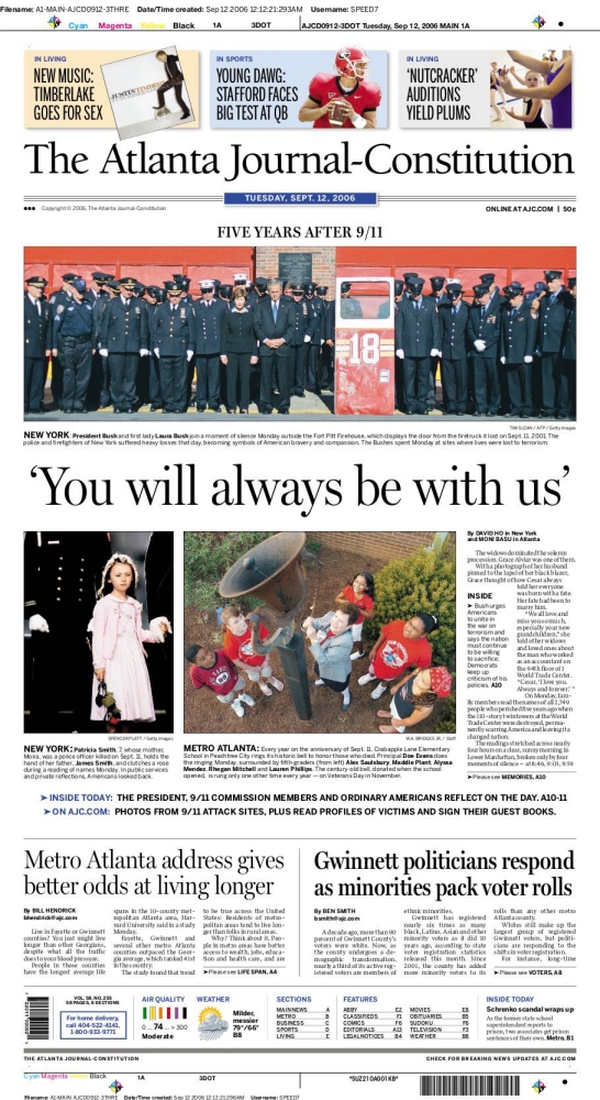
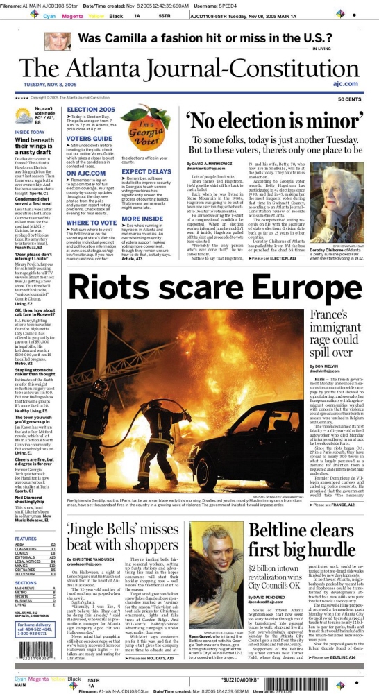
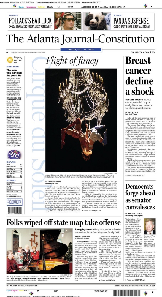
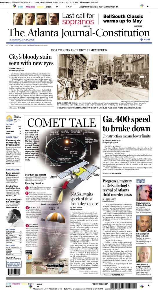
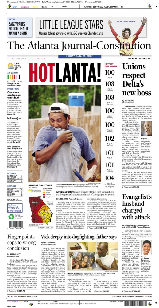
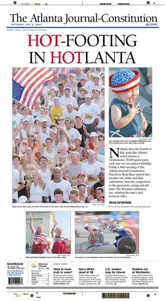
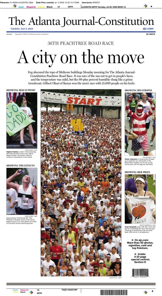
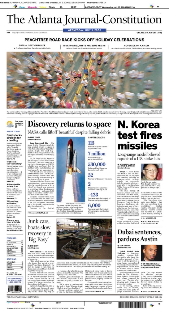
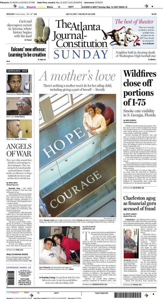
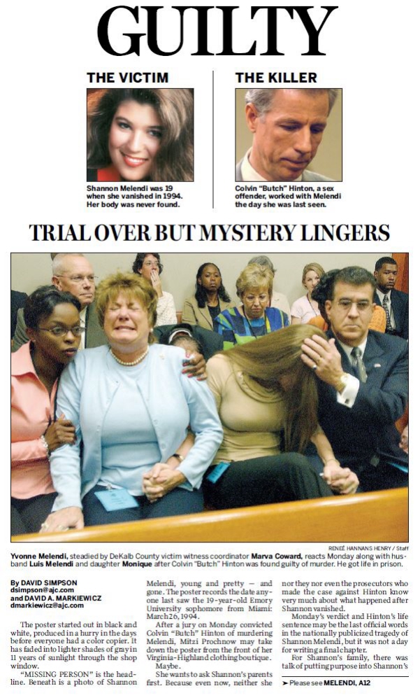
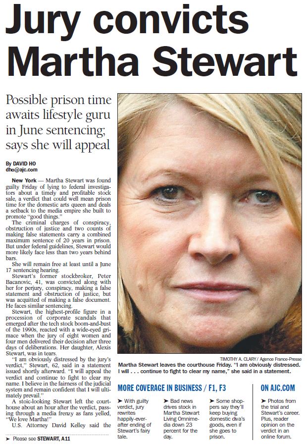
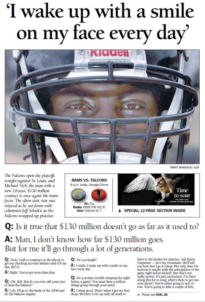
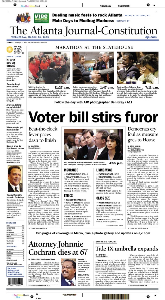
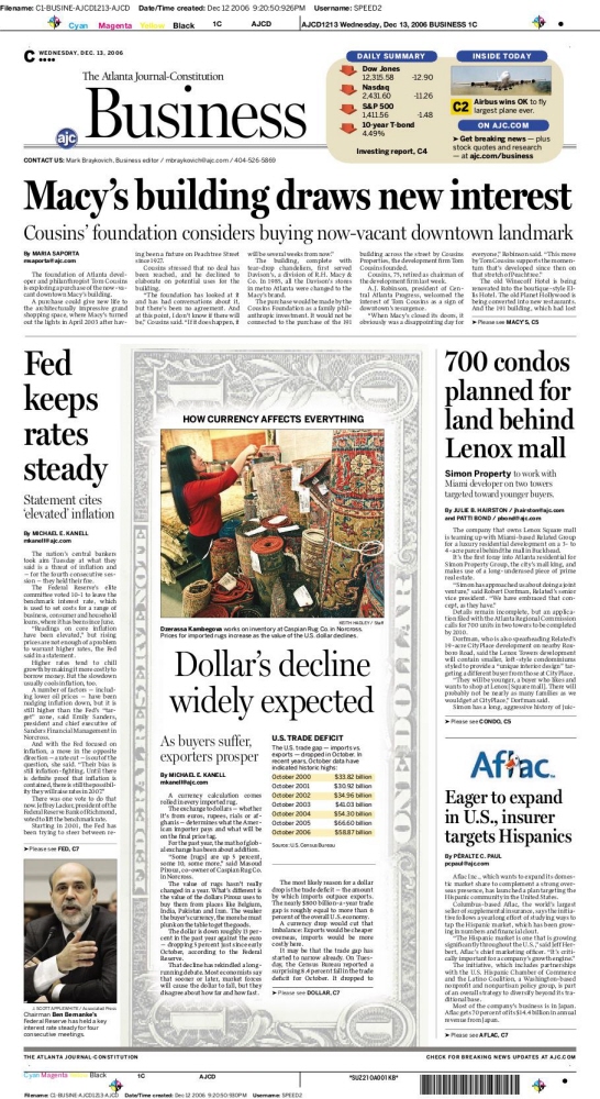
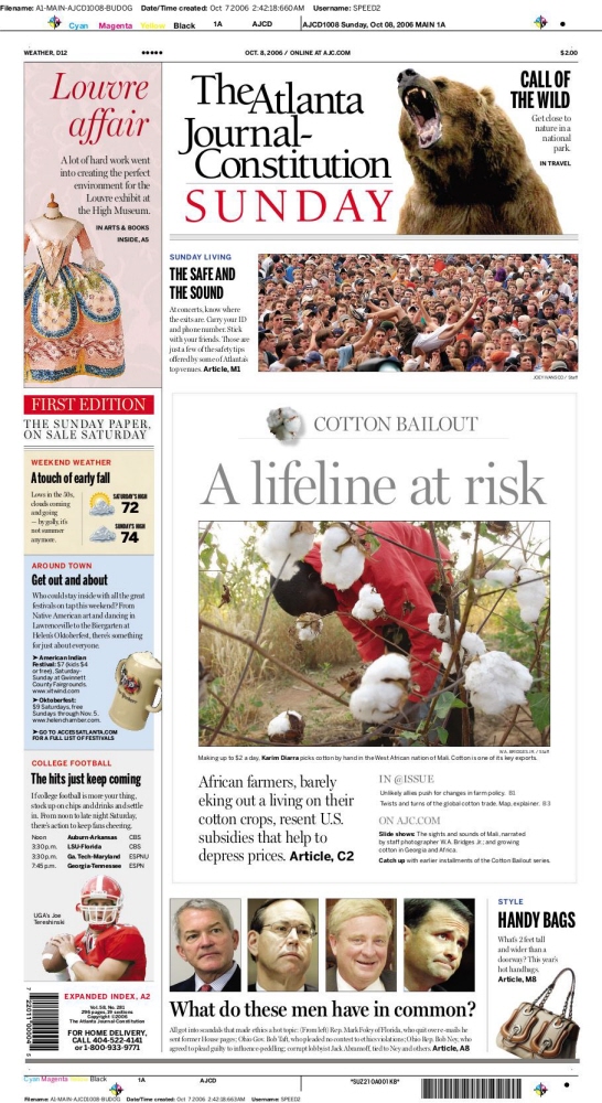
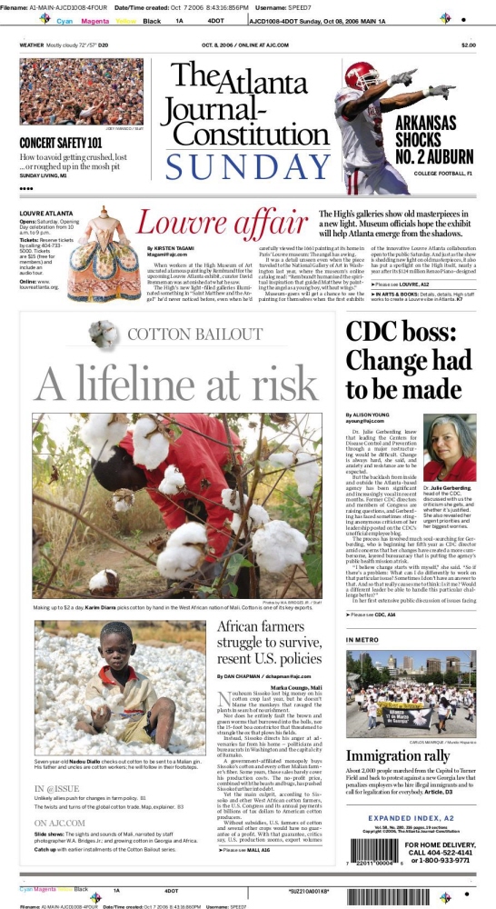
All the designs in this portfolio were published in the Atlanta Journal-Constitution during my career there between 2003 and 2014. I have included here a mix of Pages, Alternative Story Forms and Simple Tease Elements. Those familiar with the AJC design through the years can speak to the evolution of the paper's typography, which in the mid-2000s began shifting away from the old-school but pedestrian Franklin Gothic, Times Roman, Quiosco, Miller, and Benton sans – all bastions in the greater repertoire of news design.
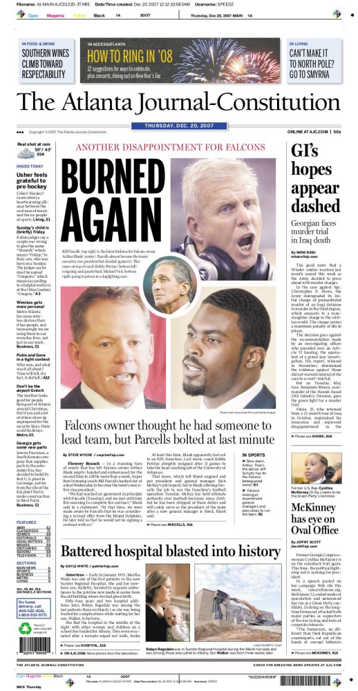
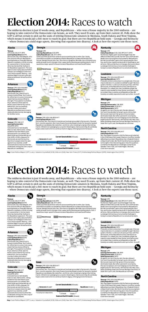
By the latter 2000s, the paper abandoned those fonts for the more sturdy combination of the elegant Publico, the utilitarian Boomer in smaller sizes, and Scout, screaming as the bold sans serif.
All have proven dynamically versatile in every news situation.
Now more than ever, the paper is bolder and can boast a more modern and consistent structure that complements the big-city feel of Atlanta.