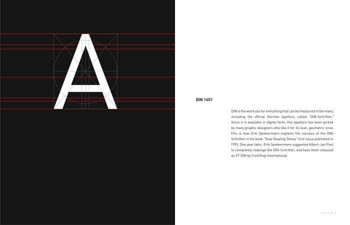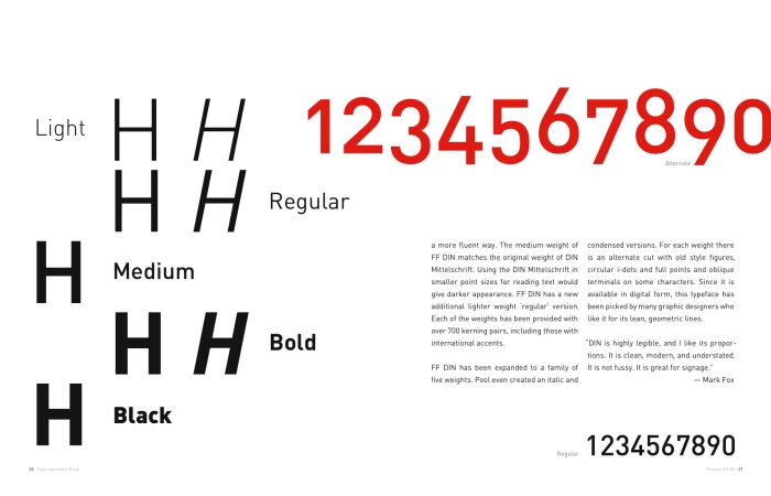
DIN - DIN, a typeface I first declined to look at, but it now entrances me. My vision has focused on its neatness and legibility. The transition from DIN 1451 to FF DIN, from street signage to text, has expresses stronger form and greater proportion.

DIN Spreads

DIN Spreads

DIN Spreads

DIN Spreads

DIN Spreads
gLike