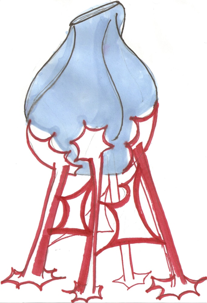
The aim of this project was to show texture in a 12 x 12 area. The scene is from a Dr. Seuss book.

The aim of this project was to create an effect of vibration by using complimentary colors next to each other.

An exercise in transparency.


Drawing from a photograph made in paint (not traced).

Health and Sickness - Two sculptures that represent opposite ideas.

A small sculpture showing two opposite ideas, in this case health and sickness

A small sculpture showing two opposite ideas, in this case health and sickness

A small sculpture showing two opposite ideas, in this case health and sickness

A small sculpture showing two opposite ideas, in this case health and sickness

A small sculpture showing two opposite ideas, in this case health and sickness

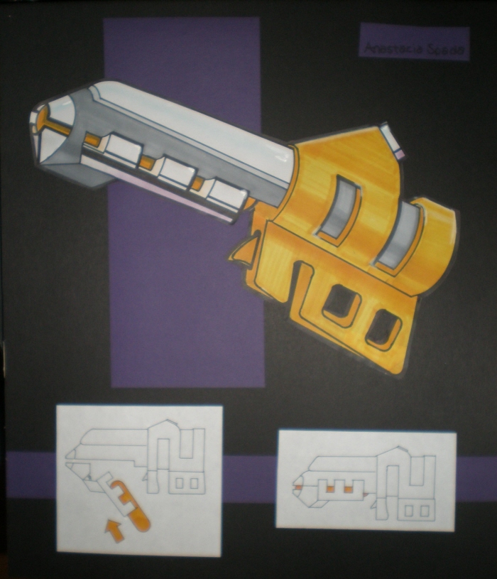
Corkscrew Layout - A Cad I assignment, done in Solidworks
View PDF
View PDF

Corkscrew


A layout and article cover for classmates' art history articles.
From Design III for Graphic Design
View PDF
View PDF

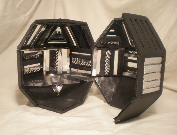
Roberto Cavalli Runway - Our assignment was to create a space for a runway show for Milan's fashion week. The location is a giant Ferris wheel in which each designer has a single cart. The shape of the cart, a rhombidodecahedron, was picked by the instructor.

Roberto Cavalli Runway - Our assignment was to create a space for a runway show for Milan's fashion week. The location is a giant Ferris wheel in which each designer has a single cart.

Roberto Cavalli Runway - Our assignment was to create a space for a runway show for Milan's fashion week. The location is a giant Ferris wheel in which each designer has a single cart.

Roberto Cavalli Runway - Our assignment was to create a space for a runway show for Milan's fashion week. The location is a giant Ferris wheel in which each designer has a single cart.

Roberto Cavalli Runway - Our assignment was to create a space for a runway show for Milan's fashion week. The location is a giant Ferris wheel in which each designer has a single cart.

Roberto Cavalli Runway - Our assignment was to create a space for a runway show for Milan's fashion week. The location is a giant Ferris wheel in which each designer has a single cart.

Roberto Cavalli Runway - Our assignment was to create a space for a runway show for Milan's fashion week. The location is a giant Ferris wheel in which each designer has a single cart.


Player Piano - In this project we picked an obsolete product and designed it as if it were still in use today.

Mix - re: a line - In this project, done at Nouva Academia di Belle Arte in Milan, we first photographed a variety of unusual or different things that we noticed in Italy. Then we honed in on one subject, and photographed multiple instances of it. After having a collection of photographs, we began to form a general phrase or idea about them. After formulating an idea or conviction, we made an identity, with logos and a short phrase, to summarize and explain our observations

Mix - re: a line - In this project, done at Nouva Academia di Belle Arte in Milan, we first photographed a variety of unusual or different things that we noticed in Italy. Then we honed in on one subject, and photographed multiple instances of it. After having a collection of photographs, we began to form a general phrase or idea about them. After formulating an idea or conviction, we made an identity, with logos and a short phrase, to summarize and explain our observations

description of project - In this project, done at Nouva Academia di Belle Arte in Milan, we first photographed a variety of unusual or different things that we noticed in Italy. Then we honed in on one subject, and photographed multiple instances of it. After having a collection of photographs, we began to form a general phrase or idea about them. After formulating an idea or conviction, we made an identity, with logos and a short phrase, to summarize and explain our observations
View PDF
View PDF

variations of logo - In this project, done at Nouva Academia di Belle Arte in Milan, we first photographed a variety of unusual or different things that we noticed in Italy. Then we honed in on one subject, and photographed multiple instances of it. After having a collection of photographs, we began to form a general phrase or idea about them. After formulating an idea or conviction, we made an identity, with logos and a short phrase, to summarize and explain our observations
View PDF
View PDF

logo scaled - In this project, done at Nouva Academia di Belle Arte in Milan, we first photographed a variety of unusual or different things that we noticed in Italy. Then we honed in on one subject, and photographed multiple instances of it. After having a collection of photographs, we began to form a general phrase or idea about them. After formulating an idea or conviction, we made an identity, with logos and a short phrase, to summarize and explain our observations
View PDF
View PDF

color choices - In this project, done at Nouva Academia di Belle Arte in Milan, we first photographed a variety of unusual or different things that we noticed in Italy. Then we honed in on one subject, and photographed multiple instances of it. After having a collection of photographs, we began to form a general phrase or idea about them. After formulating an idea or conviction, we made an identity, with logos and a short phrase, to summarize and explain our observations
View PDF
View PDF

typography - In this project, done at Nouva Academia di Belle Arte in Milan, we first photographed a variety of unusual or different things that we noticed in Italy. Then we honed in on one subject, and photographed multiple instances of it. After having a collection of photographs, we began to form a general phrase or idea about them. After formulating an idea or conviction, we made an identity, with logos and a short phrase, to summarize and explain our observations
View PDF
View PDF

business card
View PDF
View PDF

Triptych Vase - My philosophy for this project was to use historical references as a basis for my design. Because my choices of subjects were familiar and recognizable to many people, I realized they had to be designed in a way that was new, relevant, and exciting. I chose the triptych as inspiration, and updated it by changing the context, using bright colors, and modern materials.

Triptych Vase - My philosophy for this project was to use historical references as a basis for my design. Because my choices of subjects were familiar and recognizable to many people, I realized they had to be designed in a way that was new, relevant, and exciting. I chose the triptych as inspiration, and updated it by changing the context, using bright colors, and modern materials.

Sketches, Process and Inspiration


gLike
