
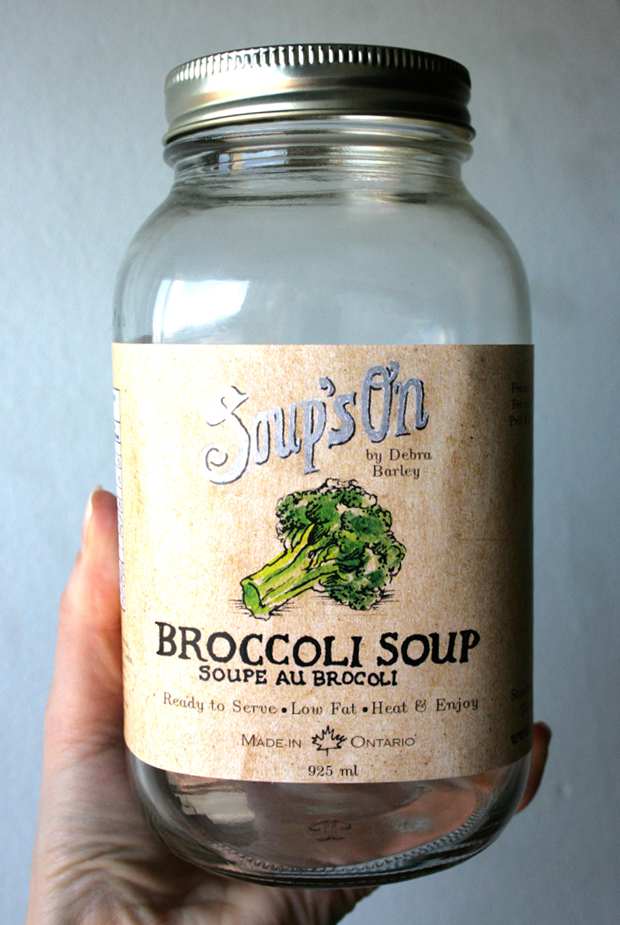
Soup's On Redesign - The objective was to choose a product in the food & beverage category that would benefit from a redesign. We conducted research and developed a more professional feel without sacrificing the fresh, natural homemade brand equity. The label and illustrative approach reflects nutritious qualities of the product and helps differentiate it from the competitors. We also emphasize the locality by adding the claim “made in Ontario.” This was a collaborative effort with illustrator Gillian Goerz.
Soup's On Redesign - The objective was to choose a product in the food & beverage category that would benefit from a redesign. We conducted research and developed a more professional feel without sacrificing the fresh, natural homemade brand equity. The label and illustrative approach reflects nutritious qualities of the product and helps differentiate it from the competitors. We also emphasize the locality by adding the claim “made in Ontario.” This was a collaborative effort with illustrator Gillian Goerz.
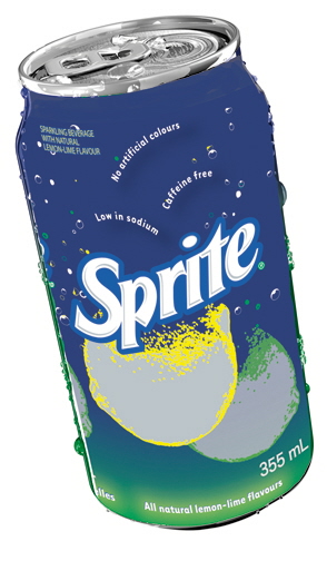
Sprite Redesign: Can - Sprite Canada called for submissions for a new carton and can design. It wishes to reposition itself as the more responsible and permissible soft drink in a time when people are seeking healthier choices.
I've redesigned the 'bubble' claims and used a smooth gradient to allude to a smooth taste. It's more futuristic and places a greater emphasis on the lemon-lime fruit through a aluminum substrate reveal.
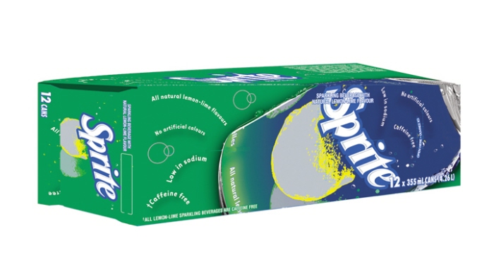
Sprite Redesign: Carton - Sprite Canada called for submissions for a new carton and can design. It wishes to reposition itself as the more responsible and permissible soft drink in a time when people are seeking healthier choices.
I've redesigned the 'bubble' claims and used a smooth gradient to allude to a smooth taste. It's more futuristic and places a greater emphasis on the lemon-lime fruite through a aluminum substrate reveal.
gLike
Packaging