Accent Wall : After. Simple framing and tight installation of the oversized sketches packs serious punch upon entry to the home. I brought the whole vignette together by using a chair from their bedroom in addition to the low swivel patterned club chair in front of the sketches. The purple accent paint continues around the corner and down the hallway. The entire main living area will become a soothing swirl of richness, delighting your senses, with the vibrant green accent pillows and ultimately, with the installation of the charcoal grey cabinetry and quartz counters in the kitchen.
View PDF
View PDF

Accent wall : before
View PDF
View PDF

Living Room : Before. The grey paint looks a little bleak in the before shots. But once the room started coming together, the color took on a new luster and became a nice neutral to show off all their unique items.

Living Room : Before.
View PDF
View PDF

Living Room : After

Living Room : After. The client had a large book collection and objects d'art. To showcase these items a non-descript bookcase was utilized. It also provided weight to that wall to counterbalance the TV. A trio of lithographs top the unit, bringing your eye upwards. The unit also provided drawers and cabinet storage to hide remotes and other necessary elements.

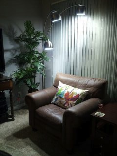
Living Room : After. I love the addition of the 3 armed arch lamp!

Living Room : After. This bookshelf is adaptable and can be rearranged into different configurations should the clients ever need to make adjustments.

Living room sofa - sample picture. This sofa will replace the leather loveseat. We selected a neutral colored fabric with various shades of grey threads running through it as well as the wenge wood sled style base. With the low profile, tailored nature, and a punch of the lime green pillows, the sofa will be a dominate feature yet not take over the whole space, allowing ones eye to glide about the room noticing all the unique elements and the patio lounge area beyond.

Sofa fabric selection.

Display : Vintage books and wood bird sculpture.

Display : The client is an avid Master Gardner, so wonderful garden design books full of inspirations and fabulous images are at the ready.

Display : A combination of driftwood, books and a delicate miniature pot.

Display : Something zen.

Display : A collection of train books evoke romantic train adventures.

The guest room shows off the clients collection of treasures from their many travels. The headboard was a great find at a recent yard sale and was transformed by simply spray painting it bronze. Now the bed grounds the space. Masks and other artifacts adorn the walls. Vintage suitcases become a nightstand. The tall slender lamp was a perfect fit.
View PDF
View PDF

Art installation : Before. The client had a collection of train memorabilia due to his long career as a train engineer. I organized the layout on the floor and placed belt buckles and pins in a shadowbox which became the focal point of the installation.

Art Installation : After. Here is the finished installation in the hallway. The purple wall is such a great backdrop!

Kitchen : Before. We intend to extend the base units out 12" to allow for larger drawer banks and more counter top area.

Kitchen : Before. Stove and microwave will ultimately be replaced.

Kitchen : Before. A tile backsplash, installed vertically, will run the full distance between upper cabinets and countertops and continue onto the return.

Kitchen : Backsplash tile, to be installed vertically as shown.

Kitchen : Before.

Garage : Before. Even the garage got a little face lift.

Garage : After. We used what the client had, extra wire shelving from previously installed closet systems, pegboard, and lumber from a pallet broken down and nails removed. We were able to construct a work bench area, housing the recycling and refrigerator underneath. The pegboard is not only functional but also provides a place to show off beautiful vintage tools from the client's father.

Garage : After. Display detail.

Garage : After. Display detail.

Patio : The outdoor space was simply refreshed using the elements the client owned. I rearranged furniture to create intimate spaces and entertaining areas. This also opened up the patio making it feel less cluttered.

Patio : The guest room has it's own slider door onto the patio. The chaise lounge is a welcoming spot to enjoy a cup of coffee and watch the sun rise.

Patio : On a daily basis, the clients can enjoy a meal on the patio and maintain an open unencumbered arrangement. However, the table is light weight and easily adjusted when necessary to accommodate guests.

Patio: Dining al fresco. Set for brunch.

Patio : The master bedroom also has a private slider door out to the patio. A single chair awaits, hidden from the street by the oversized fern.

Floor Plan : Option 1. Inevitably things change, so staying flexible is key when it comes to design. Although, with a plan in place, intelligent choices can then be made.

Floor Plan : Option 2

Floor Plan : Option 3

Floor Plan : Option 4
gLike