A logo that I created for a local construction company. The client had a few requests for guidance:
• No "clip art" like imagery, such as a hammer, ruler, house, saw, etc.
• To go from old to new. Emphasizing the aspects of renovation and restoration, and also the aspect of new construction
To accomplish these goals I used the professional looking border around the company name, incorporating a peak at the top; creating an abstract image of a building. Then by using different type faces, I was able to go from old to new while ensuring the RAYMOND name was the first word to catch your attention. By using an older serif font for RENOVATION and a san-serif font for & NEW CONSTRUCTION; I was able to give contrast to the two aspects of this company.

Logo that I created for the use on the 2012 Rome Operative ticket. See The ticket design in the Rome folder

Chimera Carnival - This is the logo that I created for my senior thesis project, Chimera Carnival.
A Chimera is a greek mythological creature made up of a lion, a snake, and a goat. My challenge was to make a logo that involved all these animals without making it too busy, confusing, or just plain weird.
I also had the challenge of making a logo that appealed to all audiences. It couldn't be too scary for the kids, but not too childish for the freaks. I had to bridge all three branches.

New Horizons Logo - Logo created for the New Horizons program through PSU's Outdoor Center.

Fiddy Six Logo - A logo that I created for my past residence, 56 Langdon. This was used on stickers and also created as a banner through stenciling. The design was inspired by the Denver Nuggets.

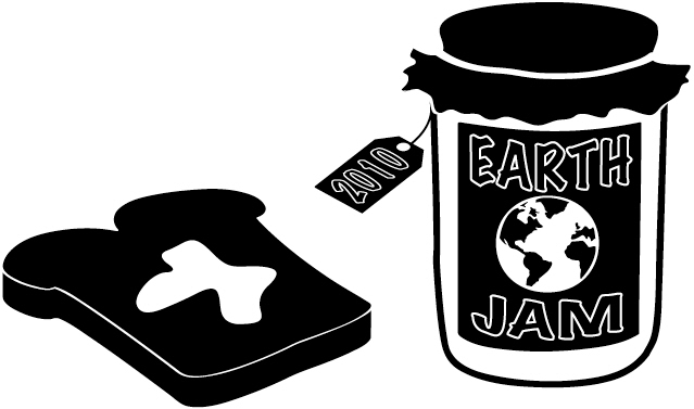
PSU Earth Jam 2010 T-Shirt Design - An enlarged image of the front graphic on the Earth Jam t-shirts for PACE. This logo needed to work both on a plain white shirt and also on tie-dye.

Union Grille Sign - Proposed sign design for the HUB Union Grille at Plymouth State University.

Union Grille Sign - Proposed sign design for the HUB Union Grille at Plymouth State University.

Union Grille Sign - Proposed sign design for the HUB Union Grille at Plymouth State University.

Animal Series - The assignment was to take an image of an animal and take it through three stages of illustration. Starting out realistic and progressing to a stylized version of the same animal.

Animal Series - The assignment was to take an image of an animal and take it through three stages of illustration. Starting out realistic and progressing to a stylized version of the same animal.

Animal Series - The assignment was to take an image of an animal and take it through three stages of illustration. Starting out realistic and progressing to a stylized version of the same animal.
gLike