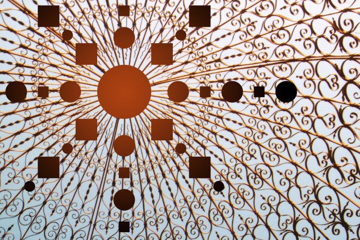
VC130_Week1_Exercise1 - Using a rectangular or elliptical marquee, delete multiple parts of an image in an interesting manner. Remember, according to the Gestalt Principle of Closure, we don't need the complete image to make sense of it. Push this principle as far as you can in this exercise but the final result should still be recognizable for what it contains.
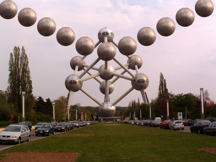
VC130_Week1_Exercise2 - Using a rectangular or elliptical marquee, isolate part of the image, copy it, paste it, and then use the Move Tool to move the duplicate to another part of the image such that the resulting image is more interesting to look at than the original.
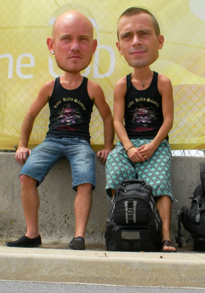
VC130_Week1_Exercise3 - Using a rectangular or elliptical marquee, isolate part of the image and scale the selection 200%. Copy and paste the scaled selection then move it to another part of the image such that the resulting image is more interesting to look at than the original.
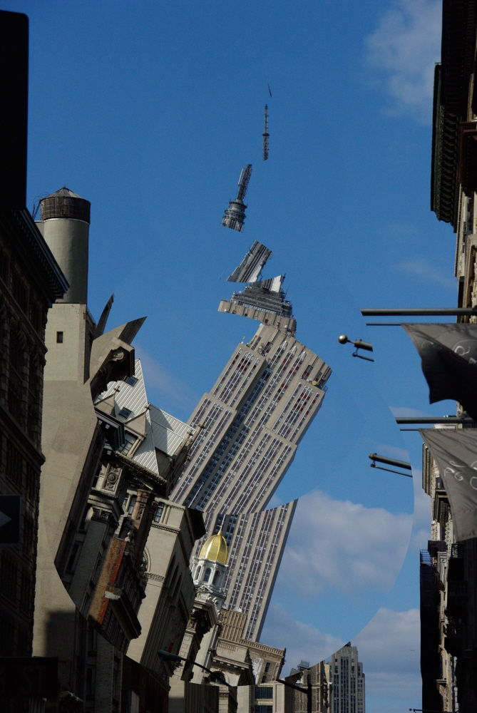
VC130_Week1_Exercise4 - Using an elliptical marquee, rotate one or more parts of an image in an interesting manner. Experiment with various angles of rotation by either free rotating or specifying a rotation angle in the input box. For added interest, rotate parts of the image previously rotated.
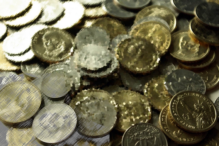
VC130_Week1_Exercise5 - Using a rectangular or elliptical marquee, isolate part of the image then go to the Filter pull-down menu and experiment with various Artistic, Brush and Distort filters. Try different settings and combinations of filters. If you don't like the results then step backward in history. Find a filter(s) that increase the interest of the original image.

VC130_Week1_Exercise6 - Using a circular selection, select an interesting part of an image and copy it to the clipboard. Paste the image on the clipboard into the middle of the composition. Use the Move Tool to move the image to the left side of the composition. When you have positioned the first image, paste another copy of the image and position it next to the first. Repeat this until you have a chain of ten images in a row. If you want to add in some variety, rotate each selection as you go.
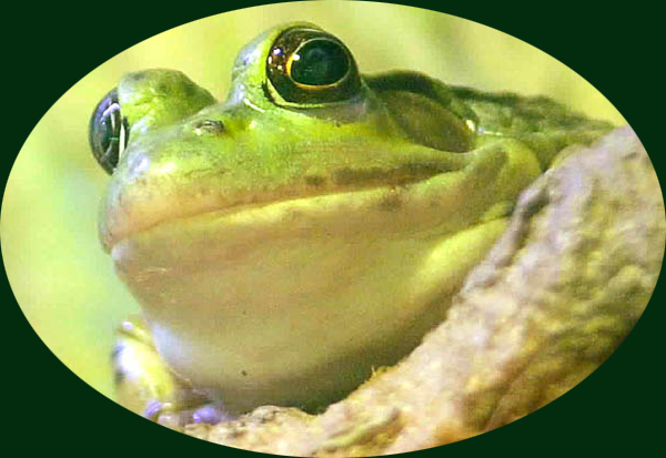
VC130_Week1_Exercise7 - In this exercise you will use a rectangular or elliptical marquee to select an interesting part of the image, and then use the Crop command to remove all parts of the image around it. Experiment with different shapes of marquees and different placements of the selections. The end result should be a cropping that is more interesting to look at than the original image.
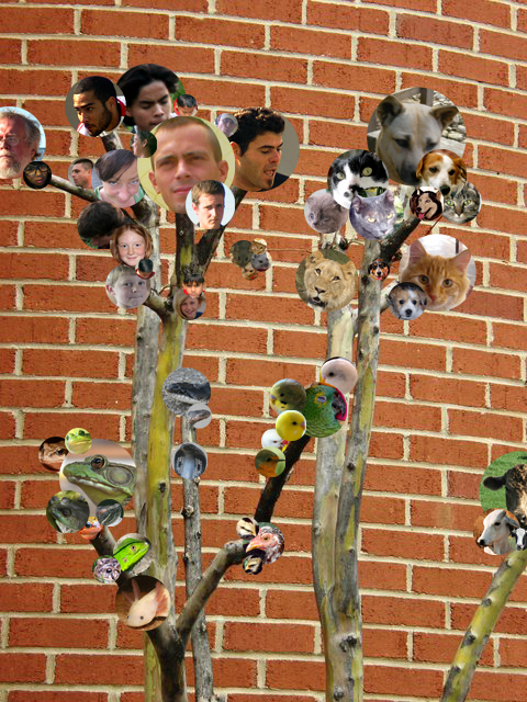
VC130_Week1_Exercise8 - Your creative task is to add circular selections to the image "tree.jpg" from other images with interesting colors and textures as "ornaments" to this tree. To add variety, make the ornaments different sizes and rotation values. Use overlapping to create a sense of depth. Create clusters of various images (like bunches of grapes). Choose selections from images with varying colors and textures. It should look like the images are clustered at the end of the bare branches. Have fun!
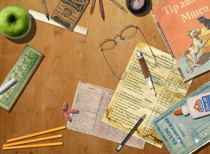
VC130_Week2_Exercise1 - For this project you will be using the basic selection tools to recreate a composite of a vintage/antique desk complete with the things you might expect to find on such a desk. Each composition must incorporate a minimum of ten items extracted via selection techniques. Each object must support the chosen theme.
Teacher's desk
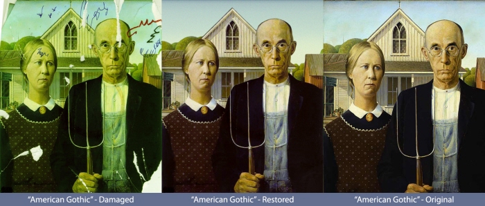
VC130_Week3_Exercise1 - Complete the restoration of the famous American Gothic by Grant Wood utilizing the Clone Stamp Tool as discussed in class. The actual color of the photo will be restored by applying a Color Balance Adjustment Layer. A recoloring of the sky will necessitate the use of a Polygonal Selection and a gradient ramp. Some of the especially tricky areas to restore include: his and her foreheads, the pattern on her dress, removing the coffee stain, and restoring the right roof fascia.
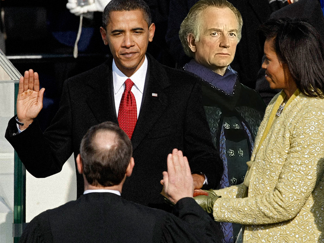
VC130_Week4_Exercise1 - In this exercise you will utilize any of the selection techniques discussed thus far to extract a person from one photograph, and then seamlessly integrate it into another photo using layer masking. You are trying to suspend disbelief as much as possible such that the viewer believes it is plausible that the photo is authentic (though realism isn't necessary). You MUST utilize layer masking in this exercise, therefore you will have to composite a photo int the intermediate zone of the image.
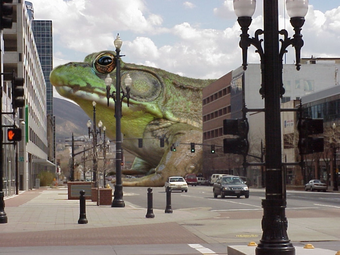
VC130_Week4_Exercise2 - Advanced Selections & Masking
This exercise is identical to Lab 1 except this time you will be following a different theme. In this exercise, you will be taking a small animal and integrating it into another photo such that the animal now looks like a Godzilla-sized monster!
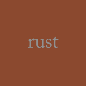
VC130_Week7_Exercise1 - Create a 300 x 300 (pixels) image of a single color. The color you select should be based on a color that can be associated with an everyday or commonplace object that evokes a common color in everyone's mind. Once you have settled on a word, find photographs of your object (use morguefile.com) and use the Eyedropper Tool to take averages of that color. Fill your square in with that color. Place the name of that object at the center of the color swatch (no caps, using achromatic color).

VC130_Week7_Exercise2 - In this exercise you will create a 300x300 (pixels) image of a 2-color complementary pair. Each color will fill 1/2 of the square divided vertically. Do not tint, shade or tone the hues. Use ColorImpact to create this harmony.

VC130_Week7_Exercise3 - In this exercise you will create a 300x300 (pixels) image of a 3-color triadic harmony. Instead of dividing the space equally you will fill three circular selections with each color. The circles should be overlapped in such a manner that none of the background color can be seen in the final image. Apply an equal amount of tinting to each color. Use ColorImpact to create this harmony.

VC130_Week7_Exercise4 - Find a five color palette from the Top Palette section of COLOURlovers.com that you find appealing. Recreate this palette as a 750x300 (pixels) image with the colors spaced equally.
This palette is called "Peaceful Evening" by Pet.
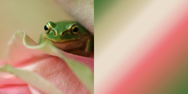
VC130_Week7_Exercise5 - Find a photograph from morguefile.com that is comprised of three colors that interest you. Open that image in Photoshop and crop it to a 300x300 (pixels) image in such a way that the cropped image still has the three colors in it. Increase the width of the image to 600 pixels. Fill in the remaining half of the canvas with a linear gradient that includes all three colors. Adjust the gradient stops in such a manner that the spacing is equivalent to the proportions of each color in the photo.

VC130_Week7_Exercise6 - In this exercise you will create a 300 x 300 (pixels) image comprised of a 4-color analogous harmony. The composition will comprised of nearly vertical overlapping lines. Use varying line thicknesses. Desaturate three of the colors equally by adding gray to the hue. The third color should be more saturated to create emphasis. Use ColorImpact to create this harmony.
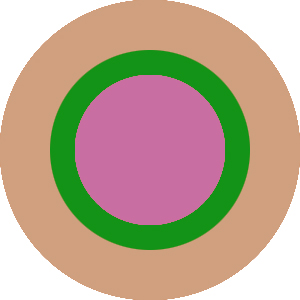
VC130_Week7_Exercise7 - In this exercise you will create a 300 x 300 (pixels) image comprised of a 3-color split-compliment harmony. The composition will be comprised of three concentric circles. The circles should all be centered at the middle of the composition. The largest circle should fit completely within the composition without any cropping therefore; the white background color will show through in the four corners.
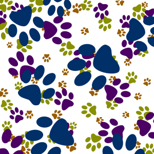
VC130_Week7_Exercise8 - Create a 300 x 300 (pixels) image comprised of a 4-color tetradic (rectangular) harmony. The composition will be comprised of four of the same custom shape created with the Shapes Tool. Each of the four identical shapes should vary in size. Apply an equal amount of shading (black) to each color. Use ColorImpact to create this harmony.
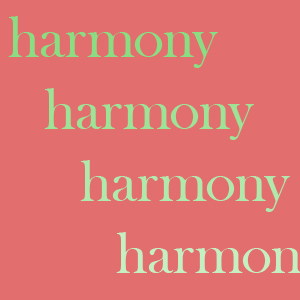
VC130_Week7_Exercise9 - Create a 300 x 300 (pixels) image comprised of a 4-color monochromatic harmony. The composition will be comprised of a random repetition of the word "harmony." Each copy of the word will be the same size, with the same font, with the only variation being to color. Your harmony should be comprised of equal amounts of tinting, shading, or toning (but don't mix tints with tones or shades). Fill the background layer with a compliment of the hue being used in the monochromatic harmony.
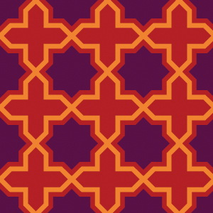
VC130_Week7_Exercise10 - In this exercise you will create a tileable pattern in Illustrator and then cutting it out for use in Photoshop.
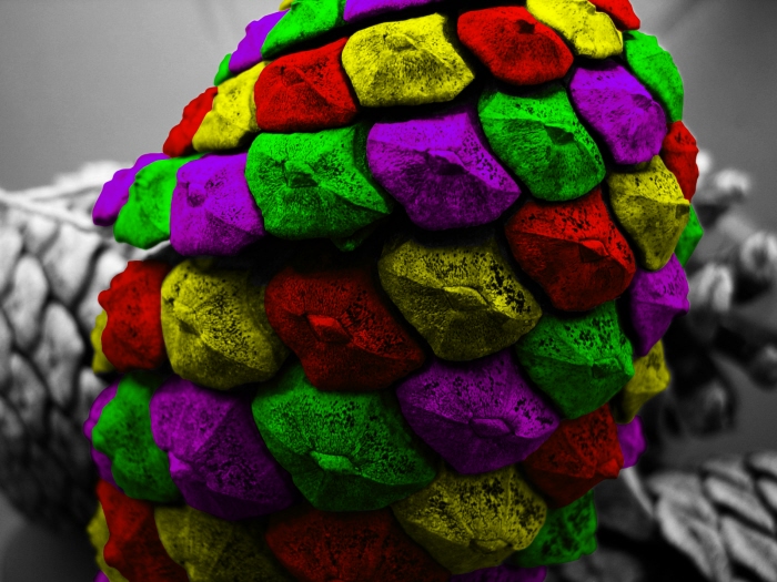
VC100_Week8_Exercise2 - You must start with an original black & white photo (no destaturating). Isolate part of the photo with a selection technique. Create a layer above the photo layer. Add a "solid color" adjustment to the new layer. Fill the selection in with the desire color. Use the "color" layer blending option to blend the solid color adjustment layer into the photograph. Repeat this step for every new color you are tinting the photo with.
Image credit:
http://www.elftown.com/_B&W
by Janouk
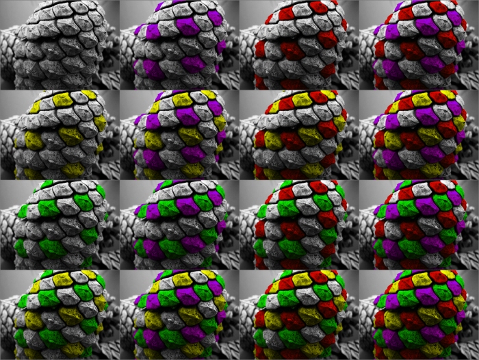
Jewelled Pinecones - Recap of an assignment to add color in an interesting way to a black & white photo.
Photo credit:
http://www.elftown.com/_B&W
by Janouk
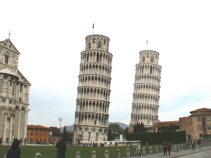
Pisa by Two - Create an image from a Worth1000.com contest (1 of 3)
More Than Usual 5
Were there always this many?
Five fingers, five toes. Two arms, two legs. One stem on an apple, one cherry on a stem. Absolute normalcy. Absolutely boring.
For this contest, we want you to add extras where extras don't normally exist. We want to see jetfighters with 6 wings, foxes with nine tails, trees with four trunks, triple decker buses... you get the idea. The more, the merrier.
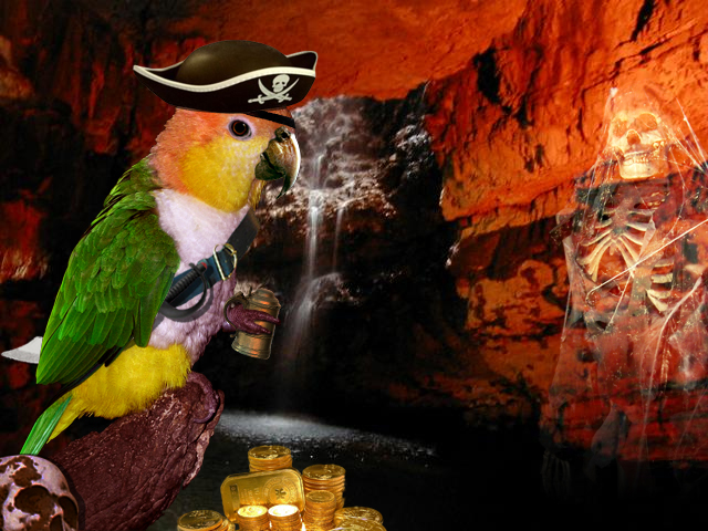
Polly Pirate - Create an image from a Worth1000.com contest (2 of 3)
Critter Pirates 2
Cut Throat Critters
The animal kingdom have taken to the sea!
Your aim in this competition is to take ordinary animals and turn them into bloodthirsty pirates. Imagine a boatload of buccaneer meerkats, or swashbuckling alsatians, or treasure guarding Frog as in Cameon's wonderful image "Guarding Treasure". Imagine the horrors that a squad of pirate sharks would unleash upon the seven seas!
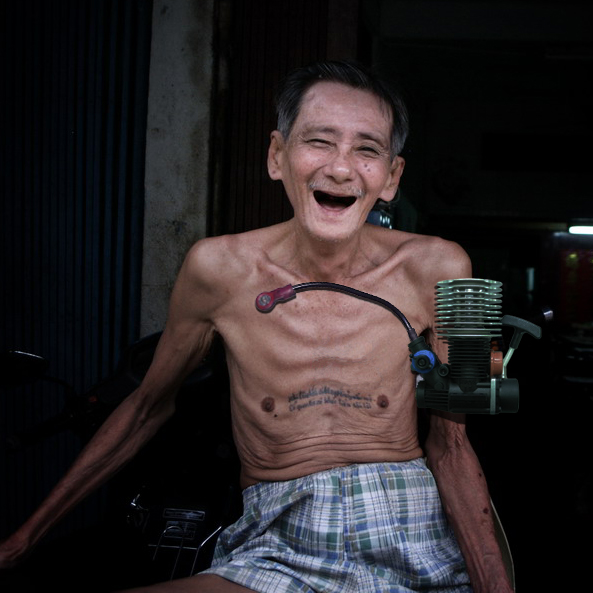
Early Pacemaker - Create an image from a Worth1000.com contest (3 of 3)
Prototypes 5
What famous things looked like, the first time around.
In this contest we want you to create a prototype for a famous product, character or object which is woefully inefficient or badly designed in comparison to the current model, the funnier the better.
gLike