
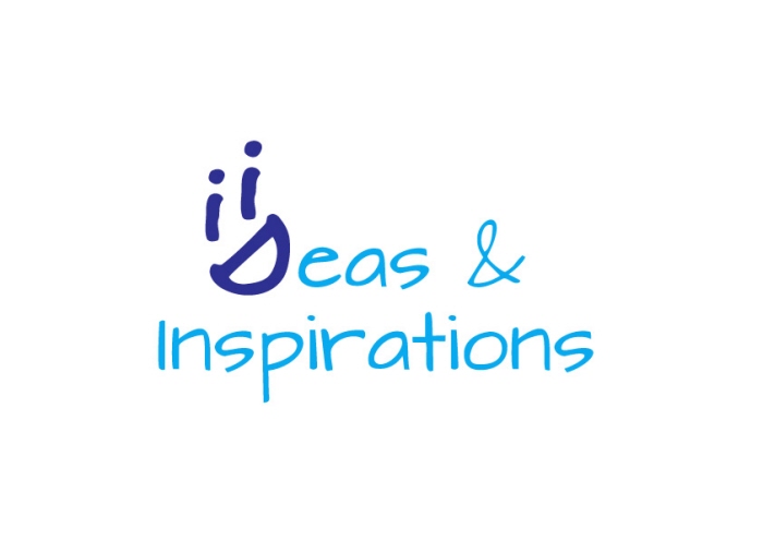
Ideas & Inspirations - For an events management comapany, the client wanted the two 'i's to be used in the symbol.
The two very bold ‘i’s that
make up the symbol represent silhouettes
of human figures socializing which
is one of the biggest thing about events.
The two bright colors give a feeling of
freshness n have a vibe of new age to
them. The font used has a casual yet chic
look to it which goes well knowing that
their services range from corporate
events to weddings.
Ideas & Inspirations - For an events management comapany, the client wanted the two 'i's to be used in the symbol.
The filaments in the bulb
(which of course universally symbolizes
creativity, innovation, an idea) are made up
of two ‘i’s. A rich brown color has been used
to highlight the ‘i’s yellow, a color which
shows joy. Brown compliments the warmth of the yellow.
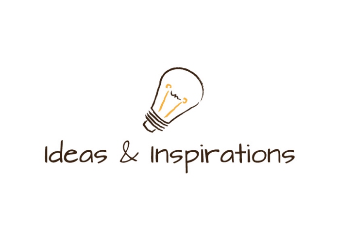
Ideas & Inspirations - For an events management comapany, the client wanted the two 'i's to be used in the symbol.
The D n ‘i’s form a joyous
face which is what any event
planning’s end goal would be. It
shows that your Ideas would make
them happy and make it a completely
wholesome, satisfactory and
most importantly happy event. The
royal blue n d bright light blue
again have been used to show the
range of your services and also so
that the whole thing looks cohesive.
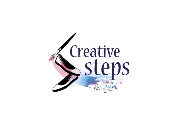
Creative Steps - Logo design is for custom hand painted shoes.
The Shoe n the Paint Brush forms the ‘S’..wich stands for shoes, steps n also in this case for Snehal, the artist.
The strokes of paint with the brush are symbolic to the fact how she hand paints them.
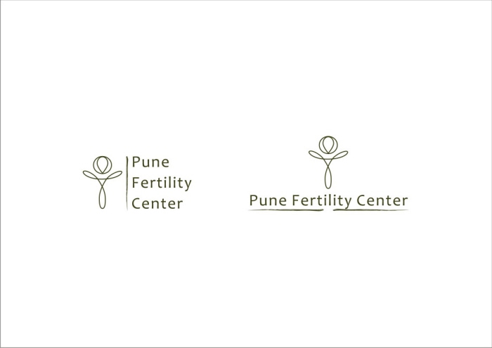
Pune Fertility Center - Inspiration : Egyptian symbol of fertility ‘Ankh’
It symbolizes reproduction
and sexual union. According to other sources it means life and zest for life. The best summary of its meaning is future life, “Breath of Life”.
The color Green is used because it is the color of nature and therefore the color of life.
The adaptation of the symbol in the logo design which uses very organic lines, also resembles the female reproductive organ
and hence adds even further meaning to it.
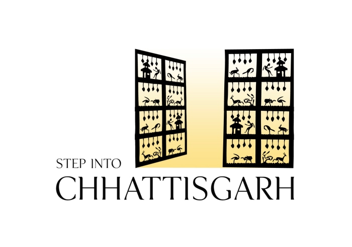
Chhattisgarh Tourism - The bell metal handicraft called Dokra is famous all over the world. Common people unaware of it’s origins find these in city stores & wonder which famous designer/artist designed them. Well these are Dokra work produced here in Chattishgarh and stand as a strong and unique symbol for this state.
The open rectangular gate made with the the motifs/designs of Dokra art depict the amiability of the state and welcomes everyone to indulge into its many cultural and traditional beauties.
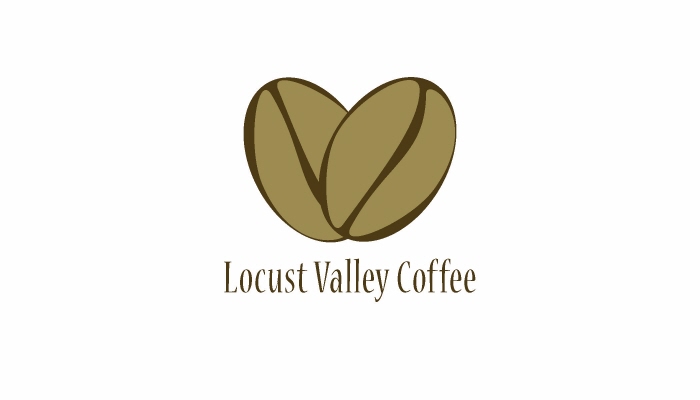
Locust Valley Coffee - Logo design for a premium gold coast quality coffee producing company.
I tried to achieve the letter V in the negative space Also the letter L forms up. And of course the two beans together also form a V or a heart shape.
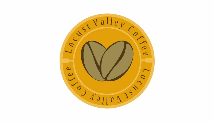
Locust Valley Coffee - Logo design for a premium gold coast quality coffee producing company.
I tried to achieve the letter V in the negative space Also the letter L forms up. And of course the two beans together also form a V or a heart shape.
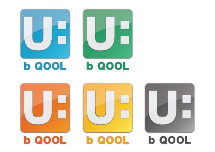
U B Cool - Logo design for an online interactive technology based learning process for school kids.
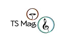
TS Mag - abbreviates for Time Signature Magazine, on music, done for a friend, the idea was how music leads to sound that leads to resonance.
View PDF
View PDF
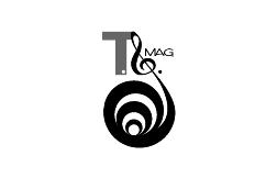
TS Mag - A more loud and bold approach to the design solution for Time Signature Magazine
View PDF
View PDF
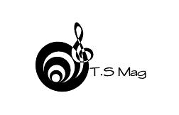
TS Mag - A more loud and bold approach to the design solution for Time Signature Magazine
View PDF
View PDF
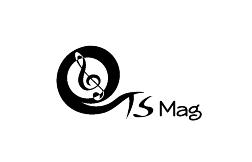
TS Mag - A more loud and bold approach to the design solution for Time Signature Magazine
View PDF
View PDF
gLike
Logo design