
Color Palate Tweaks - For the 2011 season, the Wenatchee Wild were to have some fan gear produced by New Era, and wanted to change their colors to better reflect what New Era was going to create for them. They had selected a new blue (called Air Force Blue), so I built a new palate around the new primary blue tone. For the team's designer and I, this was only the beginning (side note: we toyed with making a variant of the Penguin's 2011 Winter Classic palate, but that idea didn't make it very far)
Initial Concept Sketches - The team's designer and I decided to do a "head-on" logo, two updates to the current logo, and three "perspective" logos for the final proposal. We also agreed to cut the color palate down to 5 total colors, and to keep Gary Cekus' logo and build a fully cohesive system around it.
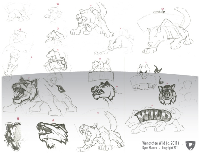
With this round, I cranked-out some simple sketches to lay ideas onto paper, fleshing-out some concepts here-and-there. I numbered the sketches for ease of reference during email conversations
Initial Concept Sketches - This round was concentrated on updates to the Wild's current logo and for the "head-on" concept we wanted to include for the final presentation. These were slightly more fleshed-out then the first salvo of sketches, but my attempt to sketch without reference images created a few un-Wolfish Wolf heads
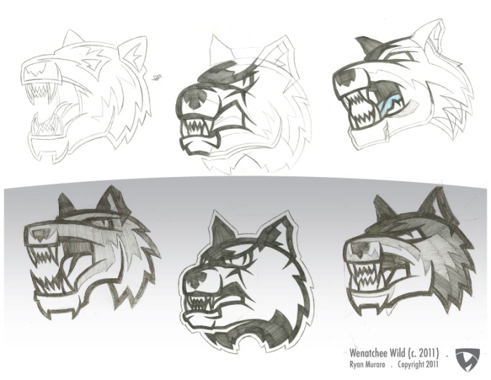
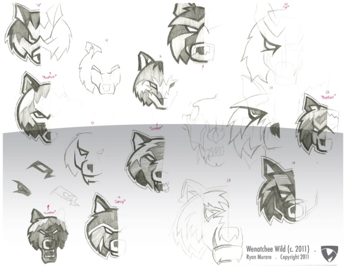
Secondary Sketches - Some of my second round sketches are seen at the bottom, with the three concepts that were fully rendered shown at the top. The top sketches were the ones I used as the blueprint for the rendered logos, though the middle logo was cut out of the final presentation
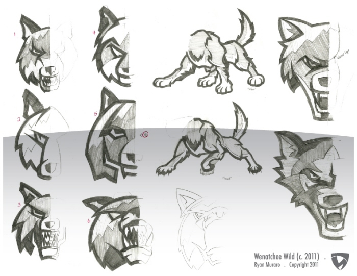
Secondary Sketches - Further development on the "Head-On" concept, with the finalized "Updates" shown on the far right. The body poses were to be used as platforms for the "Perspective" logo sets, with only the lower pose being used for the final logos. The "Head-On" logo labeled #6 was the chosen concept, with it's corresponding Illustrator-ready sketch shown to it's right. It was given the name "Brak" (in reference to Space Ghost, of course), and was shelved do to the pose being too similar to a rival's logo
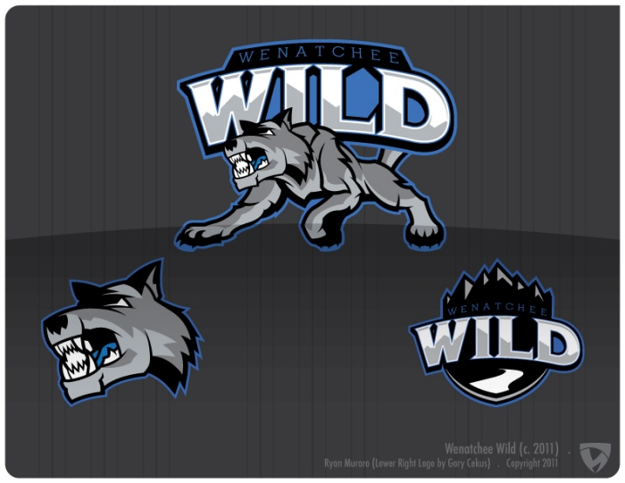
Primary Logo Concept "B" - For the final presentation, we reduced the logo number to 3 concepts, though the full allotment of 6 logos were rendered (sometimes logos look better as a sketch then they do as a rendered final). This was "Concept B", and was the favorite of the team's designer. For all the produced logos, Gary Cekus' logo was the genesis, and my logo sets stemmed from that foundation
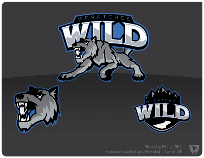
Primary Logo Concept "C" - This was my personal favorite of the "Perspective" bunch, though I could never fully attain common ground with the team's designer. It's format was the same as Concept "B"s; if either were chosen, the head would act as the jersey crest, with the full body being used for promotional work. The body would have been redesigned to better match the chosen head as well
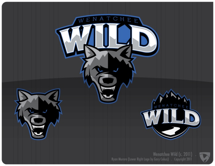
Primary Logo Concept "A" - This was the logo the team's designer and I agreed should have won, being exactly what we thought would gain the upper management's approval (finally). The head was directly formatted off of the current logo, with some major overhauling to create the shown logo. To render the head, I used the mountainscape from Gary Cekus' logo, which not only links the two cleanly but also looks bad-ass (professionally speaking)
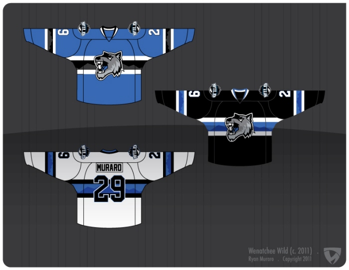
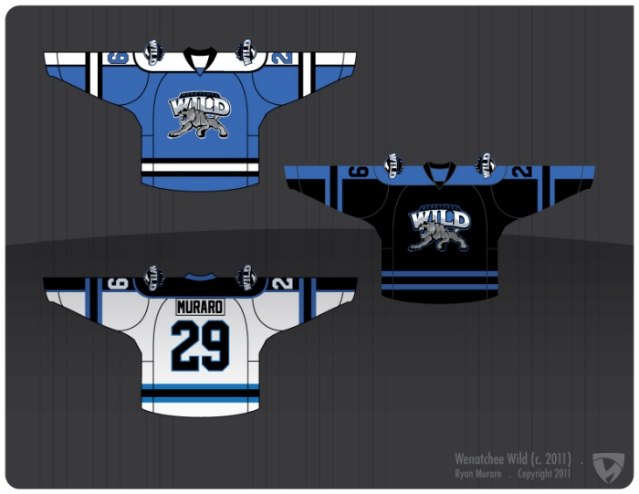
Jersey Concept "A" - Along with logos, this design brief included new jersey concepts to replace the team's current uniforms. Supposedly the owner was dead-set on changing the uniforms, but he got cold feet on both the jerseys and logos, marking yet another futile effort at rebranding the team. This was the "Canadians" concept, here using Cekus' mountainscape as a sublimated central stripe pattern. The black one in-particular was my favorite
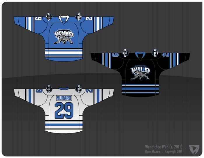
Jersey Concept "B" - Jersey "B" was just a templating exercise, and was based off of other jerseys the team's producer had made in the past. It was never a front runner, but it was included in the presentation to give a "base" option
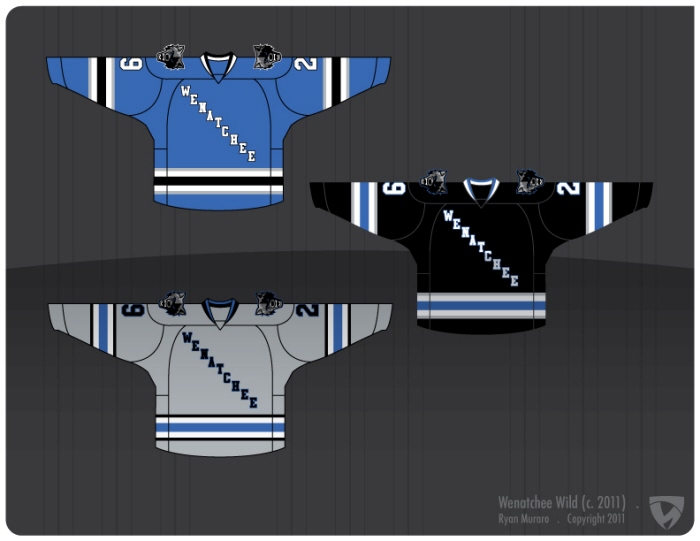
Jersey Concept "C" - The team's designer e-mailed me during the jersey design phase and told me he was enamored by the Buffalo Sabre's new uniforms, and wanted to see what a Wenatchee-colored version of the Buffalo jersey would look like. Here was the product of that exercise, which was included as an option in the final presentation
Jersey Concept "E" - Here's the "Rangers" concept, which is a pretty synonymous format with minor league hockey teams. The gray version was specifically asked for by the team's coach, and was considered as the front runner to act as a third jersey to the following uniform...
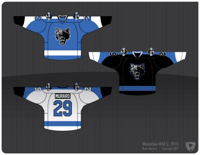
Jersey Concept "D" - Here's the "Flyers" concept, which was considered by me and many on the Wenatchee staff as the favorite to become the team's new look. Sadly it was not meant to be.
I want to quickly thank those in the Wenatchee Wild organization, particularly Andrew Carroll (the team's designer) who worked with me on this project; I know I'm not the only one who was disappointed by the eventual outcome of all this work
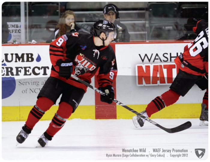
Washington Apple Education Foundation (WAEF) Jersey In-Action (12.3.11) - At the moment the plan is to implement the new primary logo for the '12-13 season, so for the '11-12 season the Wild and I decided to slowly roll-out the new logo during the team's specialty jersey promotions.
This was the second jersey, first of my design; A "vintage" look was asked for by the WAEF, so I proposed a few options based upon jerseys from Washington hockey teams of the 40's and 50's. The final design was a tweaked and recolored version of a jersey worn by the Seattle Ironman
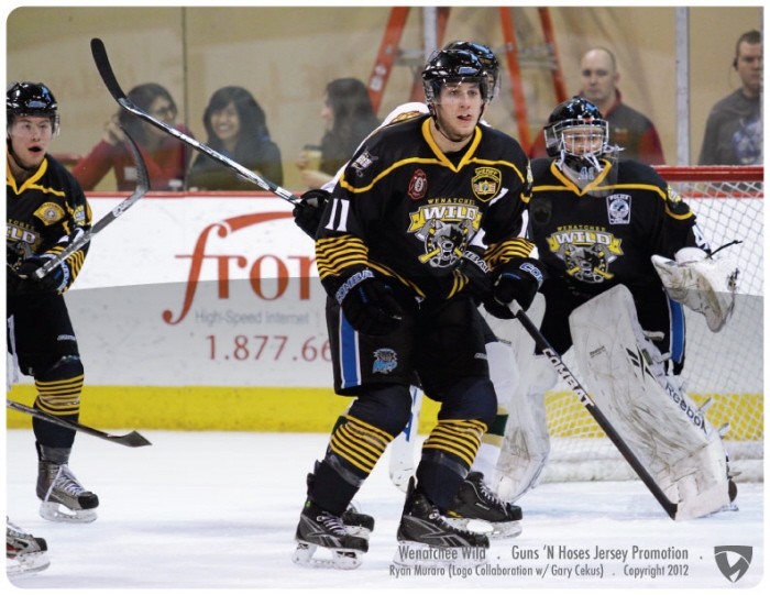
Guns 'N Hoses Jersey In-Action (1.28.11) - For last year's Guns 'n Hoses promotion, the Wild went with a Patriotic theme... For this year, after batting around a few Patriotic-flavored uniforms I proposed to design a jersey that was SWAT-styled, and this was the final product. The dark grays were dropped-off the uniform to leave a black canvas, and "Police Gold" piping was used to create some contrast across the uniform. The 7 stripes represent the 7 departments who represent the greater Wenatchee area
gLike
Wenatchee Wild 2011
During the summer of 2010 the Wenatchee Wild looked at creating a new graphics package for their team, and ended-up only partially overhauling their look. They picked one logo from a package designed by Gary Cekus and used it as their shoulder patch, while keeping their primary logo to use as the jersey crest. Through some email conversations, I embarked with the team's graphic designer to finish the job; this is the majority of that endeavor