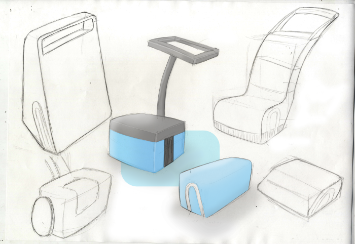
After looking at existing products, my target market, specification and ergonomic data, I began to sketch some initial ideas. My first ideas included, having a washing up bowl that allowed the user to recycle the dirty water that is created during the process.

However, after doing a few sketches I decided not to take forward the idea of the washing up bowl for hygiene reasons. I therefore started to look at different areas where I could apply the same kind of idea. I then came to think of mopping and how people waste water by refilling their mop buckets, or carry on mopping with dirty water.
I started to then look at mains powered concepts that the user could push around with an extended handle. I also considered incorporating high water pressure to clean the floor, with a few brushes to help with the cleaning process.

I then started to look at how the water would flow around the product and where the main water compartment would be. I started looking at how the user would be able to fill the product up with water and chemicals.

After deciding to have the product as an electrical appliance, I then considered having two compartments to fill the product, one for water and one for chemicals. However, this seemed a little pointless. I also started to look into how the water filter would work in the water compartment. Therefore I decided to have the compartment tilting downwards, therefore allowing the water to be passed through the filter naturally using gravitational force.

I then started to look at other ways in which the water compartment could be removed to refill the product as well as clean it, alongside the filter. I then came across the problem of how the user would be walking straight over the floor in which they had cleaned. I considered having the product so that the user could stand on it to clean the floor. However, I didn’t want to make the product larger than it had to be. Therefore I dismissed this idea.

I then started considering different types of styles for my design, and continued to work on how the water compartment would be removed from the product. When considering this, I had to be careful to not allow any of the water to escape from the compartment easily. Therefore I started to look at having a top box that could be pulled directly out of the top of the product with the lid on, as to not spill the water everywhere.

I then began to look into what type of brushes I could put into my product to get an effective clean. I looked at having a front brush that scrubbed in a right to left direction, four middle brushes that rotated in a circular motion and a back roller to complete the process and throw the used dirty water backwards. However, after looking into the product and how it would work, I decided to not use the front scrubbing brush as it did not appear to add anything to the product.

I then came up with an initial shape for my product, incorporating a few of the internal components. This showed where the water compartment would be fitted, how the water would leave the product, the brushes that would be used to scrub the floor and how the dirty water would be sucked back up and around the system and through the filter.

Following this, I was able to see that where the four front brushes were concerned, if the two left brushes turned the opposite way to the two right brushes, it would make the product work more efficiently by channelling the used water down the middle of the product and directly to the back roller. To get this to work, I would have three gears on each side, per two brushes. This would allow them to rotate in opposite directions. These gears would then be operated via gears that were being driven off the back roller, which would be driven off the motor

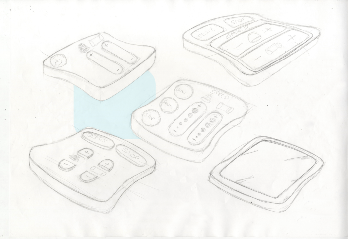
For the product to work effectively, it would have to have an intuitive interface. Therefore, I decided to start looking at the interface, how the user would interact with the product, and what controls it would need for it to work effectively. Initially I began looking at the shape of the interface and what type of shape to design it. However, as the user would not have to physically hold the interface, this was not a major issue anthropometric wise

I decided to develop an interface with slightly rounded edges and curved sides. I then started to consider what type of interface to have, I considered a touch screen, however dismissed this as it seemed unnecessary as the product only required to be switched on, off and maybe have different speeds available for the brushes. I then decided to focus more on the layout of the interface and the semantics of the product

Enter Your Description Here

I then started to look in more detail at the water compartment and how the user would interact with it. After looking at the anthropometric data I was able to apply the dimensions I had found to the product. I then started to look at different ways of positioning the handle to take the weight of the water and to make it easier on the user.

I then looked further into the handle, and decided to make it a central handle which would allow the user to easily remove it from the main body of the product. I also incorporated a slide on and off lid that would lock into place when in use. However, once the product was removed from the main body, it would easily come off, therefore allowing the user to remove the water compartment without spilling any of the water. This would also make the compartment and the filter easier to clean.


I then decided to tackle the issue of how the impeller pumps would work within the product. I came to the decision that for the product to work effectively, using two pumps would be for the best, one at the beginning of the process to suck the clean water out of the compartment and push it out at a high pressure. And at the end of the process to suck the dirty water up from the floor and push it back into the water compartment, ready to be filtered and used again.

Created in solidworks, this was the final design outcome.

This cross-sectional view shows how the product works. The user simply fills the central compartment with cleaning products. The clean water is then sucked out of the central compartment using an impeller pump which then comes into contact with the dirty floor. The 5 brushes scrub the floor clean until a second impeller pumps removes the water from the floor and pushes it through a filtering system.
gLike