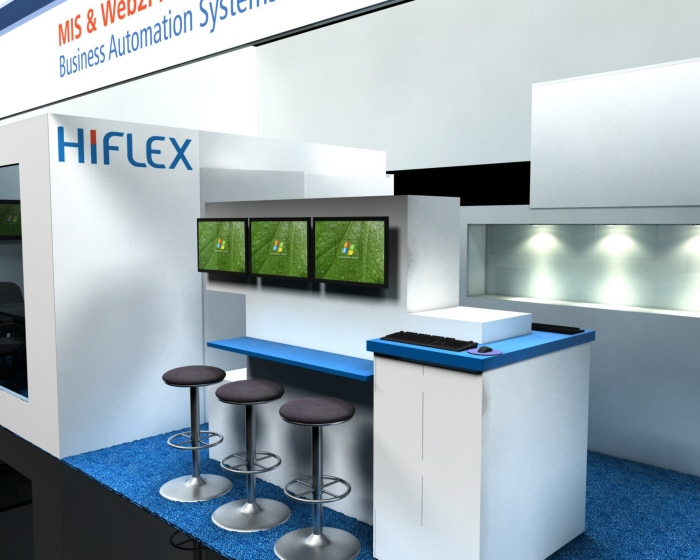
Custom Booth Design
The look of this booth was inspired by the cubic feel of the company's secondary logo. The booth was created using a series of rectangles, to keep this from looking static, the shapes have been offset from one another. This is especially evident in the demonstration kiosks and the reception counter. To keep the booth from feeling cluttered or busy, a clean white was used for the majority of the structure. Blue counters and occasional logos were used as accents.


