The original good idea from ZERO SR/F motorcycle range.
My makeover I think improves it, and the direction of advertising it needs to take.
Apart from the colour change alternatives it includes, new screen, new winglet panel, belly pan, seat highlights, frame support and logo positions.
Simple and easy to do changes make an effective overall more interesting impression.
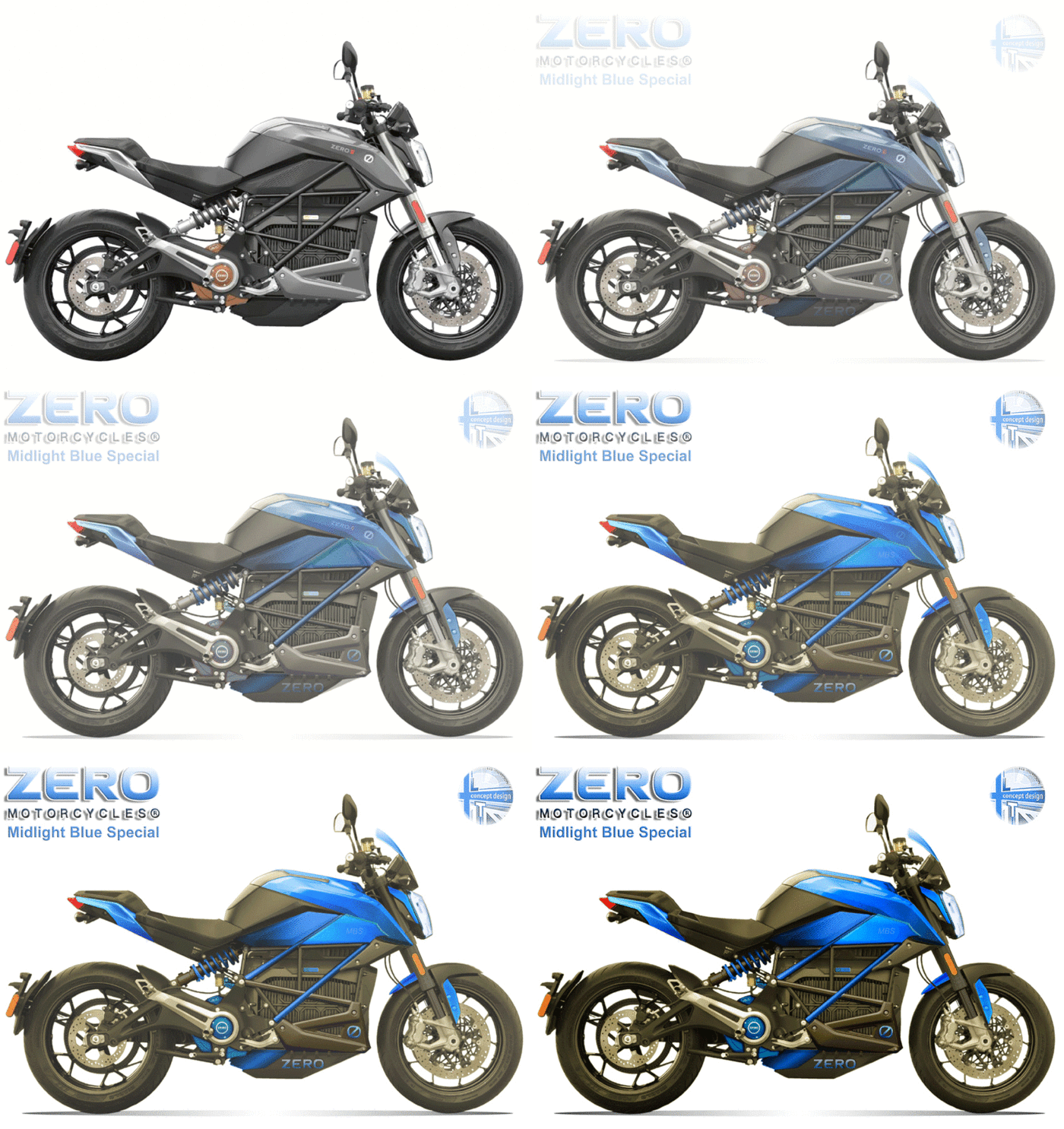
From original to makeover in colour version.
gLike
ZERO SR/F range makeover.

Again this is an example of not always having to do a complete new redesign, The original is a good and interesting design, I wanted to turn it into a great and eye catching design, according to feedback I managed it. The needed subtle changes have been made apparent and can be seen with the images.

Available
Freelance, Full-time
Lee Thompson
Independent Graphic Design Professional Town Centre, United Kingdom