Magazine You + I - Professor : Joseph Quackenbush
Design a magazine with complete editorial and design control, striving to compose a cohesive visual system.
With a magazine striving to bring understanding through discovery, I felt the aesthetic must be approachable and familia. A far cry from typical academia, You + I gives the reader white space to breath and think, illustrations to ease and interest the mind, and text to contemplate. In its truth, it is about body and soul, of all creatures.

Magazine You + I Slides - inDesign Slides
*please open as 'PDF FILE'*
Design a magazine with complete editorial and design control, striving to compose a cohesive visual system.
With a magazine striving to bring understanding through discovery, I felt the aesthetic must be approachable and familia. A far cry from typical academia, You + I gives the reader white space to breath and think, illustrations to ease and interest the mind, and text to contemplate. In its truth, it is about body and soul, of all creatures.
View PDF
View PDF

Ubu Roi Artists Book - Professor : Joseph Quackenbush
Using the 1896 text Ubu Roi by Alfred Jarry, create a rich, experiential artist book.
What made Pa Ubu so revolutionary in 1896 and just as fascinating today is how strange he is in the world of adults. With this in mind, it only seemed appropriate to analyze him as a child, through a Freudian method of course. Analysis of Pa’s phrasing, vocabulary, and tone allows a deeper insight to his mind and our understanding of him as a three dimensional character.

Book Cover - *on grey background*
Professor : Elizabeth Resnick
Assignment : Create a book cover for Freuds "The Interpretation of Dreams" that speaks to the work as well as an audience.

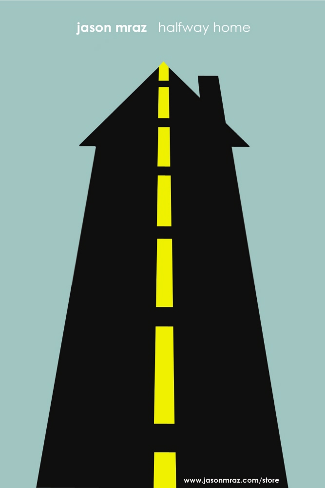
Designer Inspired Song Posters - Professor : Chaz Maviyane-Davies
Assignment : Create a poster to illustrate a song in the style of a chosen designer (Lex Drewinski). Must include song title, musician, and where song can be purchased.

Word & Image: Take Two - Professor : Elizabeth Resnick
Assignment : A second take on my previous Word and Image poster to observe the change between changing the word from "exhaust" to "active".
View PDF
View PDF

Emerald Necklace Guide - Using the given text, create a
16 page guide to the nine parks of Boston’s Emerald Necklace.
Seeing Frederick Law Olmstead as ahead of his time in conservation and environmentalism, the Guide serves as an homage to the nature he preserved. Taking on a journalistic style, the nature itself becomes the focus that Olmstead strived for.

Emerald Necklace Spread

Emerald Necklace Spread cont

Type & Image Book - Professor : Gunta Kaza
Assignment : Explore the formal relationships between the photographic image and typography in the form of an accordion fold book.
The viewer must experience the typographic relationship of image and glyph the same way he would experience a relationship with a dog : interaction.

Editorial Spreads - Click on "PDF FILE" to view all spreads
Professor : Gunta Kaza
Assignment : Choose an essay and design editorial spreads to be published in a magazine.
As a futurist caught between new ideas and old technology, the duality Fuller faced is expressed through images and design.
View PDF
View PDF

Editorial Spreads - Choose an essay and design editorial spreads to be published in a magazine.
As a futurist caught between new ideas and old technology, the duality Fuller faced is expressed through images and design.

Gilette Venus Razors - Using a given image, create an ad for a product that is not inherently thought of when viewing the image.
By speaking casually with women about an experience that nearly all women have faced, the company can establish a trusting relationship with their consumers and a sense of reliablity and concern for the customer.
View PDF
View PDF

Spoonfudge - Create an ad that reflects the company : fun & unusual.
Establishing visual play by creating the product out of the product, creates a sense of whimsy and unexpectedness that the product begs for.
View PDF
View PDF

Garden Tour Poster - Client : Kids Free to Grow
A poster than can be reused each year by the Kids Free to Grow Charity. This will create a recognizable appearance within the community, and in turn, a higher turn out rate. The flow of this poster mimics the Auction poster as well, strengthening a brand identity. The hand drawn 'doodle' style was requested by the client.
View PDF
View PDF

Auction Poster - Client : Kids Free to Grow
A poster than can be reused each year by the Kids Free to Grow Charity. This will create a recognizable appearance within the community, and in turn, a higher turn out rate. The flow of this poster mimics the Garden Tour poster as well, strengthening a brand identity. The hand drawn 'doodle' style was requested by the client.
View PDF
View PDF
gLike