
Spider-Man3, Shrek3, Pirates 3 Press Release - It was a challenge to unify these three movies' characters since they all use color palettes and art that naturally clashes together. I played around with all kinds of filters, gradients, and mostly unused licenser art until I thought I had something that worked. I love to layer my art, and anyone who's ever worked on Disney art understands how large they are in the first place.

Hannah Montana: Magazine Ad - Disney loved this ad. I found the stage image online and I chaged the color balance and saturation to match the Hannah Montana color scheme. I also created a floor, using a filter to make woodgrain, and then laid her secondary design elements over the floor boards at a 75% opacity. All product had to be mocked up as none of this product existed in any stage before our magazine printed.

High School Musical: Magazine Ad - For this ad, I thought it might be set apart from other HSM pieces if we used part of their pool element (the red area with the red lip). I mocked the headband onto this HSM character, called Taylor. Our product had gone into pre-production at this time, so we were left with mock-ups for the magazine.

Ratatouille: Product Press Release - I thought it was necessary to pick images that the public hadn't already been bombarded with in commercials so I was delighted when I found the restaurant, chef, and Remy the Mouse (they're all separate images). It seemed to serve a nice contrast for the easel, which was also half standing before I retouched in Photoshop. I also designed the puzzles and their packaging that you can see on the bottom row.

Disney Gift Set: Magazine Ad - A last minute addition to a magazine that needed to print that day AND the product doesn't exist?! WTF? No problem. I simply took an image one of our illustrators made of the floor display and gave it some depth in Photoshop by burning in select areas and creating the sides, top, and stockings afront as separate layers. I made this look like a blueprint, complete with skewing the Disney logo onto the map.

Spy Gear Games: Magazine Spread - The helicopters were harder to do than they look, as were the flying tiles on the bottom right.

Mighty Pens: Catalog - This is pretty straight-forward. I designed the page and added the motion elements to the products.

Surf's Up: Catalog Cover - A fellow artist went home sick in the middle of this catalog, which we were producing with a very short turnaround time, but he didn't do a cover. I pulled together a few images that I thought were unlike other Surf's Up art in circulation and jumped in to rush this to print.

Birthstone Guardian Angel: Product Press Release
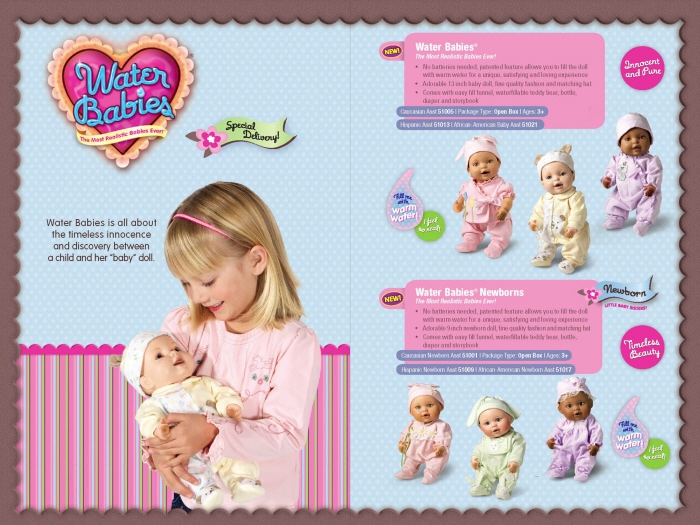
Water Babies: International Catalog Spread

Old Navy: Sew-in Labels (for Pants and Jackets)

NBA Product Press Release - I worked for a company that liked to bombard the customer with image exclusively. Some text would have been nice to break it up a bit. None of these products existed. I shot the products, changed their colors accordingly, and added the team logos before attempting to design this release. The NBA liked my header though.
gLike
Collateral and Catalog