
We wanted a modern and sophisticated look that encompassed the feel of our wide range of products, and set the mood for the rest of the brochure. Placing a beautifully executed brochure into a generic envelope would detract from the user experience, so we opted for metallic. The shape and cover colors were chosen after the envelope had been decided upon.
The damask pattern was created with a gel over a printed tint in order to give it texture and depth.
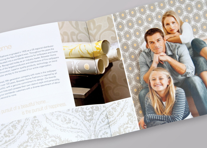
Welcome
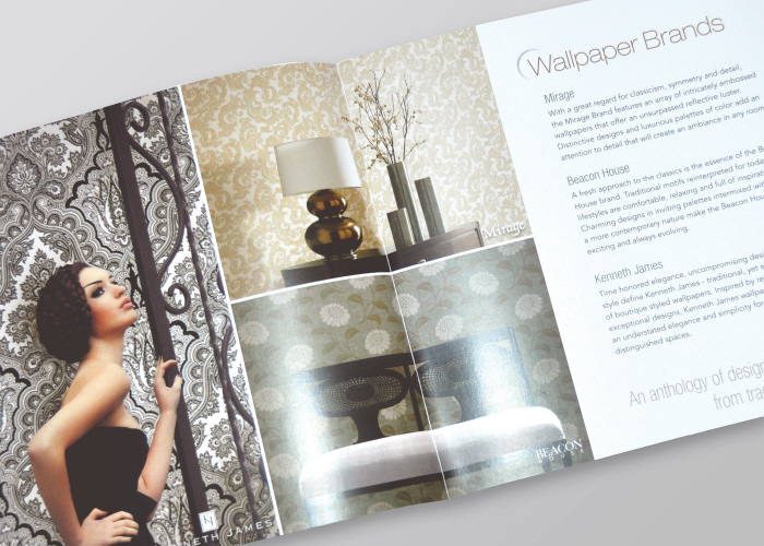
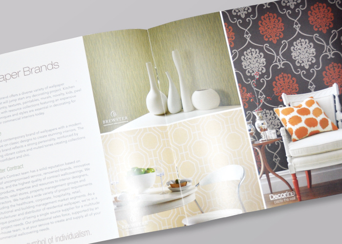
Brewster home fashions designed and carried 6 brands of wall textiles. This and the next spread identifies and details these brands.
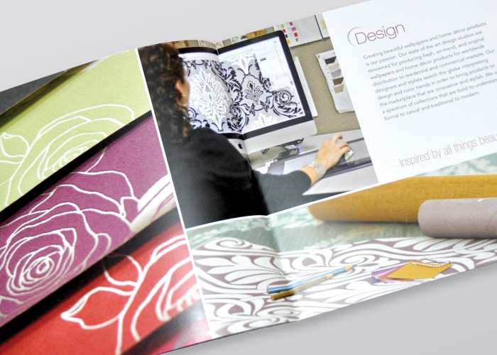
The Design Process
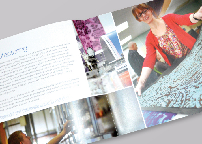
Manufacturing Details
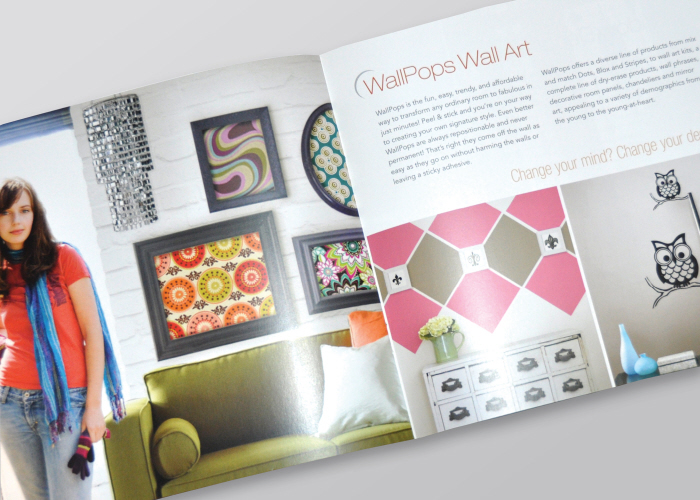
WallPOPS!
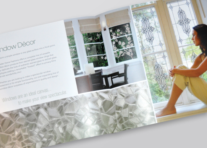
Window Decor
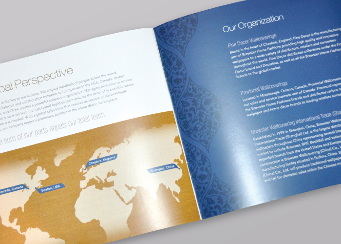
Global Information
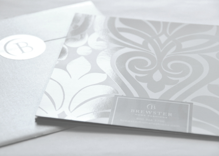
Back of the Brochure, which continues the pattern from the front, and the back of the envelope with the branded seal.
gLike
Corporate Brochure
This brochure is being handed out to prospective buyers, consumers, and interior designers at shows and meetings across the world. Our goal was to introduce the organization and its products and services in a clean, fresh, and contemporary fashion.
We wanted a modern and sophisticated look that encompassed the feel of our wide range of products, and set the mood for the rest of the brochure. Placing a beautifully executed brochure into a generic envelope would detract from the user experience, so we opted for metallic.
The damask pattern was created with a gel over a printed tint in order to give it texture and depth.