My Business Cards - Mini-Cards used for promotional purposes. Chose a CMYK color pallet with a focus on Typography

AnGel Logo re-brand. Client wanted 2 wings instead of one, so I expanded the layout and cleaned the wing to show more color on the label.

Stereo Dance Academy - A web banner graphic I did as a comp

bytecourse logo - Logo done for a company that sells subscriptions to online educational courses in modern technologies such as SQL, jQuery, Excel, C#, etc.
I chose to do a simple but web friendly logo. Its very basic and I utilized the first letter as a standalone logo mark as well. I wanted to develop the idea of the courses with some kind of "book" logo. I did a more vague interpretation by adding the "pages" to the letter B.

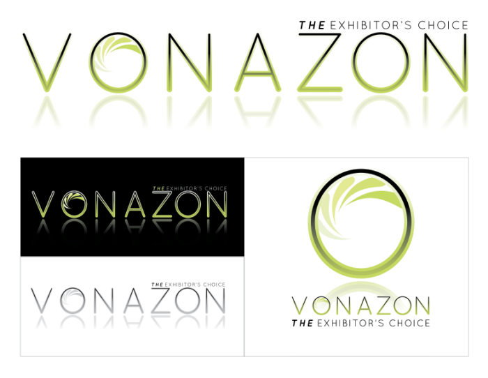
Vonazon Logo - Logo comp done for a company that provides live marketing strategies( promotional models, giveaways, booth designs, etc) to any company exhibiting at trade shows, conventions, and live events.
I approached this logo with a very clean, modern, mature but fresh appeal. There is an emphasis on the title of the company as well as the "THE" in the subtitle to help this brand stand out against its competitors. Perhaps my favorite logo I've designed.

Client asked for cards to represent japanese style "sticki pics" know as purikura. She wanted something goofy and colorful to represent her personality and style. Business cards double as tags for her clothing line. You can see them in person at Happy Six in Los Angeles, CA.

Tranquality

Emergence Tee Comp 2 - This design was done for a dance studio's upcoming performance highlighting the idea of emergence. My client said to keep the idea simple using 1-2 colors on either a white or black tee utilizing the company's standard blue.
This one I used the energetic splatters to reinforce the dancers, giving them movement within their interaction. The text read,s "Emergence - the way complex systems and patterns arise out of a multiplicity of relatively simple interactions."

Emergence Tee Comp 1 - This design was done for a dance studio's upcoming performance highlighting the idea of emergence. My client said to keep the idea simple using 1-2 colors on either a white or black tee utilizing the company's standard blue.
I used the ideas of the dancers overlapping with one dance resulting from the other, along with an interaction with the dance logo.

Roxer Logo - This is a logo comp for the company Roxer which offers a fun and easy web page builder.
I collaborated with my boyfriend to come up with the general layout and then worked to make this feel like it is a very web friendly design that can be branded as a logo mark, or alone as text. There is a dynamic, unique element to this layout that allows it to stand out from other similar companies.

35mmART logo

Logo Comps for a Noir Film Festival

Logo Comps for a Noir Film Festival - This was a logo concept for a local theater program featuring film noire pieces. It was used to help raise funds for local theaters in down town Fullerton.

Logo Comps for a Noir Film Festival

These mini cards were designed using colors and design elements from the company's branding ideals. I took several of the icons and mixed and matched them to give the client a variety of options when printing. Printing by moo.com

Pocket Panda logo created for client to use on all band merchandise including tees, stickers, and other promotional items.

Logos - New brush series, I not only designed the logos, but came up with the names as well.

Logo design for a new gel polish. The brand is AnGel, utilizing the wing that represents the concept as a means to showcase each polish color.

Hall of Fame Brews - Logo for a new personalized brewery. I tried to depict a contemporary logo type with a sort of emblematic appearance.

LOFT Recruitment Cards - Business cards used to recruit new hires to our store


Ravenous Logo


Cars.net Logo

Logo//Packaging - This is a selection of works, showing a range of logos, product design, packaging, and print done for a variety of clients.

High Five Trainer

LED High Performance

Logo Series for Web - This is a logo series for an editorial website that helped highlight their 5 central topics.

Logo

Logo

Print - This is a selection of works, showing a range of logos, product design, packaging, and print done for a variety of clients.

Nightengale Logo

Packaging//Wine labels

Packaging//Wine labels

Badges
gLike