My Ad from Connecting Rochester 2009 - Email me for freelance work!

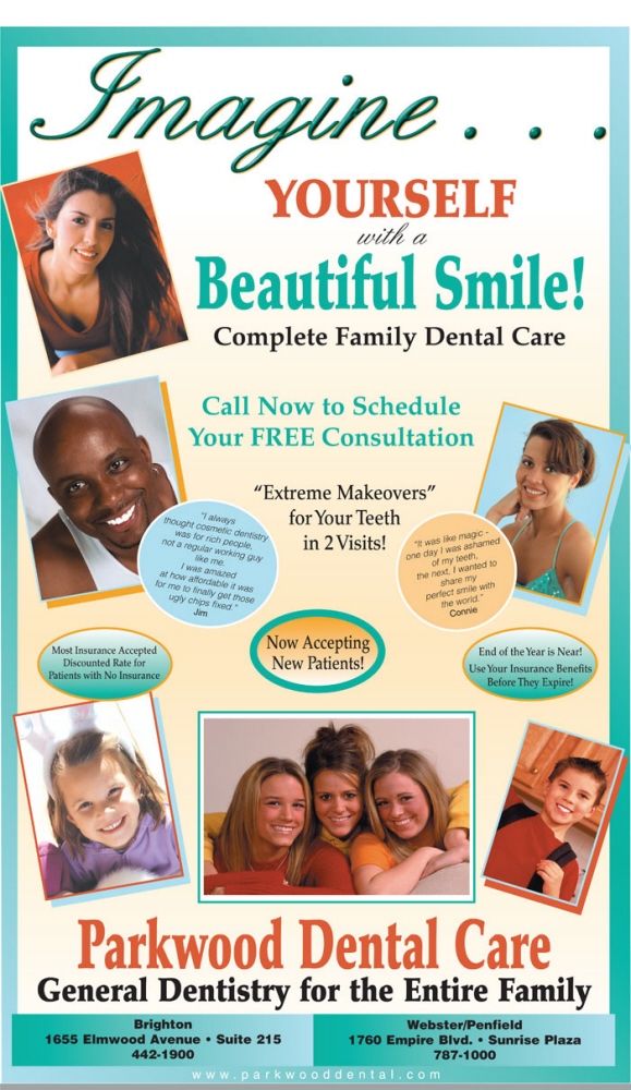
Parkwood Dental - Full page newspaper ad. This ad needed strong colors to hold up on newsprint properly.

Spec ad for Euphoria - The customer wanted an upscale, edgy but refined look.

Magazine and Newspaper Ads - This ad got TONS of comments and won a Critics' Choice Award for the month.

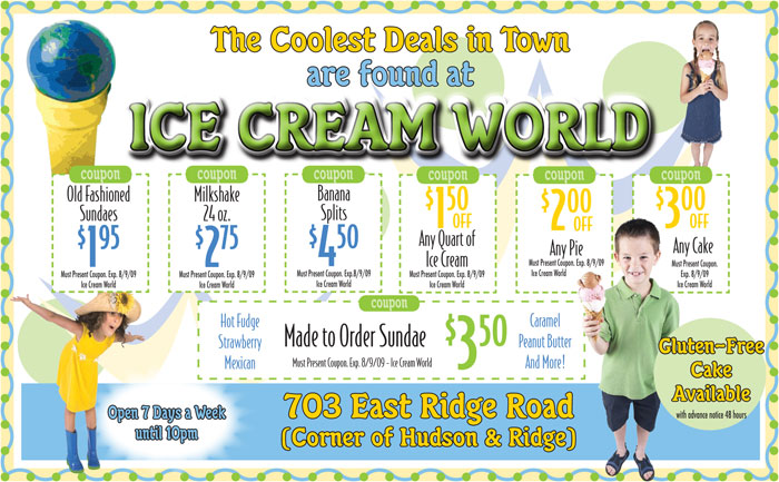
Ice Cream World - The customer was looking for a fresh, fun look and I was given free rein. Don't you love the globe ice cream cone!?

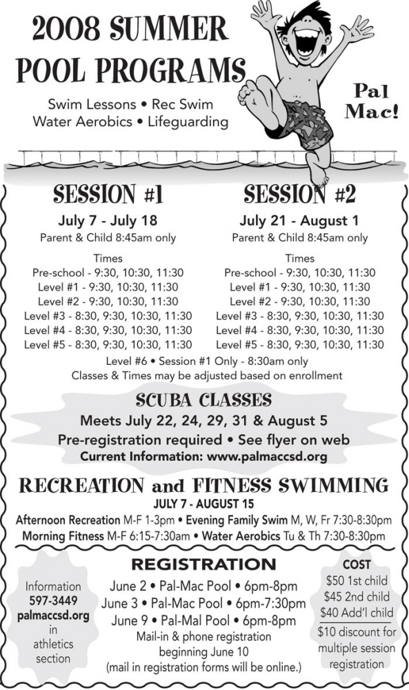
Palmyra-Macedon Summer Recreation Ad - The rep for this customer was notorious for wanting no clip art, everything centered; plain and simple. We asked her to please show this to the customer before you make changes. The ad ran as is. :)

Magazine and Newspaper Ads - I just loved how sometimes less is more.

Empire Sports Solutions - Ad that ran in Connecting Rochester Magazine.

www.gregfrancis.com - Ad for Connecting Rochester Magazine.

Kitchen & Bath Place - Purple logo? Ok, we can do this.

Monroe County Sherriff Ad - Ad for Connecting Rochester Magazine

Royal Orchid - Half page newspaper ad. Very striking on newsprint. Another Critic's Choice winner.

The Clark House

Spec ad. Love the attitude.

Topline Auto - We finally got the customer to buy color with this spec. Other local papers borrowed it, too.

Topline Auto - This was my personal favorite.

Fun use of font size and percentages.

Crescent Beach Restaurant - My favorite customer.

Webster Montessori School - Fun use of color

Wildflowers - A fun, girly shop needs a fun, girly font.

Window Design/Closet Source By Gail - Ad for Connecting Rochester with in your face color!
gLike