Initial page is branded to Coca Cola specifications. It is meant to draw the user to the main page object. Multiple offerings are listed below. Static on every page is an information bubble in the lower left hand corner. When an offering is chosen the user is given a description in the second page.

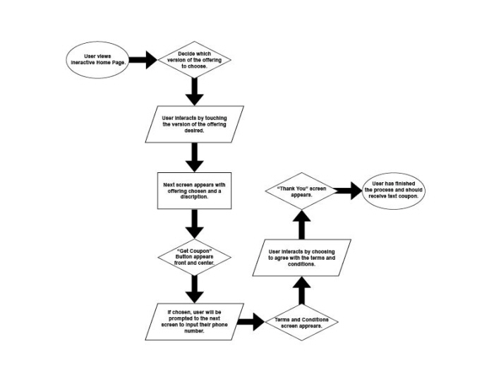
After the user chooses an offering, they are prompted to page 2 where the are given more information about to the product selected and prompted with a "Get Coupon" button front and center for the user to engage with receive a free gift (customer engagement is paramount).

After choosing the offering the user is prompted to give a phone number. A text with the coupon code is sent upon completion and further acceptance of the terms and conditions.

After entering the phone number the user is prompted to view and accept the terms and conditions, at which point and upon agreement they are taken to the final verification page.

It is important to give the user a resolution page to give feedback that the process is complete and they can now receive a coupon text for the offering of their choice.

Simple flow chart describing the UX/UI process for the user.

Persona: Brand Director, Sharon C.
gLike