The client desired to upgrade their current structural packaging with a more elegant and distinctive brand aesthetic. The goal was to develop a uniquely styled bottle design that reinterpreted desirable brand features while
elevating the overall aesthetic and presentation of the Bath & Body Works brand.
The results yielded subtle variations on an antique styled bottle design that reflected a modern apothecary theme. The direction reinterpreted the side “gripper” feature and allowed for a bolder presentation of the Bath & Body Works branding.


The goal was to come up with a fresh design approach for the structural packaging of the scented oil product. Creating a more upscale and environmentally discreet solution that has an engaging aesthetic. The result is the first non-electric scented oil freshener that delivers consistent home fragrance for a full 60 days at minimum setting and 45 days at maximum setting.

The goal of the effort was to develop a more distinct and differentiated bottle design that maintained liquid product volume and a more prominent label area. The result was a unique structural detergent bottle form that has shelf presence meets the stated physical requirements and can be reused
with other family brands.


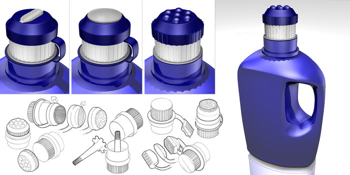
Detergent Scrubber Caps - Retrofit solution for pretreating laundry

Liquid soap dispenser redesign that features a unique branded approach to structural and packaging design.

The client desired to create a new packaging structure for a common national brand that had a more distinct and unique shelf presence within the market. For the Vicks VapoCool brand, an interesting and unique take on gusset bag packaging structures of the traditional brand was created to promote
a more modern and unexpected presentation of the brand.

Black Opal - Hanging Packaging Concept


gLike