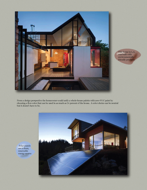
This magazine two-page spread features the importance of environmentally friendly architecture, products, and services designed with natural earthy colors and an arch on the top of the page that represents similar shapes seen in natural formations.

The touched-up Photoshop photos selected for the second page of this two page spread help draw the eye to this well-designed piece.

This ad for Serenity, a light, natural, cool body spray was designed with the water and clear sky offering a relaxing, serene, fresh feeling mirroring this product’s selling point.

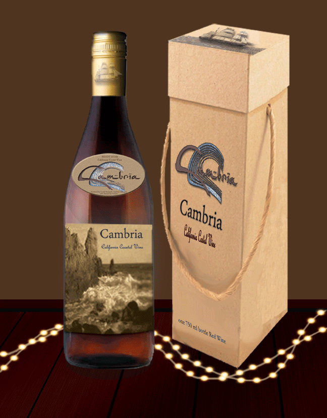
This ad combines sophistication with a fun coastal flair. A distinct water-chic logo and interesting font as well as the dark table and bright lights embody a tasteful ambiance and the package's sandy color, textured rope handle and ship earmarked on the top of the box and bottle neck compliment this sophisticated beachy motif.
gLike